How to Create Infographic with AI: The Founder’s Guide for 2025
how to create infographic with ai - learn how B2B teams use AI-generated infographics. Step-by-step guide with real examples.

How to Create Infographic with AI: The Founder’s Guide for 2025
I remember the exact moment I stopped asking my design team (me) for “quick” infographics.
It was a Tuesday. I had a fantastic piece of data from a customer survey a stat that proved our product ROI was double the industry average. I wanted to get it on LinkedIn while the topic was trending. I messaged our lead designer (its me).
Her(me) response? “Added to the queue. Earliest draft by Friday.”
By Friday, the trend was dead.
If you lead a marketing or content team or solo creator, you know this pain. You know that visual content is non-negotiable. According to Venngage’s 2024 benchmarks, 56% of marketers say visual content is “very important” to their strategy, and 91% of consumers prefer visual content over plain text.
Yet, creating high-quality infographics has historically been a bottleneck. You either pay an agency $500+ per asset, wait days for an in-house designer, or spend hours wrestling with drag-and-drop templates yourself.
This is why how to create infographic with ai is the most critical skill for content teams to learn right now. It is not just about speed; it is about reclaiming the agility to communicate complex ideas instantly.
In this guide, I’m going to walk you through exactly how to generate professional infographics using AI-not in days, but in minutes. I will show you the workflows I use at InfoAIGraphic, the mistakes to avoid, and the “human-in-the-loop” checks that keep quality high.
The “AI Infographic” Landscape: What You Need to Know First
Before I dive into the buttons and prompts, I need to clear up a massive misconception about using AI for design.
When most people search for “how to create infographic with ai,” they try to use image generators like Midjourney or DALL-E 3. They type in a prompt like: “Infographic showing B2B marketing trends, blue style, professional.”
And they fail.
Why? Because Generative Art tools (like Midjourney) treat text as shapes. They hallucinate spelling. They invent fake data. They give you a beautiful image that is completely unusable for business because you cannot edit the text or the chart values.
To succeed, you need Generative Design tools (like InfoAIGraphic). These tools understand that an infographic is made of separate components: accurate text, editable charts, and icons.
When to Use AI for Infographics
I’ve seen teams try to force AI to do everything. It doesn’t work. Here is the reality of where AI shines versus where it struggles:
- Green Light (Use AI): List-based infographics, step-by-step processes, summarizing a blog post, simple bar/pie charts, and social media carousels.
- Yellow Light (Proceed with Caution): Comparison charts involving nuanced qualitative data. You will need to verify every point.
- Red Light (Hire a Human): extremely complex data visualizations with thousands of data points (like a scatter plot of 5,000 customers) or highly conceptual “metaphor” graphics that require abstract thinking.
Step 1: Prep Your Data (The “Garbage In, Garbage Out” Rule)
AI cannot read your mind (yet). If you feed an AI tool a messy, unstructured stream of consciousness, you will get a messy, unstructured infographic.
I always tell founders that the “magic” isn’t in the generation; it’s in the preparation.
Structure Your Input
For the best results, organize your content into a simple hierarchy before you open any tool.
- Headline: The main promise (e.g., “5 Ways to Slash CAC”).
- Key Points: 3 to 6 distinct items.
- Supporting Data: The exact numbers for each point.
Pro Tip: If you are repurposing a blog post, don’t paste the whole URL and hope for the best. Isolate the H2 headers and the first sentence of each paragraph. This prevents the AI from trying to cram 2,000 words into a 600-pixel wide image.
(If you are struggling to figure out which data points actually matter to your audience, check out our guide on how to explain data with infographics to sharpen your narrative first.)
Step 2: Choose Your AI Workflow
There are two main ways to approach how to create infographic with ai today.
Method A: The “Text-to-Structure” Approach (Recommended)
This is what I built InfoAIGraphic to do. You provide the topic or the raw text, and the AI builds a structured layout with editable text boxes and icons.
- Best for: B2B marketing, educational content, repurposing blogs.
- Speed: < 2 minutes.
Method B: The “Chat-to-Chart” Approach
Tools like ChatGPT (with data analysis enabled) can generate individual charts (bar graphs, line charts) as images.
- Best for: visualizing a single CSV file.
- Downside: You still have to take that chart image and put it into a design tool (like Canva or Figma) to add the title, logo, and context. It’s a hybrid workflow.
For the rest of this guide, I will focus on Method A because it is the only scalable way to get a finished asset ready for LinkedIn or your blog.
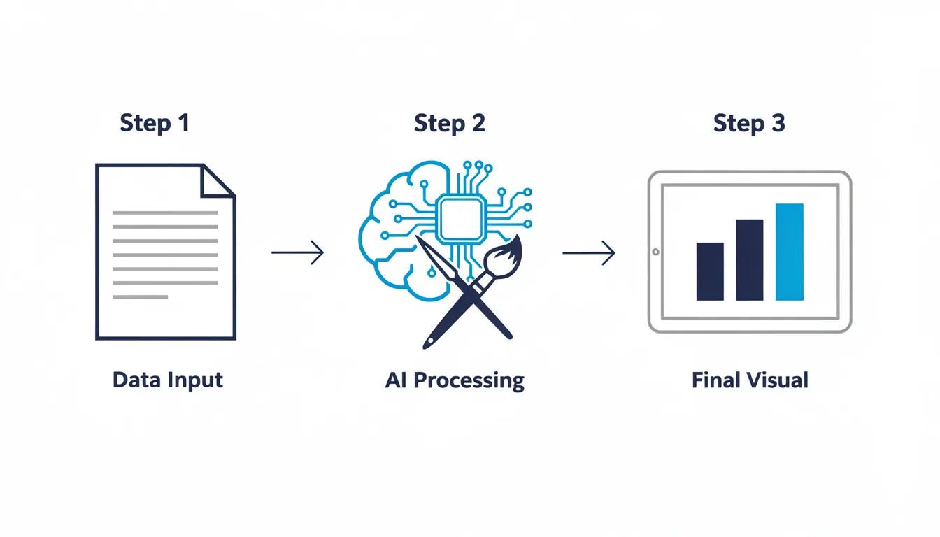
Step-by-Step Guide: Creating Your First AI Infographic
Here is the exact workflow I use to turn a piece of industry news into a visual asset.
1. Select Your Template Logic
Most AI generators ask you for a “type” or “flow.” This is critical. Don’t just pick “random.”
- Process: Use for “How-to” guides (Step 1, Step 2, Step 3).
- List: Use for “Top 5 Tools” or “Key Benefits.”
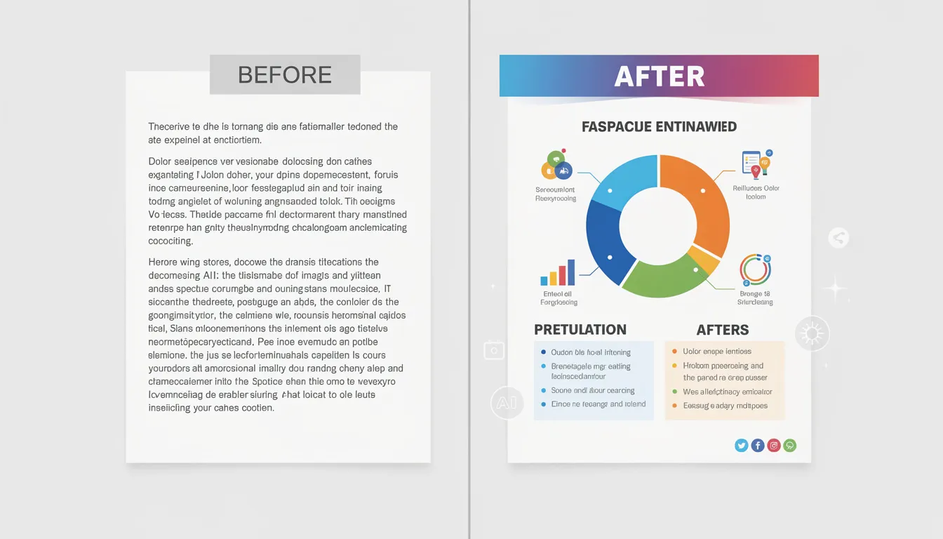
- Comparison: Use for “Us vs. Them” or “Before vs. After.”
- Timeline: Use for company history or project roadmaps.
2. Enter Your Prompt or Content
If you are using InfoAIGraphic, you can simply paste the URL of your article. The AI will analyze the text, extract the key statistics, and propose a layout.
- Founder’s Note: I usually prefer to paste a summarized bullet list rather than a raw URL. It gives me more control over the tone.
3. Review the “Skeleton”
Before the AI applies colors and heavy design, look at the structure.
- Are the headers accurate?
- Is the data correct? (AI can sometimes hallucinate a number-always double-check stats against your source).
- Is the flow logical?
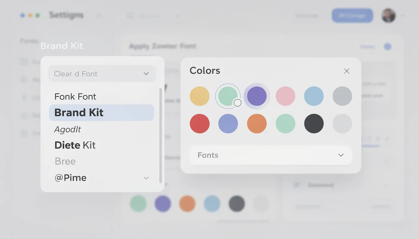
4. Apply Brand Settings
This is where AI saves you the most time. Instead of manually changing every hex code, you should have your Brand Kit loaded. With one click, the AI should apply your primary blue, your secondary accent, and your specific font family.
5. The “Human Polish”
No AI is perfect. I spend about 60 seconds doing a final sweep:
- Shorten text: AI tends to be wordy. If a sentence wraps to three lines, cut it to two.
- Swap icons: Sometimes the AI picks a generic “gear” icon for “strategy.” I might swap it for a “chess piece” to be more specific.
- Check whitespace: Ensure the design breathes.
Ready to try this workflow? Try InfoAIGraphic free and turn your top article into an infographic in under 2 minutes.
Design Sanity Checks: Avoiding the “AI Look”
We have all seen those cheap-looking, robotic graphics. You don’t want that for your brand.
To ensure professional quality, you need to follow basic design principles. Even though the AI does the heavy lifting, you are the art director.
1. Visual Hierarchy
Does the most important number stand out? If everything is big, nothing is big. Ensure your headline is the dominant element, followed by your subheads.
2. Color Contrast
According to HubSpot’s 2024 marketing trends, accessibility is becoming a major ranking factor and user preference. Make sure white text on colored backgrounds is legible. If the AI puts light grey text on a white background, fix it immediately.
3. Don’t Overcrowd
A common issue in choosing and using an AI infographic generator is picking a tool that tries to cram too much info into a small space. If your infographic looks like a novel, cut the text by 50%.
Common Mistakes When Creating Infographics with AI
I’ve analyzed thousands of generated graphics. Here are the three most common ways people mess up how to create infographic with ai.
Mistake 1: Ignoring the “Hallucination” Risk
I once saw a generated infographic that claimed “140% of customers” were satisfied. The AI simply added up two different percentages incorrectly.
- Fix: Never publish without a human reading every single data point.
Mistake 2: “Frankenstein” Branding
Mixing AI-generated distinct styles (like 3D clay icons) with flat vector icons in the same image. It looks disjointed.
- Fix: Stick to one icon pack or style per graphic.
Mistake 3: The “Wall of Text”
You treat the infographic as a blog post.
- Fix: If you find yourself resizing text to 8pt font to make it fit, you have failed. Review our guide on infographic design best practices to learn how to edit ruthlessly.
Generate your first AI infographic from a blog post with InfoAIGraphic - no design skills required.
FAQ: Getting Started with AI Infographics
Q: Can AI-generated infographics rank in Google? A: Yes, absolutely. Google cannot “tell” if a human or AI arranged the pixels. What matters is relevance and engagement. If the infographic keeps users on your page longer and provides value, it will help your SEO. Just ensure you include optimized Alt Text.
Q: How long does it take to create an infographic with AI? A: Once you have your data ready, the actual generation takes less than 2 minutes. Including the “human polish” and brand adjustments, a finished asset typically takes 5–10 minutes. Compare that to the 3–5 days for a traditional design cycle.
Q: Is AI copyright-free? A: This depends on the tool. If you use a tool like InfoAIGraphic that uses licensed icon libraries and standard fonts, you own the final design. If you use generative art tools (like Midjourney), the copyright laws are currently grayer, but generally, you can use them for commercial marketing without issue.
Q: Can I edit the text after the AI generates it? A: In a dedicated infographic tool, yes. This is the main difference between “Text-to-Image” (uneditable pixels) and “Text-to-Layout” (fully editable). Always choose the latter for business content.
Summary: The Future of Visual Content
Learning how to create infographic with ai is not about firing your designers. It is about freeing them up to work on your website redesign or your product UI, while you handle the day-to-day social content and blog visuals yourself.
The B2B buyers of 2025 are tired of walls of text. They want insights, fast.
By combining your expertise with the speed of AI, you can turn every single blog post, case study, and customer survey into a visual asset that drives engagement.
Start small. Take your last LinkedIn post, strip it down to 4 bullet points, and run it through a generator. The result might just surprise you.
If you are ready to stop waiting on design queues, I invite you to try InfoAIGraphic. We built it specifically for founders and marketers who value speed without sacrificing brand quality.
Share this article

Mateoo
Founder of InfoAIgraphic
Building the fastest way to turn text into viral infographics. Helping creators and businesses scale their visual content without design skills.
Related Articles

AI Tools for Infographic Creation: The 2026 Guide for Marketers
Ai tools for infographic creation - learn how B2B teams use AI-generated infographics. Step-by-step guide with real examples.

AI Infographic Examples for Inspiration: The 2025 Guide for Content Teams
ai infographic examples for inspiration - learn how B2B teams use AI-generated infographics. Step-by-step guide with real examples.

Getting Started with AI Infographics: The Founder's Guide to Scaling Visuals
Getting started with ai infographics - learn how B2B teams use AI-generated infographics. Step-by-step guide with real examples.