AI infographic design for beginners: B2B Guide 2026
Learn ai infographic design for beginners with a practical B2B framework to turn dense reports into clear visuals that improve engagement. Read more!

Ai infographic design for beginners Guide: How to Scale Your Visual Content
I’ve been on enough marketing calls to know the exact moment the “infographic panic” sets in.
You have a killer blog post or a dense white paper. The data is solid. The insights are unique. But you know-deep down-that if you just post a wall of text on LinkedIn or your blog, 90% of your audience will scroll right past it.
You need visuals. specifically, you need an infographic to make that complex data digestible.
But then reality hits: your design team is booked for three weeks. You open a “simple” design tool, stare at a blank canvas, and realize you have no idea how to arrange 12 statistics without making it look like a ransom note. So, the idea dies in your drafts folder.
I see this happen constantly. Great content gets buried because teams can’t bridge the gap between having data and visualizing data.
That’s where ai infographic design for beginners changes the game. It’s not about replacing designers; it’s about unblocking marketers. It allows you to turn a paragraph of stats into a scroll-stopping visual in minutes, not days.
In this guide, I’ll walk you through exactly how to get started-without the hype, and without needing a degree in graphic design.
Why “Simple” Infographics Are So Hard to Make
If you’ve ever tried to DIY an infographic, you know the struggle is real. It looks easy when you see a polished example on Pinterest, but the process is full of friction.
1. The “Blank Canvas” Paralysis
Most traditional tools give you a blank white box and a library of 10,000 icons. For a non-designer, this isn’t freedom; it’s a trap. You spend 45 minutes searching for the perfect “growth” icon, only to realize it doesn’t match the style of your “revenue” icon.
2. The Data Density Trap
Beginners often try to cram an entire white paper into one image. The result is a cluttered, unreadable mess. Professional designers know about “whitespace” and “visual hierarchy.” AI tools can help structure this for you, but only if you know how to prompt them correctly.
3. The Consistency Problem
You might make one decent graphic today. But can you make a second one next week that looks like it came from the same brand? Keeping fonts, colors, and layout styles consistent is where most DIY efforts fall apart.
The result? Inconsistent visuals that dilute your brand authority, or worse-no visuals at all.
How AI Changes the Workflow (And Where It Doesn’t)
Let’s be honest about what AI can actually do. There is a lot of noise about “one-click magic,” but the reality is more nuanced.
What AI is great at:
- Summarization: Taking 500 words of text and pulling out the 5 key bullet points.
- Layout Structuring: Instantly suggesting a layout that fits your specific data points (e.g., a timeline vs. a comparison chart).
- Style Matching: Applying your brand colors and fonts across every element instantly.
What AI still struggles with:
- Contextual Nuance: It might pick a “happy” icon for a serious statistic if you aren’t careful.
- Data Accuracy: Generative AI can sometimes “hallucinate” numbers. Always double-check the stats in your final graphic.
In my experience building InfoAIGraphic, the sweet spot is AI-assisted design, not AI-autopilot. You bring the strategy and the data; the AI handles the pixel-pushing.
Why this matters: According to HubSpot’s 2024 State of Marketing Report, infographics are 30 times more likely to be read than a written article. The leverage here is massive if you can crack the workflow.
Step-by-Step: Your First AI Infographic Workflow
If you are new to ai infographic design for beginners, don’t overthink it. Follow this simple 4-step process to generate your first asset today.
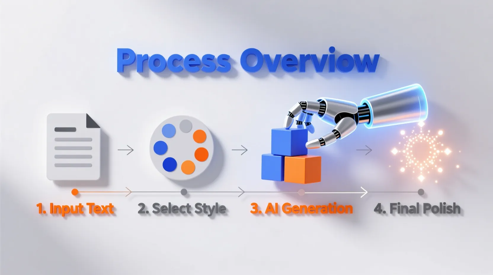
1. Prune Your Content First
Don’t paste your entire blog post into an AI tool. It will get confused.
- Do this: Extract the top 3-5 stats or steps you want to visualize.
- Example: Instead of “The History of Email Marketing,” narrow it down to “5 Key Milestones in Email Evolution.”
2. Choose Your Structure
Before you generate, decide how the data should be read.
- Listicle: Best for “5 Tips for…”
- Timeline: Best for history or project roadmaps.
- Comparison: Best for “Old Way vs. New Way.”
- Data/Chart: Best for hard statistics.
3. Generate and Iterate
Use an AI tool to generate the base layout. This is where tools like InfoAIGraphic shine-you paste your text, and it builds the structure.
- Pro Tip: If the first result is 80% there, don’t scrap it. Edit the 20%. Tweak the text, swap one icon, or adjust a color. It’s faster to edit than to regenerate endlessly.
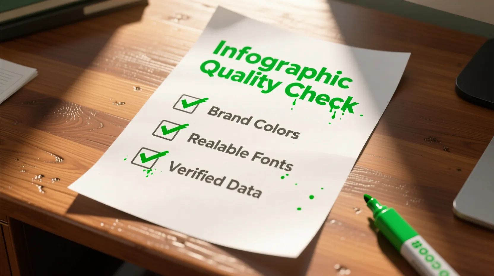
4. The “Brand Polish” Check
Before you download, run through this quick checklist:
- Are the colors from my official brand palette?
- Is the logo visible but not overwhelming?
- is the text large enough to read on a mobile screen?
Ready to try this workflow? Try InfoAIGraphic free and turn your top article into an infographic in under 2 minutes.
Common Beginner Mistakes (Troubleshooting Guide)
Even with AI, things can go wrong. Here are the most common “symptoms” of a bad AI infographic and how to fix them.
Symptom 1: The “Wall of Text” Graphic
The Problem: You pasted too much text, and the AI tried to squeeze it all in. The font size is tiny, and it looks like a textbook page. The Fix: Be ruthless. Cut your word count by 50%. Infographics are for scanning, not reading. Use the AI to “summarize” or “shorten” text before placing it in the design.
Symptom 2: The “Generic Stock Photo” Look
The Problem: The infographic looks like a generic corporate poster from 2010. The Fix: Avoid generic prompts like “business growth.” Be specific. Instead of “business man,” try “minimalist flat line icon representing revenue growth, blue and white palette.”
Symptom 3: Disconnected Data
The Problem: You have a pie chart next to a list of tips. It feels disjointed. The Fix: Stick to one theme per infographic. If you are showing data, make the whole graphic about data. If you are teaching a process, stick to steps. Don’t mix metaphors.
Best Practices for B2B Teams
If you are marketing to other businesses, the bar for quality is higher. Content Marketing Institute research shows that 72% of B2B marketers utilize generative AI, but quality control is the biggest differentiator.
- Cite Your Sources: Always include a small footer text like “Source: 2024 Industry Report” at the bottom of your infographic. It builds trust instantly.
- Repurpose Smartly: Create one “master” infographic for your blog, then slice it into 3-4 smaller squares for a LinkedIn carousel. AI tools often let you resize content instantly-use that feature!
- Focus on Utility: The best B2B infographics are “cheat sheets.” Give your reader something they want to save for later, like a checklist or a workflow diagram.
When NOT to Use AI Infographics
I want to be transparent here. AI is powerful, but it’s not a magic wand for everything.
- Complex Original Data Visualization: If you have a brand new, complex dataset that requires a very specific, nuanced scatter plot to prove a scientific point, use a dedicated data tool like Tableau or a human designer. AI might oversimplify the nuance.
- High-Stakes Print Assets: If you are printing a 10-foot banner for a trade show booth, hire a human designer. Vector resolution and print margins are tricky, and you don’t want to risk pixelation on a $5,000 print job.
For everything else-blog visuals, social media posts, slide decks, and one-pagers-ai infographic design for beginners is the most efficient path forward.
Generate your first AI infographic from a blog post with InfoAIGraphic - no design skills required.
Step-by-Step: Transforming a Blog Post into a Visual
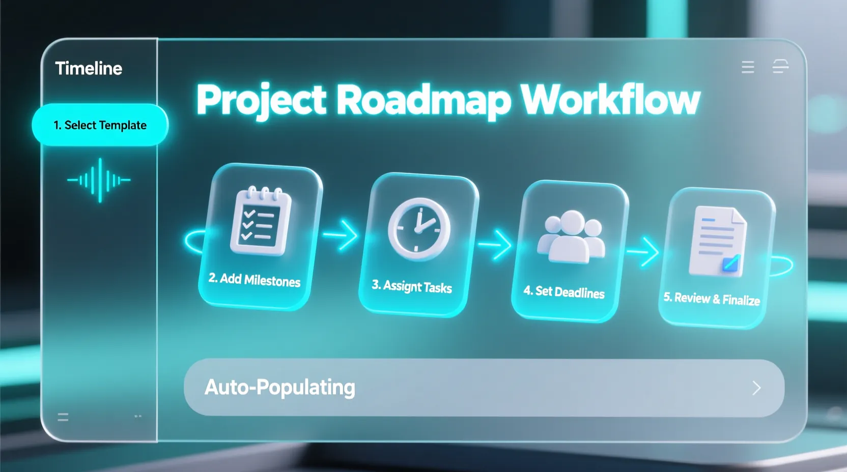
Here is a concrete example. Let’s say you have a blog post titled “How to Onboard New Clients.”
- Identify the H2s: Look at your subheadings. “Send Welcome Email,” “Schedule Kickoff,” “Set Permissions.” These are your infographic steps.
- Draft the Prompt: “Create a 5-step timeline infographic. Title: Client Onboarding Checklist. Steps: 1. Welcome Email, 2. Kickoff Call, 3. Access Setup, 4. Training, 5. Go Live. Style: Professional, blue and grey, minimal icons.”
- Select Layout: Choose a vertical timeline layout (best for mobile scrolling).
- Review Icons: Does the “Training” step have a graduation cap icon? Maybe swap it for a laptop icon to look more modern.
- Export: Download as PNG for social media and PDF for your blog post download.
By following this loop, you build a reusable engine for visual content.
FAQ
Q: Can AI-generated infographics rank in Google Images?
A: Yes, absolutely. Google indexes the image file and the surrounding text. To maximize SEO, ensure your filename includes your keyword (e.g., ai-infographic-design-tips.jpg) and always add descriptive Alt Text that explains the data in the image.
Q: How long does it take to learn ai infographic design for beginners? A: With modern tools, the learning curve is minutes, not months. Most users can generate their first usable graphic in under 10 minutes. The skill you are actually learning is content structuring-knowing what to cut-rather than pixel design.
Q: Is it okay to use AI-generated charts for company reports? A: Yes, but with a caveat: Verify the data. AI is a design assistant, not a data analyst. Paste your verified numbers into the tool. Do not ask the AI to “find stats” for you without checking the primary source yourself.
Q: What if I have zero design eye? A: That is exactly who these tools are for. Stick to the pre-made templates and color themes provided by the AI. They are pre-calibrated for contrast and readability. The biggest mistake beginners make is trying to customize too much and breaking the design system.
Conclusion
The barrier to creating high-quality visual content has never been lower. You don’t need a budget for a freelance designer or hours to learn Photoshop. You just need clear data and a willingness to experiment.
Start small. Take your most popular blog post from last month and turn its main headers into a simple list infographic. Post it on LinkedIn. See how it performs.
Once you see the engagement bump, you won’t want to go back to posting plain text.
If you are ready to streamline this process, tools like InfoAIGraphic are built specifically to help founders and marketers bridge this gap. But whatever tool you use, the most important step is to just start visualizing. Your audience is waiting.
Share this article

Mateoo
Founder of InfoAIgraphic
Building the fastest way to turn text into viral infographics. Helping creators and businesses scale their visual content without design skills.
Related Articles

AI infographic examples for inspiration: 2026 Ideas
Explore ai infographic examples for inspiration to spark campaign ideas, strengthen storytelling, and ship higher-converting visual content. Discover how!

Ai infographic generator: How B2B Teams Should Choose
Choose the right ai infographic generator with practical criteria, workflow tips, and examples that help your team publish quality visuals faster. Discover how!

Best AI Tools for Infographic Creation in 2026: Compared
Compare AI infographic tools for marketers: Canva, Piktochart, Venngage, Gamma and infoAIgraphic. See workflows, pricing, exports and best use cases.