Getting started with ai infographics: Founder Guide
Follow Getting started with ai infographics with a step-by-step framework to launch visuals quickly, repurpose content, and grow qualified traffic. Read more!

Getting Started with AI Infographics: The Founder’s Guide to Scaling Visuals
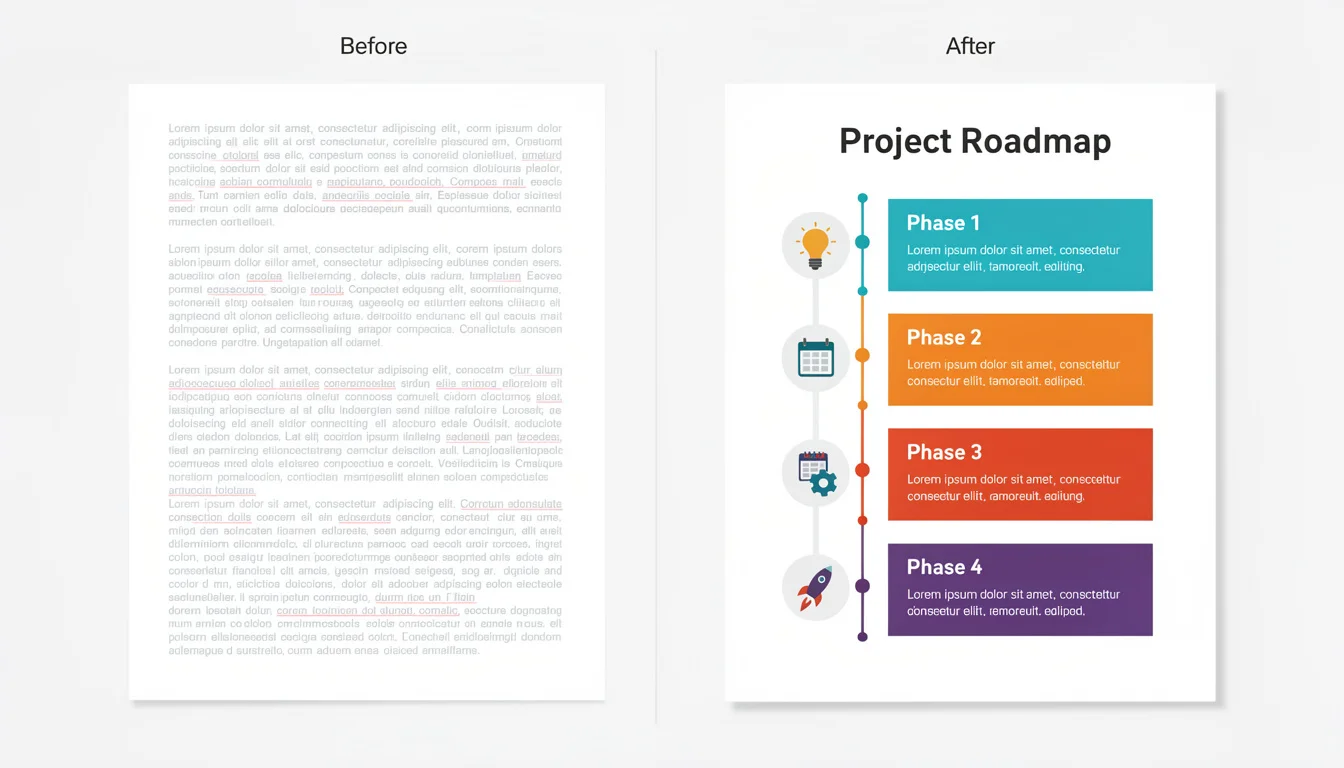
I have a folder on my hard drive I call the “Content Graveyard.”
It’s full of Google Docs-thousands of words of deep, well-researched industry insights that I spent hours writing. When I finally hit publish on them, they didn’t flop, exactly. But they didn’t fly. They were walls of text, and in the B2B world, attention spans are the scarcest currency we have.
I knew the solution: make it visual. But for a long time, “making it visual” meant one of two painful choices:
- Pay a designer $500+ and wait two weeks.
- Spend four hours wrestling with drag-and-drop tools myself, only to produce something that looked… “home-cooked.”
If you’re reading this, you’re likely in the same boat. You know that visual content is essential-in fact, HubSpot’s 2024 research indicates that 88% of marketers plan to maintain or increase their investment in infographics. Yet, the barrier to entry has always been skill, time, or money.
Getting started with ai infographics changes that equation completely. It’s not just about faster design; it’s about unlocking the ability to turn every data point and insight you have into a visual asset that drives traffic.
Here is the honest, no-fluff guide on how to make that shift today.
The “Visual Gap” and Why You Need to Fix It
We often hear the statistic that the brain processes visuals 60,000 times faster than text. But let’s look at a more practical metric: backlinks.
According to DemandWorks, articles with infographics gain 72% more views and an average of 178% more inbound links than other types of posts. In the B2B space, that is the difference between page 2 obscurity and page 1 dominance.
The problem isn’t that marketers don’t want infographics. It’s the “Visual Gap”-the distance between having the data and visualizing it.
Traditional workflows are linear and slow:
- Writer drafts the copy.
- Strategist selects data points.
- Designer builds a wireframe.
- Stakeholders review (and inevitably change the copy).
- Designer rebuilds.
By the time the asset is ready, the news cycle might have moved on.
AI collapses this timeline. When you are getting started with ai infographics, you aren’t just speeding up the “design” phase; you are merging the role of writer and designer. You can go from raw data to a published asset in minutes, allowing you to test what works rather than betting the farm on one expensive graphic.
What is “Getting Started with AI Infographics” Really About?
It is important to clarify what we mean here. There are two very different types of “AI” you’ll encounter.
1. Generative Art Tools (Midjourney, DALL-E)
These are incredible for blog headers or abstract concepts (“show me a robot painting a canvas”). However, they are terrible at infographics. If you ask them for a “marketing chart,” they will often produce nonsense text (gibberish strings of letters) and hallucinated data. They create pixels, not information.
2. Layout & Design Engines (InfoAIGraphic, Canva Magic Design)
This is where B2B teams need to focus. These tools understand text hierarchy and data structure. They don’t just “paint” an image; they arrange your actual content into a readable format.
When we talk about getting started with ai infographics, we are talking about using this second category of tools to structure information, not just generate pretty pictures.
5 Steps for Getting Started with AI Infographics
I’ve seen dozens of teams try to adopt AI tools and fail because they treat them like magic wands. They paste a 2,000-word article into a prompt and get frustrated when the result is cluttered.
Here is the workflow that actually works.
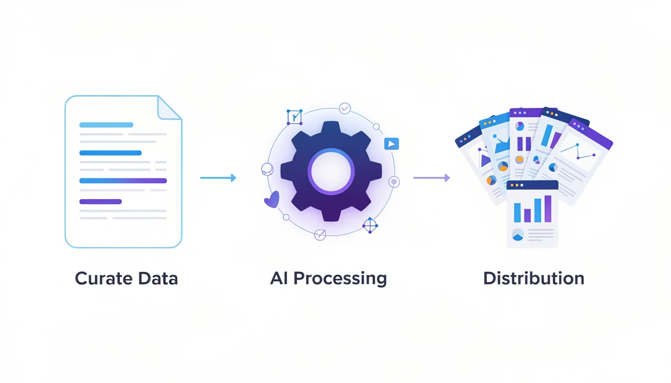
1. Curate, Don’t Create
AI needs direction. Your first step is to isolate the data or steps you want to visualize.
- Don’t: Paste a whole whitepaper.
- Do: Extract 5 key statistics or a 4-step process.
2. Structure Your Data
We built InfoAIGraphic around this principle: Garbage in, garbage out. If your text is a wall of prose, the AI will struggle to find the visual hierarchy.
- Break points into bullet points.
- Clearly label headers (H2 vs H3).
- Keep descriptions under 20 words per point.
3. Choose the Right Tool
For data-heavy B2B content, you need a tool that respects your text.
- If you need a stylistic mood board, use Midjourney.
- If you need a readable chart or timeline, use a specialized infographic generator.
4. Iterate (The “Human in the Loop”)
This is the most critical step. AI will get you 90% of the way there in seconds. The final 10%-checking the brand colors, ensuring the tone is right, and verifying the data-is on you.
5. Repurpose Immediately
Don’t just put the infographic on your blog. Slice it up. A timeline infographic can be turned into a LinkedIn carousel. A data chart can be a Twitter/X post.
Ready to try this workflow? Try InfoAIGraphic free and turn your top article into an infographic in under 2 minutes.
AI Infographic Design for Beginners: 3 Rules to Live By
Even with AI doing the heavy lifting, you need a basic “editorial eye” to ensure quality. In my experience, these are the three areas where beginners get it wrong.
Rule #1: White Space is Your Friend
The #1 mistake I see is overcrowding. Users try to cram an entire ebook into one graphic. If the AI generates a design that feels tight, delete 30% of the text.
- Why: Venngage’s 2024 statistics show that people are 30x more likely to read an infographic than a text article, but only if it is scannable.
Rule #2: One Key Takeaway Per Graphic
Don’t try to show “The History of the Internet” AND “Internet Usage Stats by Country” in the same view.
- Fix: Generate two separate infographics. It costs you nothing extra with AI, and both assets will perform better individually.
Rule #3: Verify the Data
AI tools can occasionally “hallucinate” or misinterpret numbers, especially if the input data wasn’t clear. Always double-check that the “75%” bar on the chart actually looks larger than the “25%” bar.
Practical Workflow: From Blog Post to Infographic
Let’s get specific. Here is a workflow you can use this afternoon to update an old blog post.
- Open your Google Analytics. Find a blog post that has high traffic but high bounce rates (people land, but don’t stay). This usually means the content is good, but the format is boring.
- Scan for lists. Look for sections titled “5 ways to…” or “7 reasons why…” These are your infographic candidates.
- Summarize. Copy that list into a text editor. Rewrite the headers to be punchy (under 5 words). Shorten the explanations.
- Generate. Feed this structured list into your AI tool.
- Refine. If you are using a tool like InfoAIGraphic, you can swap layouts instantly. Try a “Timeline” view vs. a “List” view. Which one makes the data pop?
- Embed. Place the infographic near the top of the original blog post (after the introduction).
Why this matters: This simple update resets the “freshness” signal for Google and gives readers a reason to stay on the page.
Generate your first AI infographic from a blog post with InfoAIGraphic - no design skills required.
Troubleshooting Common Issues
When getting started with ai infographics, you will hit bumps. Here are the “reasons + fixes” for the most common ones I hear from our users.
Problem: The infographic looks cluttered.
Reason: Too much text in the prompt or input fields. Fix: AI isn’t a magical editor; it renders what you give it. Cut your word count by half. Use the infographic to tease the full content, not replace it.
Problem: The text is unreadable or gibberish.
Reason: You are likely using a Generative Image tool (like DALL-E) instead of a Design Layout tool. Fix: Switch to a tool designed for text layout. For a deeper dive on this distinction, check out our guide on choosing and using an AI infographic generator.
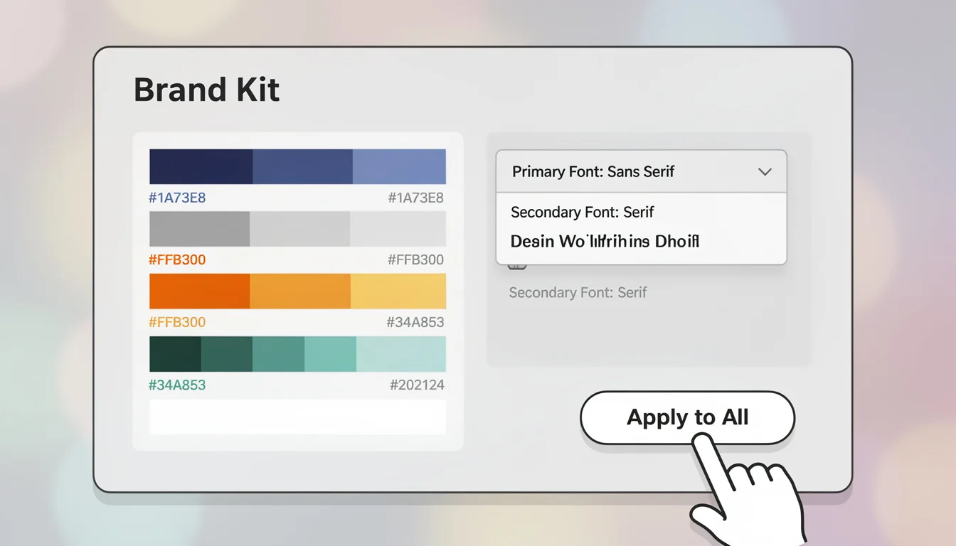
Problem: It doesn’t match our brand.
Reason: The AI is guessing your color palette. Fix: Most professional AI tools allow you to upload a “Brand Kit” (hex codes and fonts). Set this up before you generate your first asset to save hours of editing later.
FAQ
Q: How long does it really take to create an infographic with AI? A: Once you have your text ready, the actual generation takes about 1–2 minutes. The total time, including refining the text beforehand and a quick review after, is usually 10–15 minutes. Compare that to the 3–5 hours it takes to do it manually.
Q: Can AI-generated infographics rank in Google Images? A: Absolutely. Google ranks images based on relevance, alt text, and surrounding context. Because AI allows you to create unique, relevant visuals for every post rather than using generic stock photos, you actually have a better chance of ranking.
Q: Is getting started with ai infographics suitable for SEO and content repurposing? A: Yes, it is one of the best SEO levers you have. Infographics increase “dwell time” (time on page), which signals to Google that your content is valuable. Plus, they are highly shareable, generating the backlinks that drive authority.
Q: Do I need to be a designer to use these tools? A: No. In fact, if you aren’t a designer, you are the ideal user. We wrote about this in our AI infographic design for beginners guide-the tools are built to handle the design rules (alignment, contrast, hierarchy) so you can focus on the message.
Final Thoughts
The era of relying solely on expensive agencies or spending your weekends fighting with design software is over. Getting started with ai infographics is about reclaiming your time and giving your content the visual impact it deserves.
We built InfoAIGraphic because we lived this pain. We had great stories to tell but no way to visualize them at scale.
Start small. Take one existing article, find one list or data set within it, and turn it into a visual today. Your bounce rate (and your readers) will thank you.
Try InfoAIGraphic for free today and see the difference in minutes.
Share this article

Mateoo
Founder of InfoAIgraphic
Building the fastest way to turn text into viral infographics. Helping creators and businesses scale their visual content without design skills.
Related Articles

Best AI Tools for Infographic Creation in 2026: Compared
Compare AI infographic tools for marketers: Canva, Piktochart, Venngage, Gamma and infoAIgraphic. See workflows, pricing, exports and best use cases.

AI infographic examples for inspiration: 2026 Ideas
Explore ai infographic examples for inspiration to spark campaign ideas, strengthen storytelling, and ship higher-converting visual content. Discover how!

AI infographic design for beginners: B2B Guide 2026
Learn ai infographic design for beginners with a practical B2B framework to turn dense reports into clear visuals that improve engagement. Read more!