Best Infographic Colors Psychology: 5 Rules for High-Converting Visuals
I see this pattern all the time. You’ve spent hours researching data, refining your copy, and identifying the perfect angle for a new piece of content. You know this information could change your customer’s mind.
But when you finally turn it into an infographic, something feels… off.
Maybe it looks like a “fruit salad” of clashing neon shades. Maybe it’s so corporate and beige that it puts you to sleep. Or worse, you publish it, and the engagement is dead on arrival.
Here is the hard truth: Color is not decoration. In visual communication, color is functional.
According to HubSpot research, color alone can influence up to 90% of an initial impression. If you get the palette wrong, you aren’t just making an ugly graphic; you are actively telling the reader’s brain to ignore your data.
I’m going to walk you through the best infographic colors psychology specifically for B2B and marketing contexts. We’ll skip the art school theory and focus on the practical rules that help content teams build trust, drive action, and actually get shared.
Why “Gut Feeling” Fails in Infographic Design
The biggest mistake I see founders and marketers make is choosing colors based on what they like rather than what the data needs.
When you treat color as a personal preference, you run into two massive problems:
- The “Trust Gap”: If you use a chaotic palette for serious financial data, your reader subconsciously doubts the numbers. The medium contradicts the message.
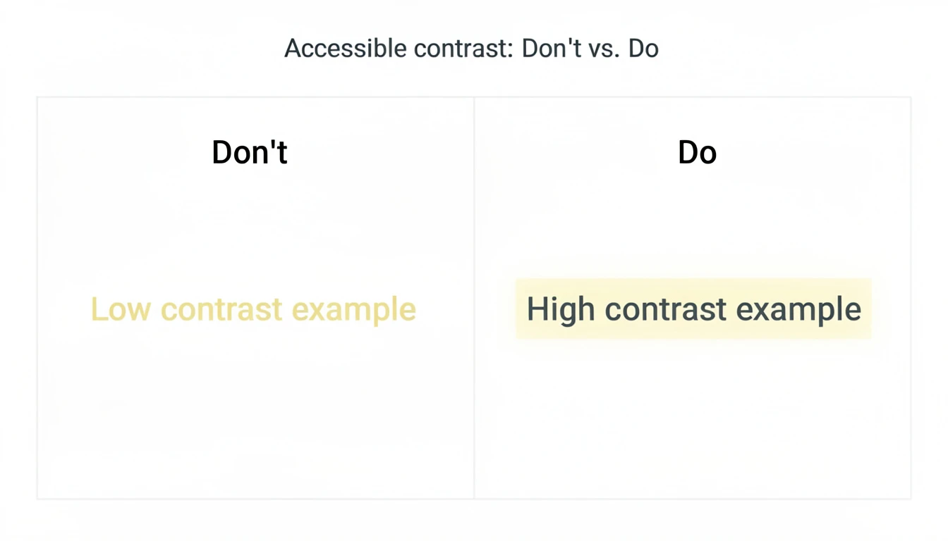
- The Accessibility Trap: This is huge and often ignored. According to WebAIM’s 2024 report, low contrast text is the number one accessibility failure, affecting 81% of home pages. If your infographic relies on subtle grey text on a white background, a huge chunk of your audience physically cannot read it.
Color psychology isn’t about manipulation; it’s about reducing friction. It’s about ensuring your viewer processes the data-which happens 60,000 times faster than text-without getting a headache.
What Is Best Infographic Colors Psychology? (The B2B Edition)
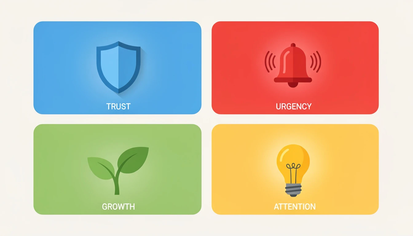
In the B2B world, we aren’t trying to make people feel “romantic” or “mysterious.” We usually want them to feel trust, urgency, or clarity.
Here is how the core colors break down for infographic design.
1. Blue: The King of Trust
There is a reason why salesforce, IBM, and virtually every bank uses blue. In color psychology, blue signals security, logic, and dependability.
- When to use it: Data about security, finance, software architecture, or corporate growth.
- The trade-off: It can feel cold or “default.” You need a warm accent color (like orange) to stop it from looking like a generic template.
2. Green: Growth and Verification
Green is the easiest color for the eye to process. It naturally signals “Go,” “Profit,” and “Correct.”
- When to use it: Success metrics, ROI positive stats, and “Do this” checklists.
- Common mistake: Using a neon “terminal green” that vibrates against white backgrounds. Always darken your greens for text legibility.
3. Red: The Alert System
Red physically raises the heart rate. It creates urgency.
- When to use it: “Don’t do this” examples, declining charts, or critical alerts.
- The risk: If you make your entire background red, it feels aggressive. Use it for less than 10% of the design (the “10” in the 60-30-10 rule).
4. Yellow: The Highlighter
Yellow is the first color the human eye notices. It captures attention faster than any other hue.
- When to use it: To highlight the one most important number on a chart.
- Accessibility warning: Pure yellow on white is unreadable. Never use yellow for text. Use it for background highlights or icons only.
Pro Tip: If you are struggling to combine these without making a mess, I recommend reading our guide on Infographic Best Practices 2026 to see how layout influences color choice.
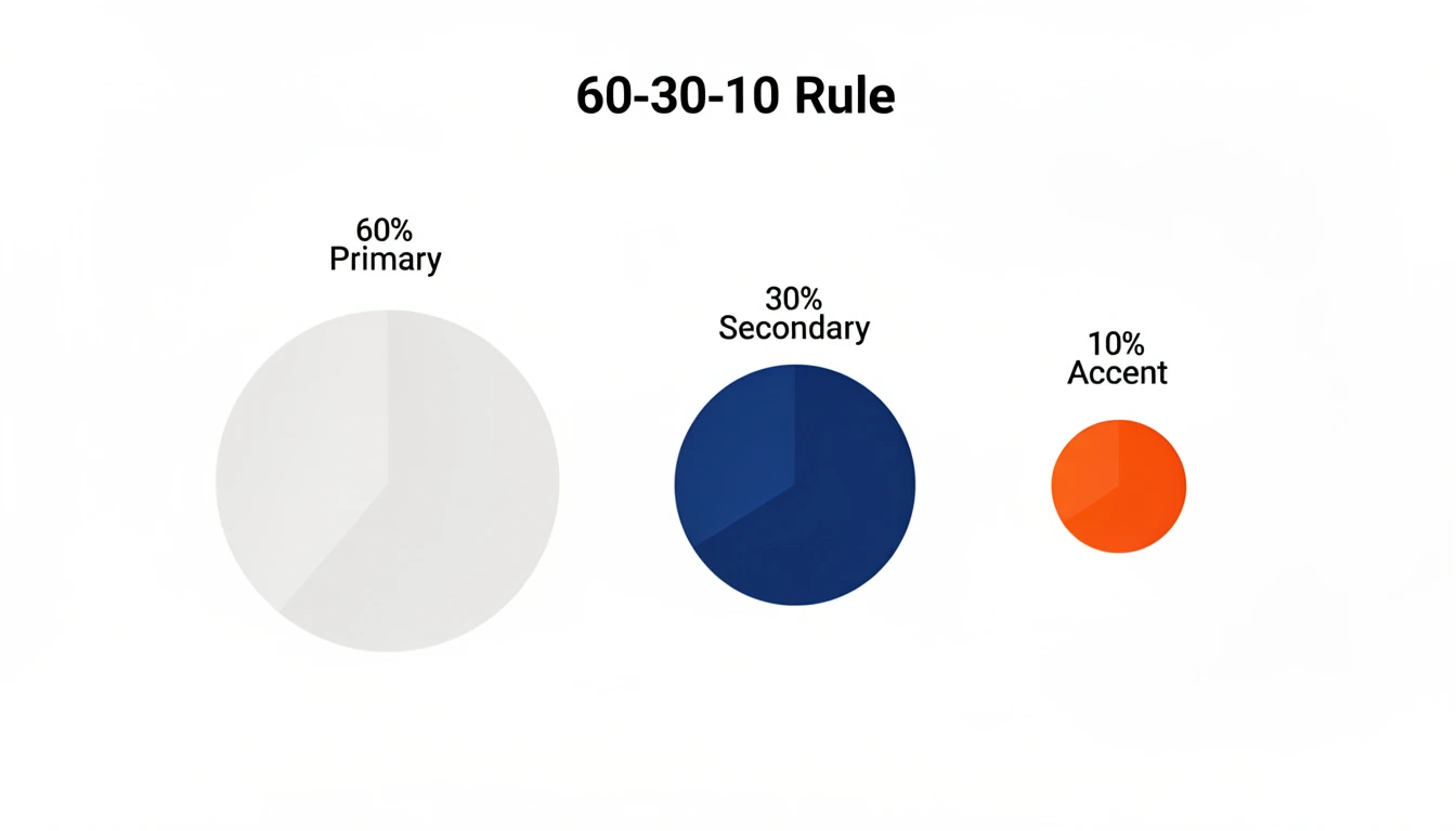
The 60-30-10 Rule for Perfect Palettes
If you take nothing else from this article, memorize this ratio. It is the secret sauce behind every professional-looking design you admire.
- 60% Primary Color: This is usually a neutral (White, Light Grey, or Dark Navy). It sets the stage.
- 30% Secondary Color: This is your brand color (e.g., Salesforce Blue). It gives the graphic identity.
- 10% Accent Color: This is the “Action” color. It draws the eye to the key insight, CTA, or the highest bar on the chart.
When teams ignore this rule, they end up with a graphic where every element is screaming for attention. When everything is important, nothing is.
Ready to try this workflow? Try InfoAIGraphic free and turn your top article into a perfectly balanced infographic in under 2 minutes.
3 Common Infographic Design Mistakes (And Fixes)
In my own tests building the InfoAIGraphic engine, I’ve analyzed thousands of generated visuals. These are the color errors that kill engagement.
1. The “Vibration” Effect
This happens when you place two high-saturation colors next to each other, like bright red text on a bright blue background. The edges literally seem to vibrate, causing eye strain.
- Fix: Always place high-saturation colors against neutrals (white, black, or very pale grey).
2. Ignoring “Mental Models”
Nielsen Norman Group emphasizes the importance of matching the system to the real world. If you use Green to represent “Churn” and Red to represent “Revenue,” you are fighting the user’s brain.
- Fix: Stick to cultural norms. Red = Stop/Loss. Green = Go/Gain. Grey = Neutral/Context.
3. Relying on Color Alone for Data
Roughly 1 in 12 men are color blind. If your line chart has a red line and a green line, and the only way to tell them apart is color, your chart is broken for 8% of your male audience.
- Fix: Use double-encoding. Add labels directly to the lines, or use different stroke styles (dashed vs. solid) in addition to color.
For a deeper dive on avoiding these pitfalls, check out my article on The 7 Non-Negotiable Infographic Design Best Practices for B2B Content Teams.
Step-by-Step: How to Choose Your Infographic Colors
Here is the exact workflow I use when designing a visual strategy or configuring an AI prompt.
- Identify the Primary Emotion: Is this a warning (Red/Orange)? A success story (Green/Blue)? A deeply technical deep-dive (Dark Mode/Neon)?
- Anchor with Your Brand: Start with your main brand color. This ensures that when the infographic is shared on LinkedIn, it still feels like you.
- Select a High-Contrast Complement: If your brand is Blue, pick an Orange or Yellow for the “10%” accent. This creates a “complementary” harmony that naturally pleases the eye.
- Check Contrast Ratios: Use a tool like the WebAIM Contrast Checker. Ensure your text has at least a 4.5:1 ratio against the background.
- Let AI Handle the Balance: If this feels overwhelming, this is exactly what we built InfoAIGraphic to solve. Our algorithms automatically enforce the 60-30-10 rule and check contrast ratios so you don’t have to manually fiddle with hex codes.
Generate your first AI infographic from a blog post with InfoAIGraphic - no design skills required.
Does “Dark Mode” Work for Infographics?
I get asked this constantly. Dark mode visuals (dark background, light text) are incredibly popular in SaaS and crypto marketing.
The Pros:
- They stand out in a white LinkedIn feed.
- They feel “premium” and “tech-forward.”
- Colors pop more vibrantly (neon effects).
The Cons:
- They are harder to print (if your sales team uses PDFs).
- If the text is too thin, it becomes illegible against the dark background.
My Verdict: Use dark mode for digital-only assets where you want to signal “innovation.” Stick to light mode for traditional B2B reports and anything that might be printed. You can see examples of both styles in our guide on AI Infographic Examples for Inspiration.
FAQ
Q: Can I just use my brand palette for every infographic?
A: Usually, no. Most brand palettes are designed for websites, not data visualization. You might have four shades of blue, which looks great on a homepage but makes a bar chart impossible to read. You often need to expand your palette with specific “data colors” that offer more contrast.
Q: How many colors should I use in one infographic?
A: Stick to 3 main colors (Background, Primary, Accent) and 1-2 neutrals for text. If you use more than 5 distinct colors, the viewer’s cognitive load increases, and comprehension drops.
Q: How does color affect SEO?
A: Indirectly, but significantly. Strong color psychology leads to higher engagement and longer “dwell time” on your page. Search engines interpret this engagement as a signal that your content is valuable. Furthermore, clear, high-contrast images are more likely to be featured in Google Image Search.
Q: What is the best background color for an infographic?
A: White (#FFFFFF) or very light grey (#F5F5F5) are the safest bets for readability and shareability. However, “Off-White” or “Cream” can make the design feel less harsh and more editorial.
Conclusion
The “best infographic colors psychology” isn’t about memorizing a textbook on color theory. It’s about empathy for your reader.
You are asking them to give you their time and attention. In exchange, you owe them a visual experience that is easy to read, clear to understand, and respectful of their cognitive load.
If you stick to the 60-30-10 rule, prioritize contrast, and match your colors to the emotional intent of the data, you will immediately put yourself ahead of 90% of the content out there.
And if you want to skip the manual trial-and-error, you can use AI to do the heavy lifting for you.
Ready to scale your visual content? Check out our guide on AI infographic design for beginners or jump right into InfoAIGraphic to create your first asset today.


