Infographic Layout Tips: 7 Rules for Higher-Converting Visuals
Improve infographic layout with hierarchy, spacing, mobile-first structure, scannable sections, and examples for marketing and reports.

Infographic Layout Tips: 7 Rules for Higher-Converting Visuals
Try the workflow on your own content
Paste a report, article, PDF, or idea and generate a free infographic preview with the AI infographic generator.
I’ve lost count of how many times a founder or marketing lead has sent me a draft and said, “I have great data here, but the design feels… messy.”
They aren’t wrong. You can have the most groundbreaking industry statistics in the world, but if your layout forces the reader to work hard to understand them, you’ve already lost. In the B2B world, attention spans are nonexistent. Your reader isn’t browsing for fun; they are scanning for value between meetings.
The problem usually isn’t the colors or the font choice-it’s the structure. It’s the invisible grid that holds everything together. When that grid is broken, the infographic feels “off,” no matter how polished the illustrations are.
In this guide, I’m going to share the specific infographic layout tips I use to turn dense data into clear, high-converting visuals. We’ll cover the psychology of how eyes move across a page, why “white space” is your best friend, and how to fix common layout disasters before they go live.
The “Kitchen Sink” Problem: Why Most DIY Layouts Fail
The most common mistake I see is what I call the “Kitchen Sink” layout. This happens when you try to treat an infographic like a Word document, cramming every single data point, caption, and disclaimer into a vertical strip.
The result? A wall of text with some icons sprinkled on top.
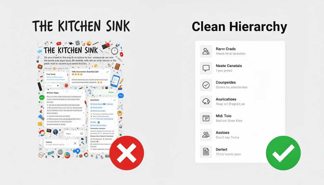
According to a 2024 report by the Content Marketing Institute, visual content is a top priority for B2B marketers, yet consistent design quality remains a massive hurdle. This is often because we prioritize completeness over clarity.
Effective layout isn’t about fitting everything in; it’s about visual hierarchy. It’s about deciding what the reader should see first, second, and last. If everything is the same size and weight, nothing is important.
1. Match Your Layout to Your Data Story
Before you drag a single element onto the canvas, you need to decide what kind of story you are telling. Different data sets require different physical structures.
In my experience, 90% of B2B infographics fall into one of these four layout categories:
The Comparison Layout (Split Down the Middle)
Best for: “Us vs. Them,” “Old Way vs. New Way,” or “Pros vs. Cons.” How to do it: Use a vertical divider line right down the center. Use contrasting background colors for each side to create a clear visual separation. This is one of the most effective ways to position your product against a competitor.
The Roadmap/Process Layout (The S-Curve)
Best for: “How-to guides,” “Customer Journey,” or “Implementation Steps.” How to do it: Don’t just list steps 1–10 in a straight line. Use an S-curve (snake-like) path. This allows you to fit more content into a vertical space while keeping the flow natural. It mimics a journey, which keeps the reader scrolling.
The Statistical Grid (Bento Box Style)
Best for: Survey results, annual reports, or roundups of disparate stats. How to do it: Divide your canvas into clear rectangular sections (like a bento box). Each section holds one key stat and its visualization. This is great for modular content that doesn’t strictly need to be read in order.
The Timeline (Vertical Center Line)
Best for: Company history, evolution of a trend, or project milestones. How to do it: Use a strong central line with branches alternating left and right. This creates a balanced rhythm and saves vertical space compared to a single left-aligned list.
Pro Tip: If you’re struggling to choose, look at your raw text. If it’s a list of dates, pick the Timeline. If it’s a list of arguments, pick the Comparison.
2. Master the Eye-Scanning Patterns (Z vs. F)
You can’t force a reader to look where you want-you have to work with their natural biology. Eye-tracking studies have long shown that we scan digital content in predictable patterns.
The Z-Pattern
For content that is less text-heavy (like a landing page header or a simple promo graphic), the eye typically moves:
- Top-left (Logo/Headline)
- Top-right (Secondary info)
- Diagonal down to bottom-left
- Bottom-right (CTA)
This is why I always recommend placing your most critical takeaway or “hero stat” in the top visual zone.
The F-Pattern
For text-heavy infographics (like deep-dive guides), readers scan in an “F” shape. They read the headline, scan down the left side for subheads, and occasionally read across to the right when something catches their interest.
Why this matters: If you bury your key insights on the right side of the page without a strong visual anchor (like a bold icon or bright color) to pull the eye over, they will be missed.
3. The Power of White Space (Macro vs. Micro)
If there is one hill I will die on, it is this: You need more white space.
White space (or negative space) isn’t empty; it’s an active design element. It reduces cognitive load, making your complex data feel approachable. In fact, studies cited by HubSpot’s marketing statistics consistently show that visual clarity directly correlates with higher engagement and retention.
There are two types you need to manage:
- Macro White Space: The large margins between the edge of the infographic and your content, and the buffers between major sections.
- Rule of thumb: If your text is 16px, your section padding should be at least 40-50px. Give it room to breathe.
- Micro White Space: The space between lines of text (leading) and between a subhead and its paragraph.
- Rule of thumb: Increase your line height. Default settings are usually too tight for infographics. Aim for 1.4 to 1.6 line height for body text.
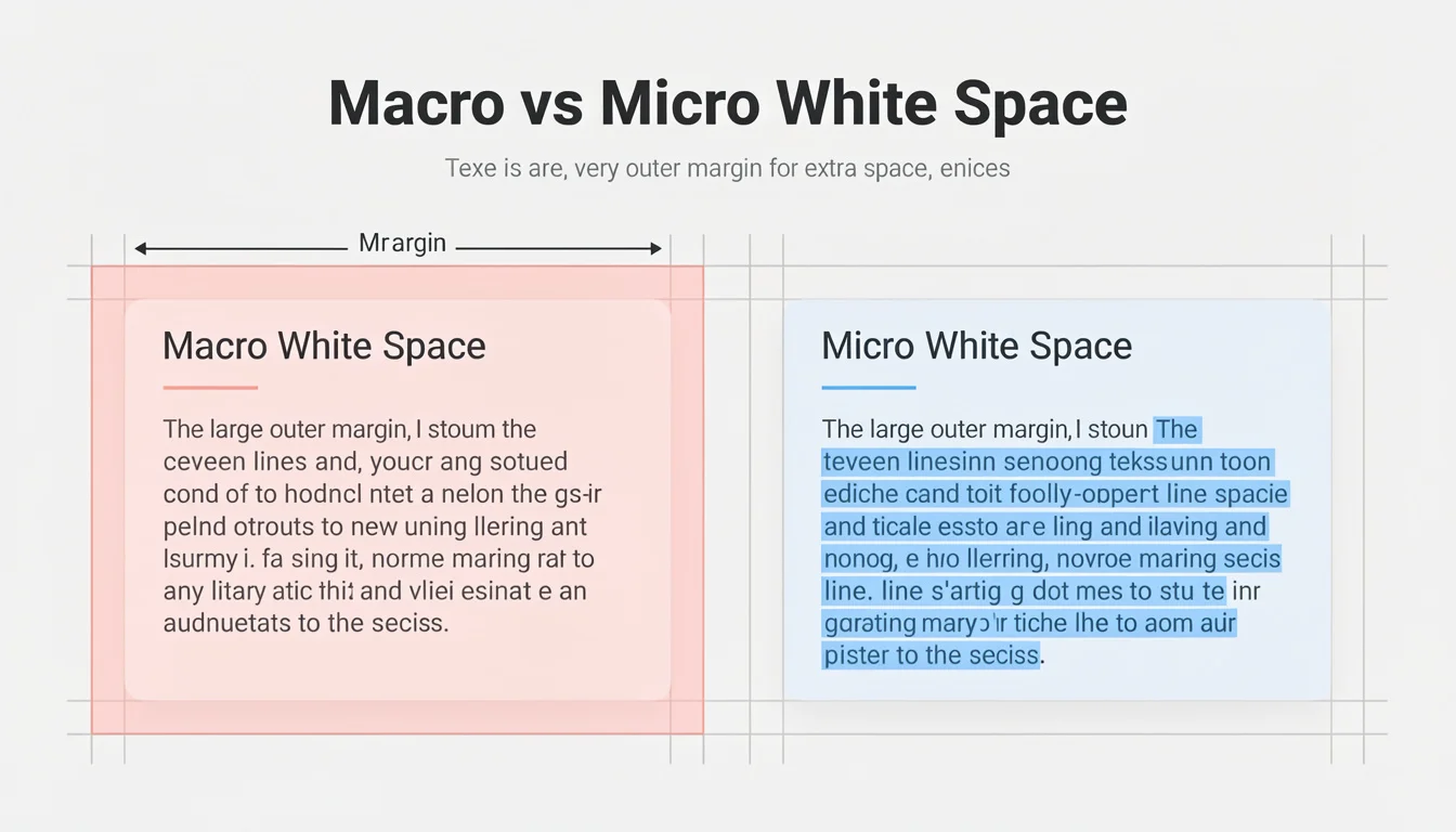
If your design feels “cluttered” but you can’t figure out why, it’s almost always a lack of white space.
Ready to try this workflow? Try InfoAIGraphic free and turn your top article into a polished infographic in under 2 minutes.
4. Establishing a Clear Visual Hierarchy
Visual hierarchy is how you tell the reader’s brain, “Read THIS, then read that.”
Without hierarchy, a reader glazes over. I see this often in B2B infographics where the headline, subheads, and body text are all too similar in size.
The 3-Level Rule
- Level 1 (The Hook): Your main title and the single most important statistic (the “Hero Stat”). These should be the largest elements on the page.
- Level 2 (The Guide): Subheaders, chart titles, and secondary stats. These guide the scanning eye.
- Level 3 (The Meat): Body text, labels, and sources. These should be legible but significantly smaller.
Practical Test: Squint your eyes until the text becomes blurry. Can you still tell which groups of information belong together? If not, your hierarchy is weak. You might need to adjust your font sizes or weights.
For a deeper dive on how color plays into this hierarchy, check out our guide on best infographic colors psychology, which explains how contrast drives attention.
Step-by-Step: How to Layout a B2B Infographic (From Scratch)
If you are staring at a blank canvas, here is the exact workflow I use to ensure a solid layout every time.
- Outline and Group Data: Don’t start designing yet. Open a document and group your data into 3–5 logical sections. Each section needs one clear takeaway.
- Wireframe the Sections: Sketch rough boxes on paper or a whiteboard. “Header here, Chart A here, list of benefits here.” This prevents you from running out of space later.
- Set the Grid: If you are using design software, turn on the grid view. Establish a 2-column or 3-column structure. Keep elements aligned to these vertical lines. Alignment creates trust.
- Place the “Anchors”: Place your biggest elements first (charts, main icons). These are your visual anchors. Everything else (text) will flow around them.
- Add Text and Refine Spacing: Drop in your text. Then-and this is critical-cut the text by 30%. Infographics are for summarizing, not reprinting your blog post.
- Apply the “Squint Test”: Check your hierarchy. Adjust sizes and colors until the path for the eye is obvious.
This process works whether you are using Illustrator, Canva, or an AI tool. Speaking of AI, tools like InfoAIGraphic automate steps 2 through 4 by analyzing your text and instantly generating a grid-based layout that follows these infographic design best practices.
Generate your first AI infographic from a blog post with InfoAIGraphic - no design skills required.
Troubleshooting Common Layout Disasters
Even with a plan, things go wrong. Here are the specific fixes for the most common layout issues I encounter.
Problem 1: “It looks chaotic and messy.”
- The Fix: Align everything to the left. Center alignment is weak for large bodies of text and creates ragged edges that are hard to read. Strong left alignment creates a clean “hard line” that organizes the chaos.
Problem 2: “The bottom half feels empty.”
- The Fix: You likely ran out of content or misjudged the length. Don’t just stretch the text to fill the space (it looks amateur). Add a “Key Takeaways” summary box or a large, illustrated Call to Action (CTA) footer to anchor the bottom.
Problem 3: “The colors clash and distract from the data.”
- The Fix: Restrict your palette. Pick one primary color and one accent color (for buttons or key stats). Use shades of grey for everything else. According to Salesforce design guidelines, limiting your palette improves accessibility and brand recognition.
AI vs. Traditional Design: When to Use Which?
I often get asked if AI can really handle complex layouts. The honest answer is: it depends on your goal.
If you need a highly bespoke, artistic illustration that metaphors your software architecture as a 19th-century steam engine, you need a human illustrator. That is art, not just layout.
However, for 95% of B2B content-listicles, process diagrams, statistical recaps, and thought leadership summaries-AI is now superior in terms of speed and structural integrity.
In my own tests, manually aligning icons and text boxes for a 10-point list takes a human designer (even a fast one) about 30–60 minutes. An AI tool can generate that grid structure in seconds, perfectly aligned. For marketing teams that need to ship content weekly, this efficiency is a game changer. We discuss this shift more in our article on infographic best practices 2026.
FAQ: Infographic Layout Tips
Q: How wide should my infographic be? A: For web and blog use, 800px to 1000px wide is the standard. This ensures legibility on desktop while being large enough to scale down for mobile. If you go wider than 1200px, text becomes hard to read on standard laptop screens without zooming.
Q: Can AI-generated infographics rank in Google Images? A: Yes, absolutely. Google ranks images based on relevance, alt text, file names, and the context of the surrounding content. The tool used to create the image (AI vs. Photoshop) is not a ranking factor. Focus on including descriptive alt text with your keywords.
Q: How do I handle mobile responsiveness for long vertical layouts? A: This is tricky. A super-long infographic can be annoying on mobile. The best practice is to ensure your font size is at least 16pt–18pt so it’s readable when shrunk down. Alternatively, slice your infographic into 3–4 smaller “cards” for social media carousels, which is a core strategy in AI infographic design for beginners.
Q: What is the best font pairing for data-heavy layouts? A: Stick to a clean Sans Serif for your headers (like Roboto, Open Sans, or Montserrat) and a highly legible Sans Serif or Serif for body text. Avoid script or display fonts for anything smaller than a main title-they become unreadable quickly when compressed.
Q: How long does it take to create a professional infographic? A: Traditionally, a high-quality infographic takes 5–10 hours of design time plus feedback loops. With AI-assisted workflows, you can cut this down to 10–15 minutes, allowing you to spend more time on the strategy and distribution rather than pixel-pushing.
Conclusion
Great infographic layout isn’t about artistic talent; it’s about engineering information. It’s about respecting the grid, embracing white space, and guiding the reader’s eye with intention.
When you get the structure right, your data stops being just “numbers” and starts being a persuasive argument.
If you are ready to stop fighting with alignment tools and start publishing visuals that actually convert, apply these rules to your next piece. Or better yet, let us handle the heavy lifting.
Ready to streamline your visual content? Try InfoAIGraphic today and generate professional, grid-perfect infographics from your existing blog posts in minutes.
Share this article

Mateoo
Founder of InfoAIgraphic
Building the fastest way to turn text into viral infographics. Helping creators and businesses scale their visual content without design skills.
Related Articles

Best infographic colors psychology: 5 Rules That Convert
Apply best infographic colors psychology to choose palettes that improve readability, trust, and click-throughs while keeping visuals consistent. Read more!

Infographic Best Practices 2026: 7 Rules + AI Examples
Learn 7 infographic design rules for B2B content teams, with real AI-generated examples, layouts, and a faster workflow from text to visual.

Infographic design best practices for B2B teams: Guide
Apply infographic design best practices to turn complex data into clear visuals your buyers understand quickly, helping your content perform better. Read more!