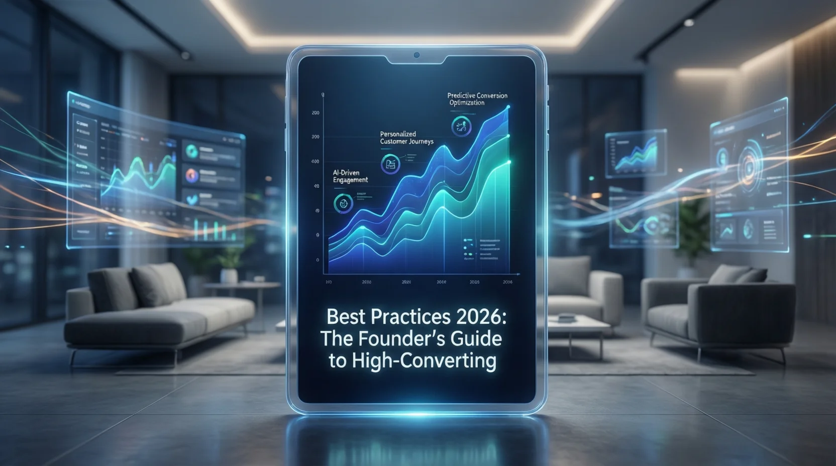
Infographic Best Practices 2026: 7 Rules + AI Examples
Try the workflow on your own content
Paste a report, article, PDF, or idea and generate a free infographic preview with the AI infographic generator.
I’ve been there. You spend three days researching a topic, another two days writing the perfect 2,000-word guide, and you hit “Publish” with a sense of pride. You wait for the traffic, the shares, the LinkedIn comments.
And then… silence.
The problem usually isn’t your writing. It’s that your audience is tired. We are living in the era of “doom scrolling,” where attention spans are measured in milliseconds. In 2026, the “text wall” is the fastest way to lose a B2B buyer. They don’t want to read; they want to understand.
When I started building InfoAIGraphic, it wasn’t because I loved design. It was because I hated seeing brilliant content get ignored. I realized that if you can’t visualize your value prop in under three seconds, you’ve probably lost the sale.
But here’s the catch: the old playbook-those towering, text-heavy 5,000-pixel skyscrapers we used to call infographics in 2015-is dead.
This guide covers the infographic best practices for 2026 that are actually working for marketing teams right now. No fluff, just the strategies I use every day to turn dry data into high-performing assets.
The “Mobile-First” Mandate: Why Old Infographics Fail
The biggest shift we’ve seen in the last two years is the death of the desktop-only view.
According to HubSpot’s 2025 State of Marketing Report, over 60% of B2B content consumption now happens on mobile devices. Yet, I still see teams designing wide, landscape-oriented graphics that look like postage stamps on an iPhone screen.
If your user has to “pinch-to-zoom” to read your headline, you have failed.
The new standard aspect ratios
In 2026, infographic best practices dictate a vertical-first approach. We aren’t just designing for blogs anymore; we are designing for LinkedIn feeds, Slack channels, and mobile inboxes.
- The “Scroll Stopper” (4:5): Perfect for LinkedIn and Instagram carousels.
- The “Story” (9:16): Essential for mobile-first consumption.
- The “Modular Block” (1:1): Square tiles that can be stacked or used standalone.
Pro tip: Stop designing one giant image. Think in “modules.” A great infographic today is actually a collection of 3–5 smaller square graphics stacked together. This allows you to break them apart for social media promotion later without redesigning them.
Strategic Layouts: The “Bento Grid” Era
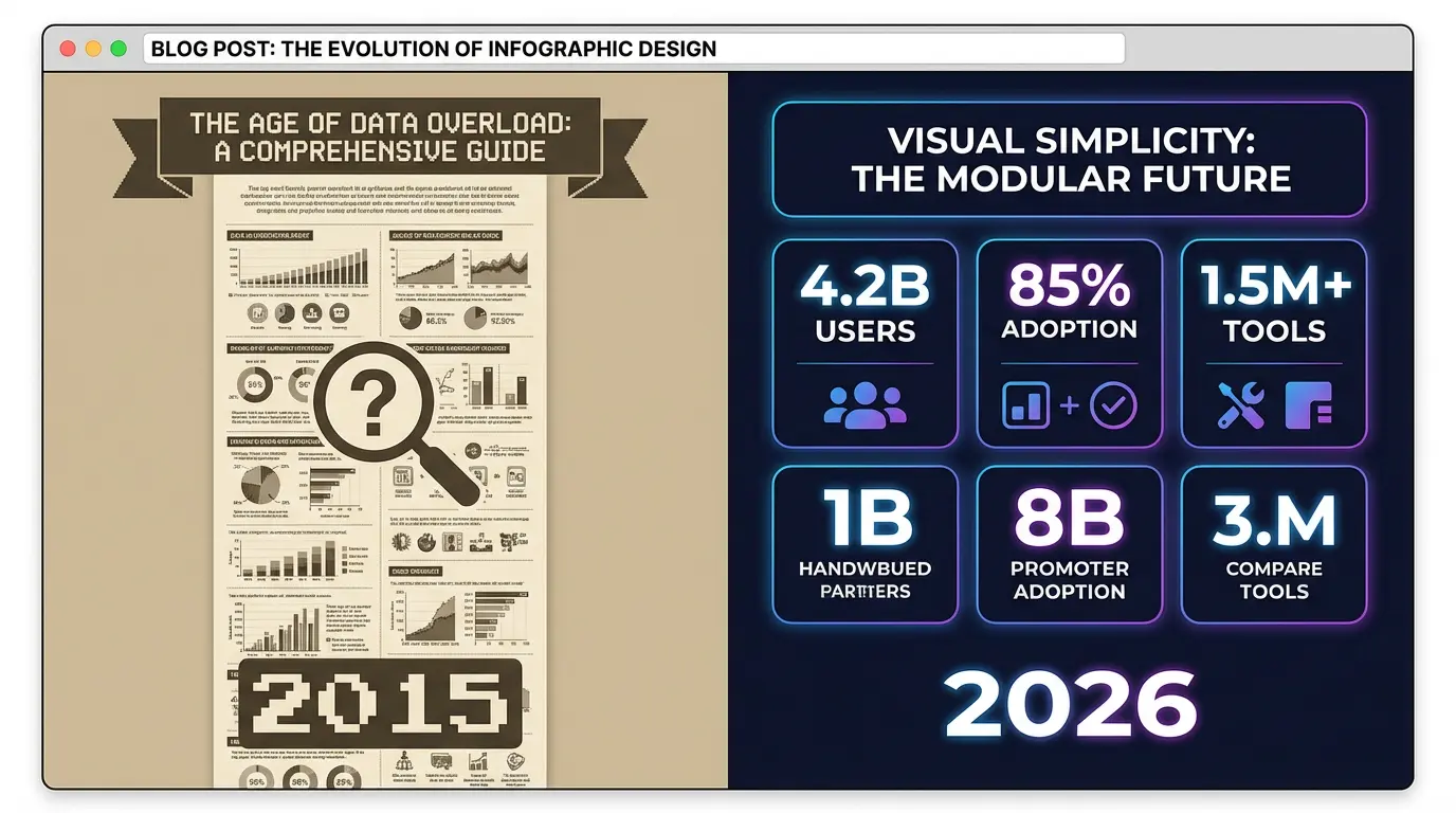
We are seeing a massive move away from linear, step-by-step lists toward what designers call “Bento Grids” (inspired by Japanese lunch boxes).
Why does this work? Because it feels organized but dense. It allows the eye to scan different “compartments” of data without getting overwhelmed by a long vertical list.
The “One Key Message” Rule
A common mistake I see founders make is trying to cram an entire whitepaper into one graphic.
Don’t do this.
Content Marketing Institute data suggests that visual assets with one clear focal point outperform complex visuals by nearly 2x in retention.
Before you open any tool, ask yourself: “What is the ONE insight I want them to remember?”
- Is it that your tool saves 20 hours a week?
- Is it that the market grew by 40%?
Make that insight your H1 in the graphic. Everything else is supporting evidence. If a data point doesn’t support that H1, cut it.
If you’re looking for layout inspiration that breaks the mold, our AI Infographic Examples guide breaks down specific grid styles that are trending this year.
Best Infographic Colors Psychology & Dark Mode
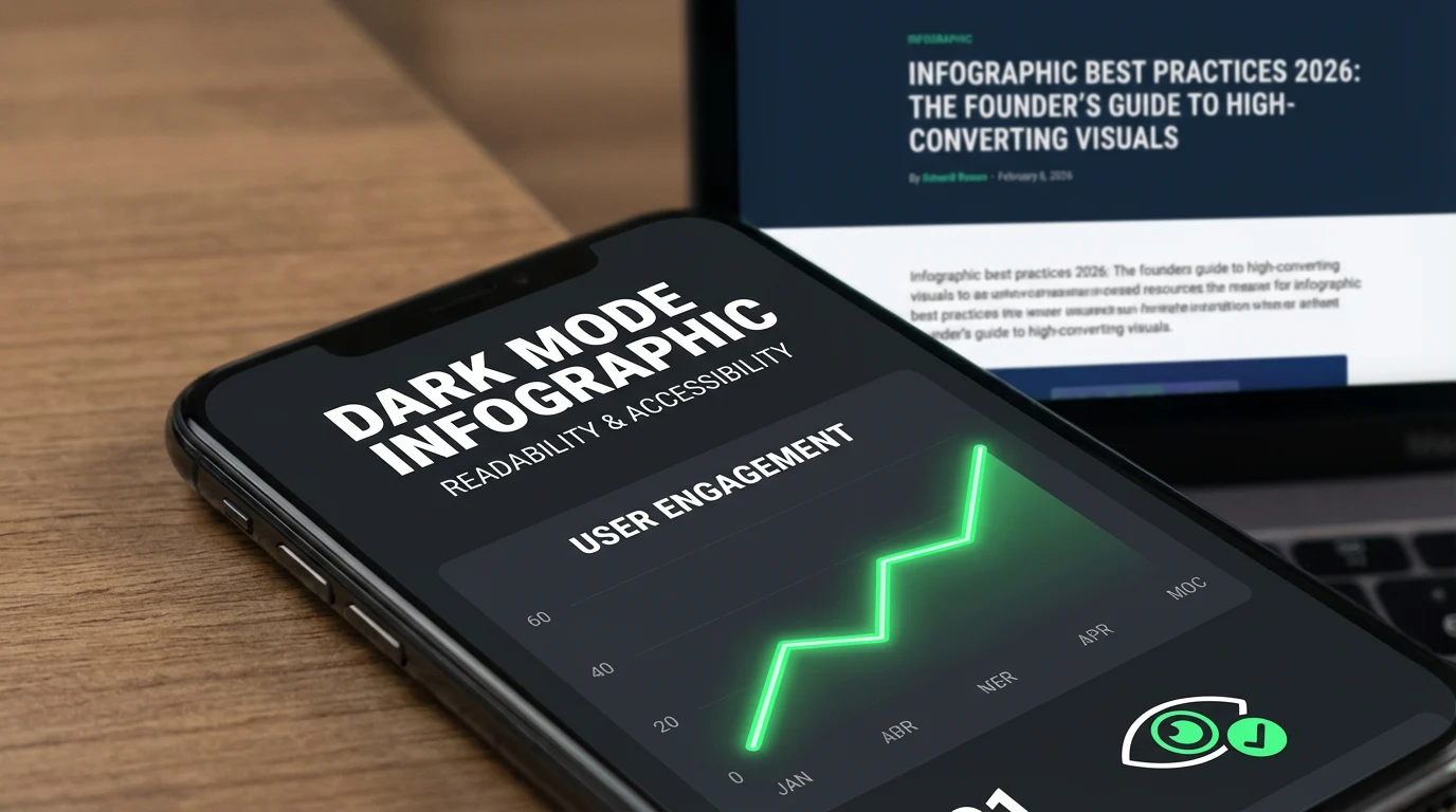
Here is a statistic that shocks most people: 82% of mobile users prefer Dark Mode (based on recent 2025 mobile usage stats).
If you design your infographic with a transparent background and black text, and someone opens it on a dark-mode phone, your text disappears. You look amateur.
The 2026 Color Palette Checklist
- Avoid Pure Black (#000000): It creates eye strain on bright screens. Use “Charcoal” (#1F1F1F) instead.
- Test Contrast Ratios: Accessibility isn’t optional. Use tools to ensure your text pops against the background.
- Backgrounds Matter: Always export your infographics with a solid background (white or brand color), unless you have specifically tested it on a dark background.
Psychology tip: In 2026, “Trust” colors (deep blues, forest greens) are outperforming “Hype” colors (bright reds, neon oranges) in B2B markets. Buyers are skeptical of hype. They want stability.
How AI Changes Infographic Best Practices 2026
I built InfoAIGraphic because manual design was a bottleneck. We used to wait 5 days for a designer to return a draft. Now, we do it in 5 minutes.
But let me be honest: AI is a tool, not a replacement for strategy.
The best teams use AI to get to the “80% mark” instantly. They generate the structure, the icons, and the layout using AI, and then spend their human energy on the final 20%-polishing the copy and checking the data accuracy.
When to use AI (and when not to)
- Use AI for: converting a blog post into a visual summary, generating icon styles, and testing 5 different layout ideas in 10 minutes.
- Do NOT use AI for: Final data verification. If your chart says “Sales grew 50%,” you need to manually check that the bar chart actually looks like 50%. AI sometimes hallucinates visual proportions.
If you are new to this workflow, check out my AI infographic design for beginners guide to see how to balance speed with quality.
Ready to try this workflow? Try InfoAIGraphic free and turn your top article into an infographic in under 2 minutes.
Common Infographic Design Mistakes That Kill ROI
In my experience auditing hundreds of visuals, these are the patterns that signal “amateur” immediately:
1. The “Data Dump”
Just because you have the data doesn’t mean it belongs in the graphic.
- Mistake: A chart with 20 bars, 5 legends, and a paragraph of explanation.
- Fix: Highlight the single anomaly or trend line that matters. Use an arrow to point to it.
2. The “Fake 3D”
Flat design is back, but with depth (drop shadows). Avoid hyper-realistic 3D charts that skew the data perception.
3. Ignoring Typography Hierarchy
If your headline, subhead, and body text are all roughly the same size, the reader doesn’t know where to look.
- Rule of thumb: Your Headline should be 3x the size of your body text. Your Subheads should be 1.5x.
Step-by-Step: The 2026 Infographic Workflow
Here is the exact process I use to create visuals that rank in Google Image Search and drive backlinks.
1. The “Content Audit”
Don’t start from scratch. Look at your Google Analytics. Identify your top 3 performing blog posts. These already have traffic; they just need a “shareable asset” to boost their backlink potential.
2. Isolate the “Nugget”
Read through that top post. Find the process, the stat, or the comparison that provides the most value.
- Example: “The 5 steps to onboarding” or “Email vs. Social ROI.”
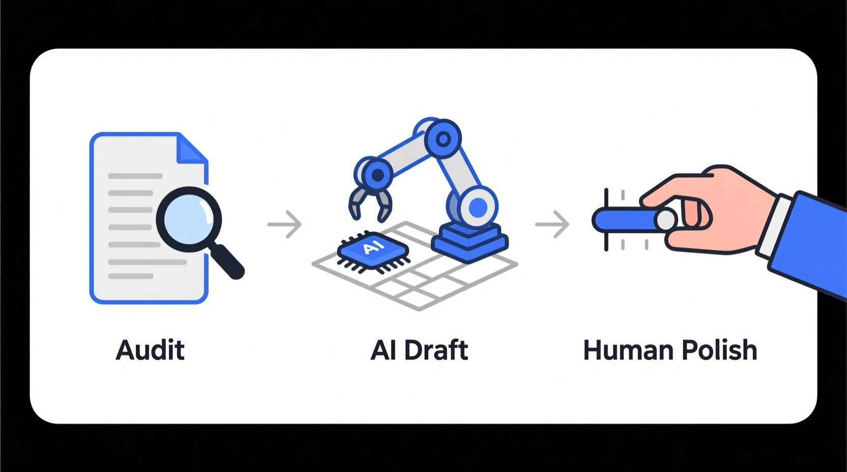
3. The “AI Draft”
This is where tools like ours shine. instead of drawing wireframes on a napkin:
- Feed the specific section of your blog post into InfoAIGraphic.
- Select a “Modular” or “Process” template (remember: mobile-friendly).
- Let the AI structure the information.
4. The Human Polish
Spend 10 minutes refining:
- Simplify text: AI tends to be wordy. Cut the word count by 30%.
- Brand check: Ensure the hex codes match your brand kit.
- Data check: Verify that the numbers in the chart match your source.
5. The “Embed & Share” Strategy
Don’t just paste the image.
- Add the image near the top of your blog post (hook the reader early).
- Use an
alt tag with your primary keyword: “infographic best practices 2026 workflow”.
- Slice the graphic into 3 slides for a LinkedIn carousel.
Generate your first AI infographic from a blog post with InfoAIGraphic - no design skills required.
FAQ: Common Questions on Visual Strategy
Q: How long does it take to create an infographic with infographic best practices 2026?
A: With AI tools, the draft takes about 2 minutes. The polishing and branding should take another 15–20 minutes. If you are spending more than an hour on a single asset, you are likely over-engineering it.
Q: Can AI-generated infographics rank in Google Images?
A: Yes, absolutely. Google ranks images based on relevance, alt text, and the context of the surrounding content. The tool used to create the image doesn’t matter; the value of the information does.
Q: Is infographic best practices 2026 suitable for SEO and content repurposing?
A: It is arguably the most efficient repurposing tactic. According to Venngage marketing stats, original graphics are the #1 type of visual content used by marketers to reach their goals. One graphic can become a blog asset, a newsletter header, and a social post.
Q: What is the best file format for 2026?
A: WebP is the standard now. It offers better compression than PNG or JPG without losing quality, which is crucial for Core Web Vitals and page load speed.
Conclusion: Function Over Fluff
If you take one thing away from this guide, let it be this: Infographics in 2026 are functional assets, not art projects.
Your goal isn’t to win a design award. Your goal is to stop the scroll, communicate an idea in 3 seconds, and get the reader to trust your expertise.
The teams that win this year won’t be the ones with the biggest design budgets. They will be the ones who can produce clear, accurate, and on-brand visuals at the speed of content.
Whether you use a manual workflow or an AI assistant like InfoAIGraphic, the principles remain the same: simplify, optimize for mobile, and always respect the user’s time.
Now, go create something worth sharing.


