Text to infographic ai: Scale B2B Content Faster Now
Use text to infographic ai workflows to convert long-form assets into polished visuals in minutes, improving repurposing speed, reach, and ROI. Read more!

The B2B Playbook for Scaling Content: How to Master Text to Infographic AI Workflows
You have the long-form article. It’s 3,000 words of deeply researched, high-intent content that your SEO team loves. It’s performing well, driving traffic, and establishing your authority.
But here’s the problem: The average reader only scrolls halfway down. They are busy, and they need the core value proposition delivered instantly.
Your content team knows the solution is visual content—infographics, charts, and data visualizations that break down complex ideas. But every time you request a new visual asset, the process stalls.
The design queue is backed up for two weeks. The freelance designer needs three rounds of revisions just to understand the data hierarchy. You lose momentum, and that fantastic piece of content sits under-leveraged.
I’ve seen this exact bottleneck paralyze dozens of B2B marketing teams. The desire to scale content hits a hard wall called “design capacity.”
The only way to truly scale visual content today is by optimizing the conversion process from text to visual structure. That’s where the power of text to infographic AI stops being a gimmick and becomes a necessity.
The Bottleneck: Why Traditional Repurposing Fails at Scale
For years, content repurposing meant one of two painful options:
- Manual Extraction: A content manager spends hours boiling down a 3,000-word piece into 10 key bullet points, then manually sketching a wireframe for a designer. This is slow and prone to subjective interpretation.
- Designer Interpretation: You hand the designer the raw article and say, “Make it visual.” The designer, lacking context on the data’s strategic importance, often focuses on aesthetics over clarity, leading to endless revisions.
In both scenarios, the core issue is the lack of a structured, automated bridge between the raw content (the text) and the visual hierarchy (the infographic).
Time, money, and opportunity are wasted in the handoff. You are waiting days for assets that should take minutes to prototype.
What Is Text to Infographic AI and Why Does Your Team Need It?
At its core, text to infographic AI is a tool or process that uses large language models (LLMs) and specialized visualization engines to analyze written content, identify key data points, structure relationships, and automatically generate a visually coherent infographic draft.
It’s not magic; it’s structured data analysis applied to content.
For B2B marketing teams, this capability shifts the focus from creation to curation. You stop spending time on the painful initial draft and start spending time on optimizing the strategic impact.
Three Core Benefits of Text to Infographic AI
- Speed and Scale: You can transform 10 articles into 10 infographic drafts in the time it used to take to design one. This is critical for keeping up with social media demands and quarterly report cycles.
- Data Structure Enforcement: AI is excellent at identifying numerical data, lists, and sequential arguments within text. It forces a structure that often gets lost in manual design, ensuring your final infographic has a clear narrative flow.
- Bridging the Skill Gap: It democratizes the initial design phase. Content managers, product owners, and SEO specialists can generate high-quality drafts without needing advanced design software expertise.
If you’re still trying to decide if an AI generator is right for your team, I highly recommend reading The B2B Marketer’s Deep Guide to Choosing and Using an AI Infographic Generator.
The Repurposing Trap: Choosing the Right Source Text
The most common mistake I see teams make when first using text to infographic AI is feeding it the wrong source material. Just because you can convert any text doesn’t mean you should.
Common Mistake: Feeding the AI a rambling, narrative-heavy blog post that lacks clear lists or data.
Symptom: The resulting infographic is text-heavy, generic, and lacks clear visual hierarchy. It looks like a bulleted list pasted onto a colorful background.
Fix 1: Prioritize Structured Content
AI thrives on structure. When choosing content to repurpose, look for these characteristics:
- Numbered Lists or Steps: “The 5 steps to better lead nurturing,” “4 phases of implementation.” These translate perfectly into process infographics.
- Data-Rich Sections: Content that includes specific statistics, percentages, or comparisons (e.g., “75% of users prefer X over Y”).
- Hierarchical Content: Text that clearly defines a taxonomy, a breakdown, or a comparison (e.g., “Types of Cloud Computing: IaaS, PaaS, SaaS”).
- Executive Summaries: If your source material has a strong conclusion or summary section, start there. It often contains the core narrative you need.
Pro Tip: If your source text is very long (over 2,500 words), don’t feed the whole thing in. Pull out the 500-word section that contains the most crucial data or the clearest steps, and use that as your prompt.
Mastering the Workflow: From Long-Form Article to AI Infographic Draft
The goal of this workflow is not to create a finished product, but to create a structurally sound, 80%-complete draft that minimizes the time your designer spends on conceptualization.
This process involves three distinct phases: Extraction, Structuring, and Generation/Refinement.
Phase 1: Strategic Extraction (The Content Manager’s Job)
Before touching the AI tool, you must define the infographic’s goal.
- Goal Definition: What is the single most important takeaway? (e.g., “Explain the 3 main pricing models,” or “Show the ROI timeline.”)
- Audience Context: Where will this be shared? (LinkedIn requires tall, narrow visuals; a sales deck requires horizontal ones.)
- Data Isolation: Manually extract the 5–10 core data points, statistics, or steps from the source article. Put them into a clean, simple text document or bulleted list.
Why this matters: Even the best text to infographic AI can get confused by surrounding narrative fluff. Clean input guarantees clean output.
Phase 2: AI Structuring and Generation (The Tool’s Job)
This is where InfoAIGraphic (or a similar specialized tool) comes in. You are using the AI to interpret the relationship between your extracted points.
- Input: Paste your clean, isolated text (the bulleted list from Phase 1) directly into the generator.
- Prompting for Structure: Don’t just paste the text. Use a specific prompt instructing the AI on the desired visual type.
- Example Prompt 1 (Process): “Convert this text into a sequential process infographic showing 5 steps.”
- Example Prompt 2 (Comparison): “Use this data to create a comparison chart between Option A and Option B.”
- Draft Review: The AI generates the initial draft, complete with suggested icons, layouts, and color schemes based on the structure it identified.
This draft often solves the hardest part: figuring out how the information should flow visually.
Phase 3: Human Refinement (The Designer/Editor’s Job)
The AI draft is a starting point, not the finish line. This phase is non-negotiable for B2B quality.
- Branding Check: Apply corporate colors, fonts, and logos. (Tools like InfoAIGraphic allow you to save brand kits for one-click application.)
- Iconography Audit: Review the AI-selected icons. Are they conceptually accurate for your industry? Replace generic icons with specific, relevant ones.
- Narrative Flow: Ensure the title, subtitle, and data labels tell a cohesive story. Sometimes, the AI needs a human editor to smooth the transitions between sections.
This human touch is what elevates an AI-generated asset from “generic stock photo” quality to high-quality, brand-aligned content. For more on ensuring your visuals meet B2B standards, review The 7 Non-Negotiable Infographic Design Best Practices for B2B Content Teams.
Troubleshooting: Why Your AI Infographic Output Looks Generic
If you’ve tried a text to infographic AI tool and found the results underwhelming, you are likely running into one of these common pitfalls.
1. Symptom: The Infographic Is Too Text-Heavy
The Reason: You are treating the AI like a layout tool, not a summarization tool. You are feeding it paragraphs instead of bullet points.
The Fix: Enforce the 10-Word Rule. For any single data point or step in your infographic, the accompanying text should ideally be 10 words or less. If the source text requires more explanation, you need to break it down into two separate points or use the text as the source for a dedicated chart, not a single bullet.
2. Symptom: Inaccurate or Misleading Data Visualization
The Reason: The AI interpreted a qualitative statement as quantitative data, or it chose the wrong chart type (e.g., using a pie chart for non-percentage comparisons).
The Fix: Verify the Data Type Prompt. When you input your text, explicitly tell the AI what kind of visualization is needed for the data you included. If you have percentages, prompt for a “donut chart” or “bar graph.” If you have sequential steps, prompt for a “timeline.” If you are dealing with complex data relationships, you may need to manually input the data into a spreadsheet format first, then paste the structured data alongside the text.
3. Symptom: The Infographic Lacks Visual Hierarchy
The Reason: You failed to define the main point. The AI treated all input text equally, resulting in a flat, visually monotonous design where the eye doesn’t know where to land first.
The Fix: Use the “Header-Subheader-Detail” Structure. When preparing your input text, clearly designate the hierarchy using bolding or specific formatting. The AI should recognize the first line of your input as the main title, the next line as the subtitle, and subsequent lines as the body points.
- Example Input Structure:
- H1: The Core Challenge of Q3 Marketing
- H2: Data Point 1: 45% Drop in MQLs
- Detail: This drop was observed across three primary channels…
- H2: Data Point 2: 2x Cost Per Acquisition
- Detail: Increased competition drove up bid prices…
This structure guides the AI to correctly size and position the visual elements, ensuring the most important data points stand out.
Step-by-Step: The InfoAIGraphic Playbook for Text Repurposing
This is the exact sequence we recommend for B2B teams looking to convert existing long-form content (like white papers or deep guides) into shareable infographics quickly.
Step 1: Identify the Core Asset and Goal
Choose one high-performing piece of content (e.g., a QBR summary, a successful blog post, or a technical explainer). Define the single, immediate goal for the infographic (e.g., “Drive social shares on LinkedIn” or “Simplify a complex product feature for sales enablement”).
Step 2: Extract and Clean the Narrative Spine (The 200-Word Limit)
Go through your source text and extract only the essential narrative spine. This should include the main title, 3–5 key sections, and 1–2 supporting statistics per section. I recommend keeping the total input text under 200 words for maximum clarity.
Step 3: Structure the Text into a Prompt
Paste the cleaned text into your InfoAIGraphic prompt box. Use clear formatting (bullet points or numbered lists) and add a specific instruction regarding the desired output type and tone.
Example Prompt: “Generate a sleek, professional timeline infographic based on the following 4 steps. Use a blue and white color palette suitable for a SaaS audience.”
Step 4: Generate and Select the Best Draft
Run the generator. Review the 3–5 initial drafts provided by the AI. Look specifically for the draft that best captures the structural relationship of the data, even if the colors or icons are wrong. Select that draft for editing.
Step 5: Apply Brand Identity and Data Integrity Checks
In the InfoAIGraphic editor:
- Apply Brand Kit: Use your saved brand template to instantly adjust fonts and colors.
- Verify Data Integrity: Double-check every number and percentage against the source material.
- Refine Icons: Replace any generic icons with specific, high-relevance visuals.
Step 6: Finalize and Export for Distribution
Export the finished asset in the required format (PNG for social, PDF for print/download). Crucially, link the infographic back to the original long-form article to ensure you capture the traffic and credit the source.
By following this structured approach, you turn a multi-day design project into a 30-minute content refinement task.
The Future of Content: AI as Your Visualization Co-Pilot
The discussion around text to infographic AI is no longer about whether the tools work, but how effectively marketing teams integrate them into their existing workflows.
AI is not here to replace your designer; it is here to eliminate the drudgery of the initial draft and concepting phase. It handles the structural heavy lifting, allowing your human designers to focus on high-value elements like brand storytelling, complex data visualization, and creative campaigns.
We built InfoAIGraphic specifically to solve this B2B scaling problem—to provide the structural integrity and speed necessary for high-volume content teams.
If your team is struggling with content velocity, the solution isn’t to write less; it’s to visualize more efficiently.
FAQ
Q: Is the data generated by text to infographic AI always accurate? A: The AI does not generate new data; it interprets the data you provide in the source text. If your source text says 75%, the infographic will show 75%. The risk lies in the interpretation—if you feed it ambiguous text, the AI might misrepresent the relationship between numbers. Always perform a human integrity check (Step 5).
Q: Can I use AI to turn a full white paper into a single infographic? A: I strongly advise against this. A white paper contains multiple chapters and arguments. Trying to cram it into one visual will result in an unreadable mess. Instead, break the white paper into 3–5 distinct infographics, each focusing on one chapter, data set, or key takeaway.
Q: What if my company uses highly specialized terminology? Will the AI understand it? A: Modern LLMs are trained on vast datasets and usually handle specialized B2B terminology well. However, they may select generic icons for those terms. Always review the generated icons and replace them with visuals that specifically resonate with your niche audience during the refinement phase.
Q: Are AI-generated infographics good enough for high-stakes marketing like paid ads? A: They are excellent for the drafting phase. For high-stakes assets like paid ads or major reports, the AI draft should be treated as the wireframe. It must then pass through a human designer for final brand polish, accessibility checks, and strategic narrative optimization to ensure maximum conversion quality.
Conclusion
Scaling content in a visually saturated market requires more than just writing faster; it requires visualizing smarter. The shift from manual design to an AI-assisted workflow is the most significant opportunity for B2B marketing teams today.
By treating text to infographic AI as a powerful structural co-pilot—a tool that handles the complex conversion from narrative to hierarchy—you free up your human experts to focus on the strategic refinement that truly drives results.
If you’re ready to stop waiting weeks for visual assets and start prototyping in minutes, take the content you’ve already written and put our InfoAIGraphic workflow to the test today.
Share this article

Mateoo
Founder of InfoAIgraphic
Building the fastest way to turn text into viral infographics. Helping creators and businesses scale their visual content without design skills.
Related Articles

AI timeline generator: Best B2B Workflow for Teams
Compare ai timeline generator approaches to build polished, on-brand timelines from raw content in minutes, helping your team publish faster. Discover how!
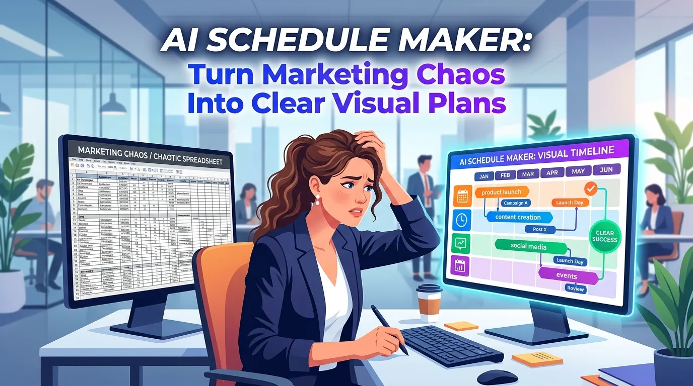
AI Schedule Maker: Turn Marketing Chaos Into Clear Visual Plans
Struggling with messy marketing timelines? Discover how an AI schedule maker turns chaotic plans into clear visual workflows. Step-by-step guide inside.

Why Your Current SEO Report Template Is Failing (And How Visual Reporting Fixes It)
Stop sending boring spreadsheets. Discover the ultimate SEO report template strategy to scale your visual content and build automated visual SEO reporting