What Is an Infographic? Definition, Types, Examples, and Uses
Learn what an infographic is, when to use one, the main types, real examples, and how AI can turn text or reports into visuals.

What Is an Infographic? Definition, Types, Examples, and Uses
Try the workflow on your own content
Paste a definition, article, report, or lesson and generate a free infographic preview with the AI infographic generator.
If you’ve ever struggled to explain a complex concept and watched your audience’s eyes glaze over, you’ve encountered the “text wall” problem. In 2026, where the average attention span has dropped to record lows, capturing interest isn’t just a marketing goal-it’s a survival skill for businesses.
Here is the reality: 93% of human communication is visual. Yet, most businesses still rely on dense reports and long-winded emails to get their point across.
The shift is happening now. The definition of an infographic has changed from a “static image” to a “dynamic AI asset.”
As creators of infoAIgraphic, we’ve helped 10,000+ users transform raw data into stunning visuals. We’ve witnessed a paradigm shift: the definition of an infographic has evolved from a static, designer-made asset to a dynamic, AI-powered communication tool.
In this comprehensive guide, you will learn:
- The 2026 Definition: How AI has redefined what an infographic is.
- The 10 Essential Types: From statistical to resume infographics.
- The Workflow: How to create professional visuals in seconds using AI.
What is an Infographic? A Complete Definition for 2026
The Basic Definition
At its core, the Oxford English Dictionary defines an infographic (a portmanteau of “information” and “graphic”) as “a visual image such as a chart or diagram used to represent information or data.”
However, in 2026, that definition is incomplete. It misses the strategic element.
The Modern Definition
An infographic is a strategic collection of imagery, charts, and minimal text that gives an easy-to-understand overview of a topic. In the age of AI, it is no longer just a static JPG; it is a dynamic asset used to simplify complexity, drive engagement, and improve information retention across digital platforms.
A Brief History of Visual Communication
To understand where we are going, we must understand where we came from. The history of infographics is the history of human communication itself.
- 30,000 BC: Cave paintings in Lascaux, France, served as the first “infographics,” telling stories of hunts and survival through imagery.
- 1786: William Playfair, a Scottish engineer, invented the line, area, and bar chart, essentially founding the field of statistical graphics.
- 1857: Florence Nightingale used the “coxcomb chart” to convince Queen Victoria to improve sanitary conditions in military hospitals-proving that visuals can save lives.
- 1920s: The Isotype (International System of Typographic Picture Education) movement standardized the use of simple icons to communicate data globally, bypassing language barriers.
- 2010s: The “Pinterest Boom” brought long-form vertical infographics to the mainstream web.
- 2024+: Generative AI democratized design, allowing anyone to generate complex data visualizations from simple text prompts.

Why Infographics Work (Psychology & Data)
Your brain is biologically wired for visual content. It’s not just a preference; it’s neuroscience.
According to research from MIT, the human brain can identify images seen for as little as 13 milliseconds. This biological advantage is why infographics outperform text in almost every metric.
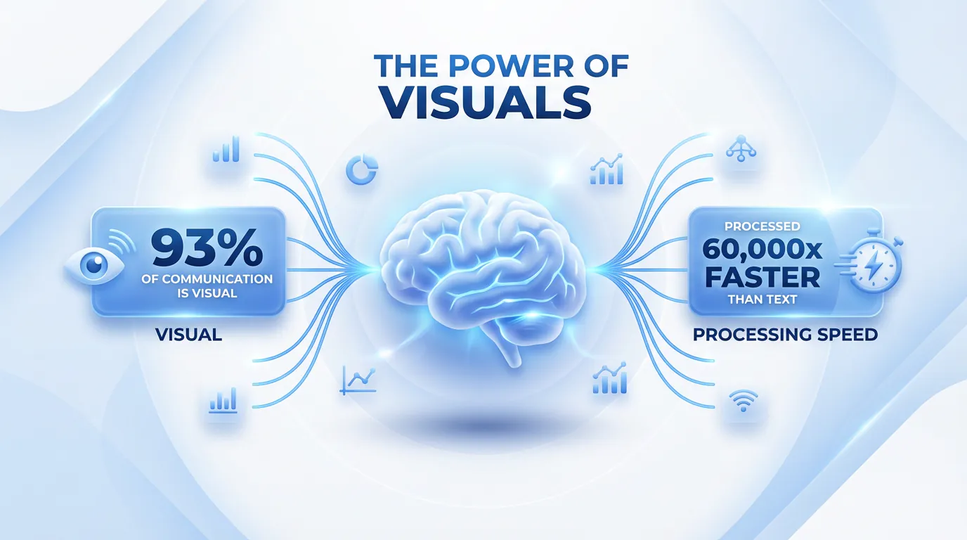
- Speed of Processing: The human brain processes visuals 60,000 times faster than text. While you are still reading this sentence, your brain could have processed a complex chart instantly.
- Scanability: The Nielsen Norman Group has proven that users rarely read word-for-word; they scan for “visual anchors.” Infographics provide these anchors naturally.
- Retention Rates: According to the “Picture Superiority Effect,” people remember 65% of visual information three days later, compared to only 10% of text (Source: Brain Rules).
- Persuasion: A study by the Wharton School of Business found that using data visualizations makes a presentation 43% more persuasive than using data alone.
Cognitive Load Theory: The Science of Simplicity
One of the primary reasons infographics are effective is that they reduce cognitive load. According to Sweller’s Cognitive Load Theory, our working memory has limited capacity.
- Text alone requires high “intrinsic load” to decode symbols into meaning.
- Visuals leverage “Dual Coding,” allowing the brain to process information through both visual and verbal channels simultaneously, doubling capacity.
Infographics vs. Data Visualization
While often used interchangeably, there is a key difference. Tableau defines data visualization as the representation of raw data, whereas an infographic combines those visualizations with a narrative to tell a specific story.
Infographics vs. Other Content Formats
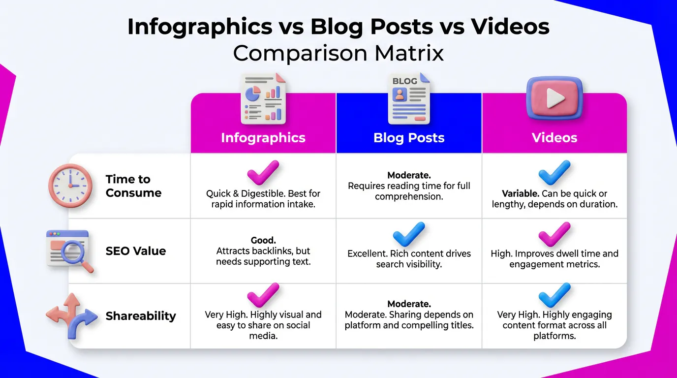
Why should you choose an infographic over a blog post or a video? Here is how they compare in 2026:
| Feature | Infographic | Blog Post | Video |
|---|---|---|---|
| Time to Consume | < 2 Minutes (Scanning) | 5-10 Minutes (Reading) | 3-15 Minutes (Watching) |
| SEO Value | High (Image Search + Backlinks) | High (Keywords) | Medium (Video Search) |
| Shareability | Viral Potential (Pinterest/LinkedIn) | Low (Needs click-through) | High (TikTok/Reels) |
| Creation Cost | Low (with AI) | Medium (Writing time) | High (Production) |
The 10 Types of Infographics You Need to Know
In 2026, choosing the right format is the difference between engagement and being ignored. Here are the 10 types you must master, including their “AI Difficulty Score.”
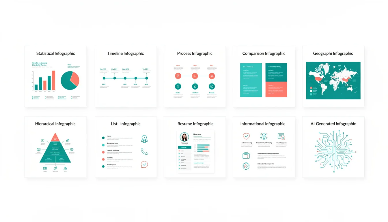
1. Statistical Infographics
Definition: A visual focus on data points, relying heavily on large typography, charts, and graphs to tell the story behind the numbers.
Best Use Case: Visualizing survey results, annual reports, or market research data where the specific numbers are the heroes.
AI Difficulty Score: Easy. AI excels at extracting numbers and placing them into pre-set layouts.
Visual Description: Features big, bold percentages (e.g., “93%”) paired with simple icons and bar charts. The layout is often modular.
2. Informational Infographics
Definition: A text-heavy graphic that explains a concept or summarizes a topic. It uses icons and short paragraphs to break down density.
Best Use Case: Summarizing a blog post, explaining a new concept, or providing a high-level overview. For inspiration, check out our collection of AI infographic examples.
AI Difficulty Score: Easy. AI is great at summarizing text and matching it with relevant icons.
Visual Description: Divided into clear sections with headers. Uses icons to anchor each point.
3. Timeline Infographics
Definition: A visualization of events in chronological order.
Best Use Case: Showing company history, project roadmaps, or the evolution of a trend (like “The History of AI”). Our AI timeline generator guide covers this in depth.
AI Difficulty Score: Medium. Requires the AI to understand the sequence and spatial relationship of dates.
Visual Description: A central line (vertical or horizontal) connecting distinct milestones, each labeled with a date and description.
4. Process (How-To) Infographics
Definition: A step-by-step guide that explains a workflow or process.
Best Use Case: Employee onboarding (SOPs), recipes, or “How-To” guides. Perfect for visualizing workflows like our guide on how to create an infographic with AI.
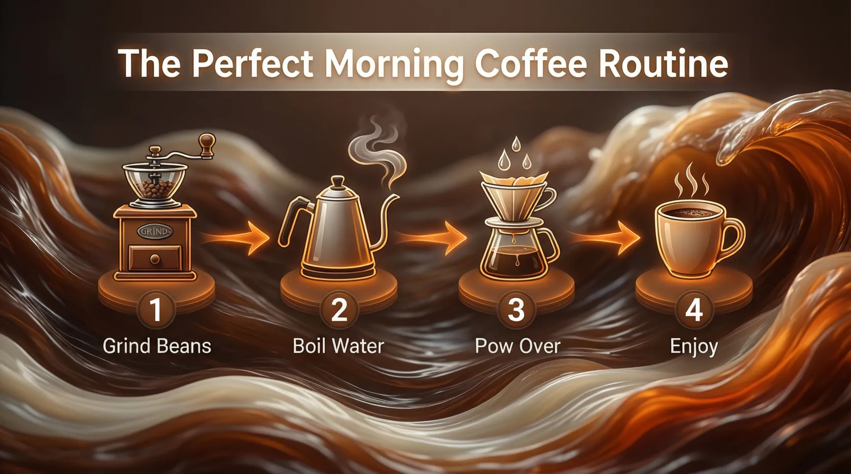
AI Difficulty Score: Medium. Needs logical flow and numbered steps.
Visual Description: Numbered steps (1, 2, 3…) connected by directional arrows or lines, guiding the eye from start to finish.
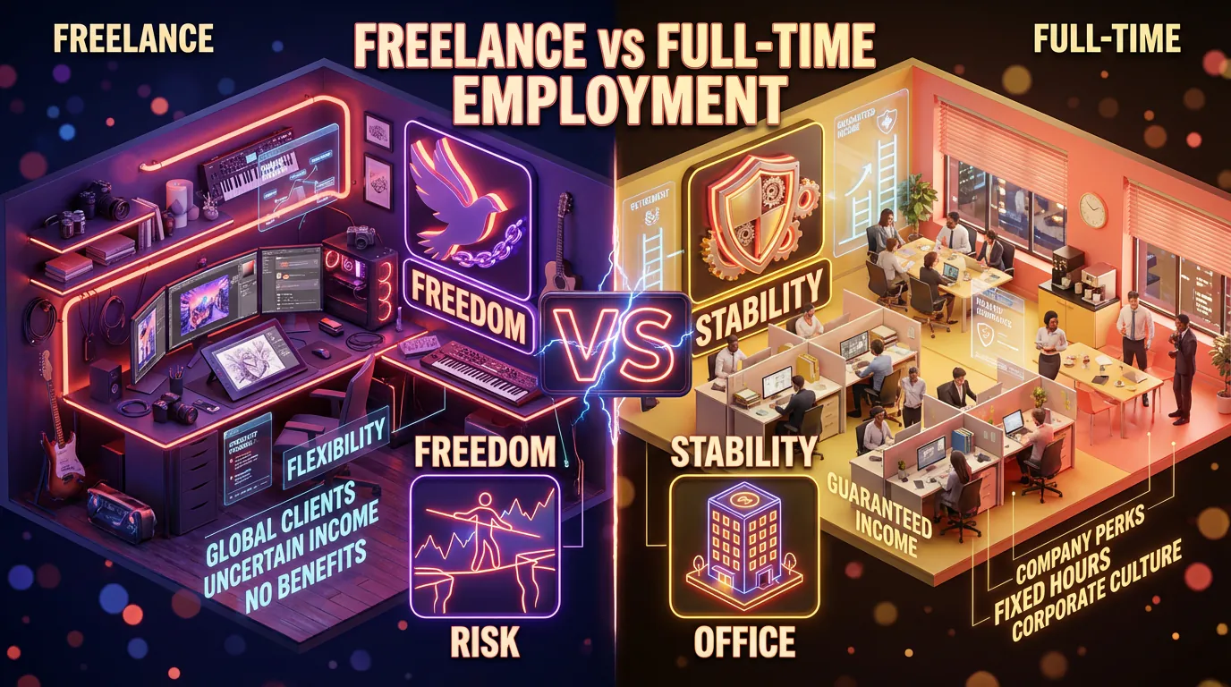
5. Comparison Infographics
Definition: A split layout that contrasts two or more options.
Best Use Case: “A vs. B” scenarios, Pros & Cons lists, or pricing plan comparisons. Source contrasting palettes from Adobe Color for maximum impact.
AI Difficulty Score: Easy. The structure is binary and simple for AI to populate.
Visual Description: A page split down the middle (often with contrasting colors) or a table format comparing features side-by-side.
6. Geographic Infographics
Definition: Map-based visuals that display data based on location.
Best Use Case: Showing demographic data, sales regions, or global trends.
AI Difficulty Score: Hard. Accurate map generation and data plotting on specific coordinates can be challenging for some AI models.
Visual Description: A map (world, country, or region) with heat maps, pins, or shaded areas representing data density.
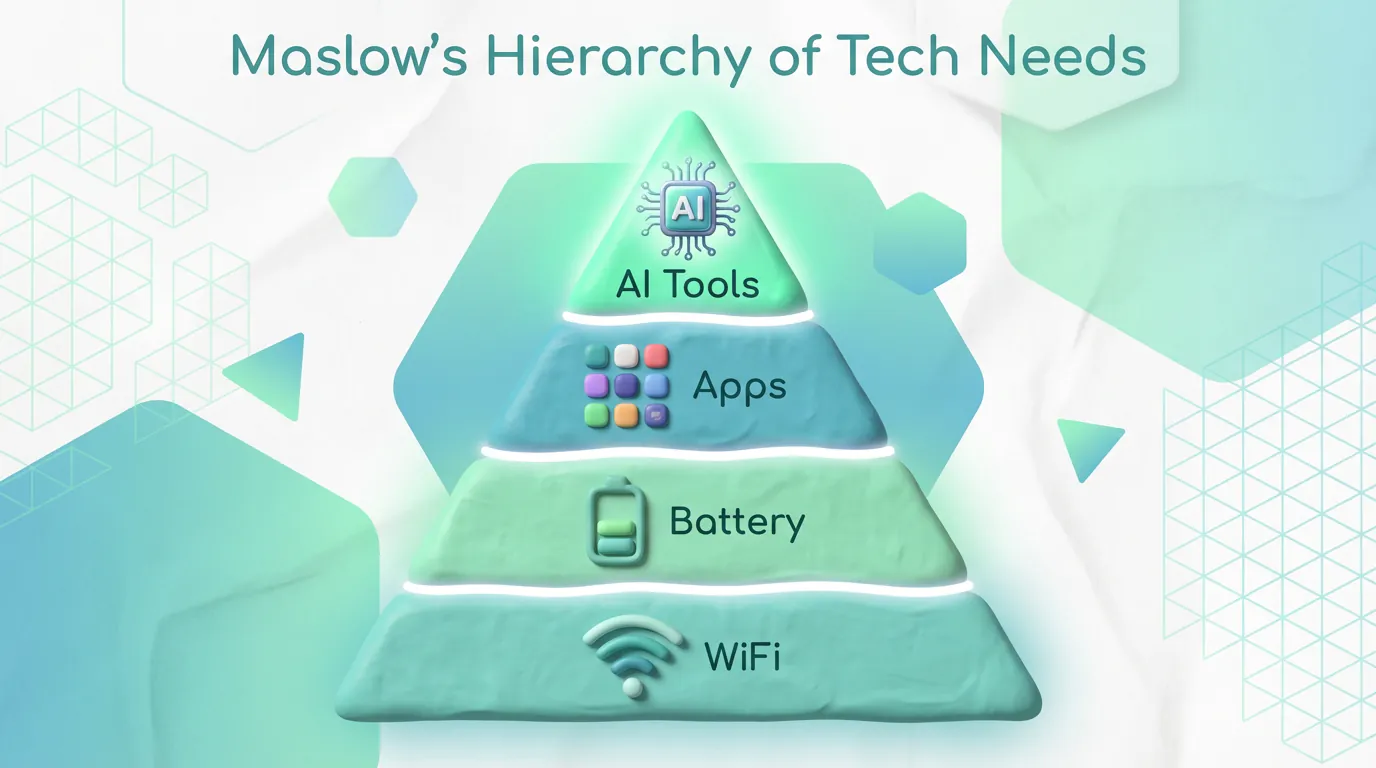
7. Hierarchical Infographics
Definition: Visualizing data in order of importance or rank.
Best Use Case: Organizational charts, Maslow’s Hierarchy of Needs, or prioritizing tasks.
AI Difficulty Score: Medium.
Visual Description: Often uses a pyramid shape or a flowchart tree structure.
8. List Infographics
Definition: A visual list of tips, resources, or examples.
Best Use Case: “Top 10 Tools,” checklists, or “5 Tips for X.”
AI Difficulty Score: Easy.
Visual Description: Vertical layout with bullet points replaced by icons and brief text.
9. Resume Infographics
Definition: A visual curriculum vitae (CV) that highlights skills and experience graphically.
Best Use Case: Job seekers in creative or tech fields looking to stand out.
AI Difficulty Score: Medium. Personalization is key here.
Visual Description: A timeline of work history, skill bars (e.g., “Photoshop: 90%”), and personality traits visualized.
10. AI-Generated Infographics (The New Standard)
Definition: A hybrid type where Generative AI combines elements of the above types instantly based on the data provided.
Best Use Case: Daily content creation for social media where speed is the priority.
Visual Description: Highly polished, often using 3D elements and modern gradients that would take hours to design manually.
11. Interactive & Animated Infographics
Definition: Digital infographics that move, react to user input, or evolve as the user scrolls.
Best Use Case: High-stakes landing pages, annual reports, or complex data storytelling where user engagement is critical.
AI Difficulty Score: Hard. While video generation is improving, true interactivity often requires code or specialized platforms.
Visual Description: Elements that fade in, charts that animate upon scrolling, or clickable hotspots revealing more data.
Ready to try this workflow? Try infoAIgraphic free and turn your data into a stunning infographic in under 60 seconds.
How to Use Infographics: Real-World Examples by Industry
Infographics are not just for designers; they are a growth hack for founders. Here is how specific industries are winning with them.
For SaaS & Tech Startups
- Product Architecture: Explain how your API works or how data flows through your system using a process infographic.
- Comparison Tables: Create a “Us vs. Competitors” comparison graphic for your pricing page.
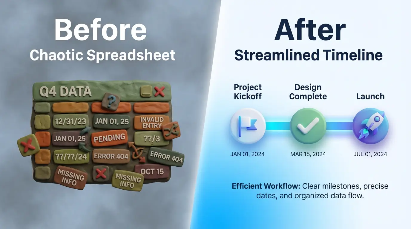
- Before/After: Visualize the “Old Way” (chaos) vs. the “New Way” (your tool) to demonstrate value instantly.
For Content Creators
- Repurposing: Take your best-performing Twitter thread or blog post and turn it into a carousel for LinkedIn/Instagram.
- Growth Hack: Infographics are “save-able” content. Platforms like LinkedIn boost posts that get “Saved” (as PDFs), making infographics a viral growth lever.
- Scaling: Learn how to systematically repurpose content with our guide to scaling visuals with AI infographics.
For E-commerce & Small Business
- Assembly Guides: Reduce support tickets by including a QR code to a visual “How to Assemble” process infographic.
- Customer Journey: Map out the steps from “Discovery” to “Purchase” to align your team.
For Education & Training
- Simplification: Break down complex modules (like “The Water Cycle” or “GDPR Compliance”) into visual cheat sheets.
- Retention: Use infographics as summary handouts after a training session to ensure the information sticks.
For Nonprofits
- Impact Reporting: Donors don’t want to read a 50-page PDF. Show them a statistical infographic: “$10 = 100 Meals.”
- Emotional Storytelling: Use data visualization to show the scale of a problem (e.g., water scarcity) to drive urgency.
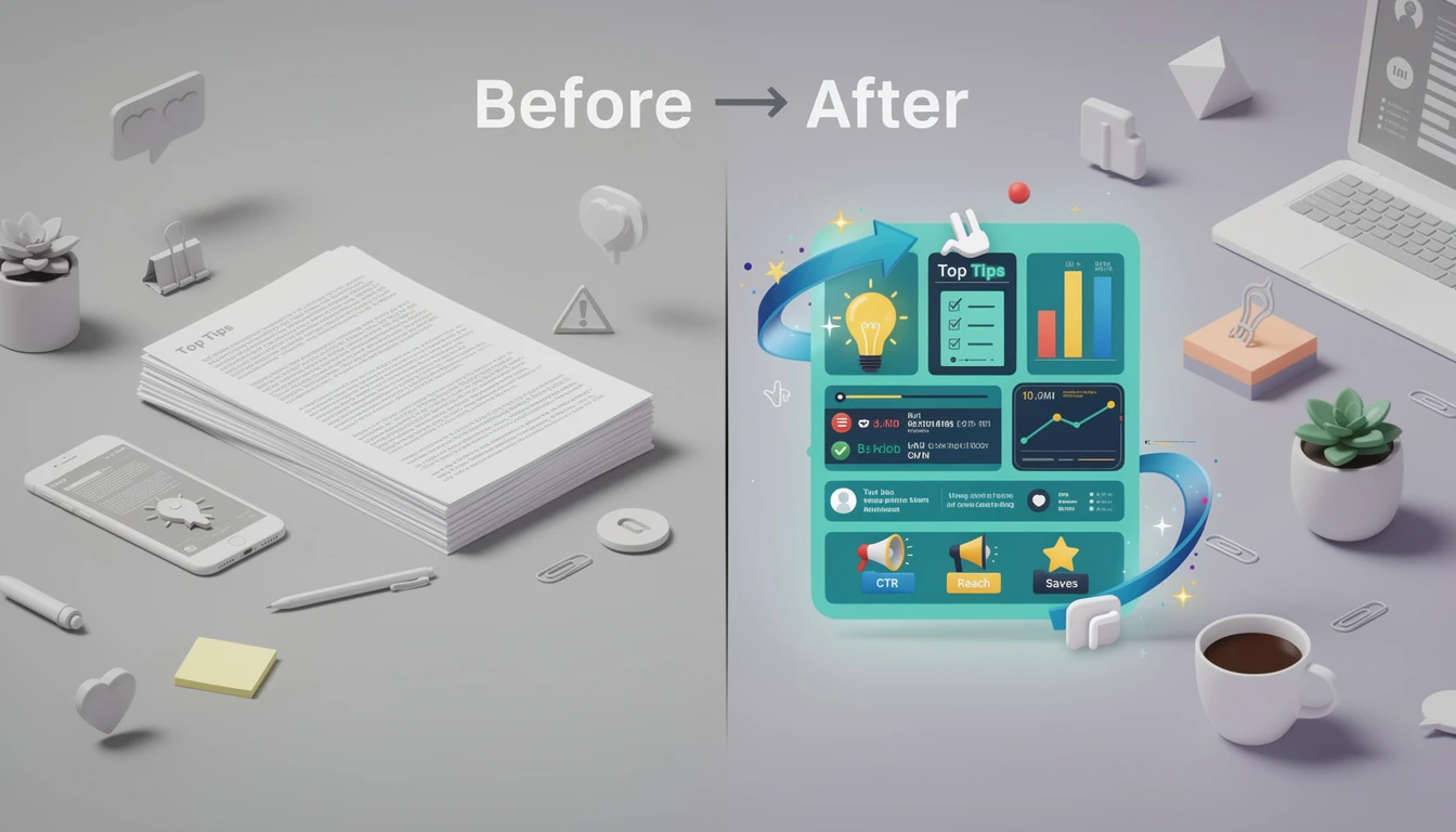
How to Create an Infographic: The 2026 Workflow
The era of spending 3-5 hours in Adobe Illustrator for a single social media post is over.
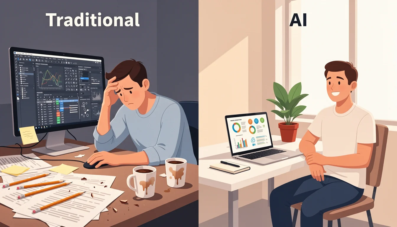
The Traditional Method (The Hard Way)
Historically, creating high-quality infographics was a barrier to entry for non-designers.
- Research: Spend hours gathering data.
- Outline: Write a text brief.
- Wireframe: Draw a sketch of the layout.
- Design: Open Illustrator/Canva. Struggle with alignment, font pairing, and color theory.
- Iterate: Send to a designer, wait 2 days for feedback, repeat.
- Total Time: 3-5+ Hours.
- Cost: High (Designer salary or agency fees).
The Modern AI Method (The infoAIgraphic Way)
In 2026, AI handles the heavy lifting of structure and design.
- Topic/Data: Paste your blog post URL or raw data.
- Prompt: Tell the AI: “Create a statistical infographic summarizing these 5 points.”
- AI Generation: The AI analyzes the text, selects the layout, picks the icons, and generates the design.
- Export: Download in 4K resolution.
- Total Time: < 10 Minutes.
- Cost: Fraction of a cent.
| Feature | Traditional (Manual) | AI (Automated) |
|---|---|---|
| Time | Hours to Days | Minutes to Seconds |
| Skill Required | Graphic Design Degree | Prompt Engineering (Basic) |
| Cost | $$$ (Agency/Freelancer) | $ (Subscription) |
| Scalability | Low (1 per day) | High (Unlimited) |
See it in action. Generate your first AI infographic from a blog post-no design skills required.
Prompt Engineering for Infographics: The New Skill
In the AI era, your ability to create stunning visuals is limited only by your ability to describe them. Here are a few high-performing prompts you can use with tools like infoAIgraphic:
- For Timelines: “Create a vertical timeline of the History of Bitcoin from 2009 to 2026. Use a dark mode, neon blue accent color, and futuristic icons.”
- For Statistics: “Generate a statistical infographic comparing Remote Work vs. Office Work productivity. Use a split comparison layout with large percentage numbers.”
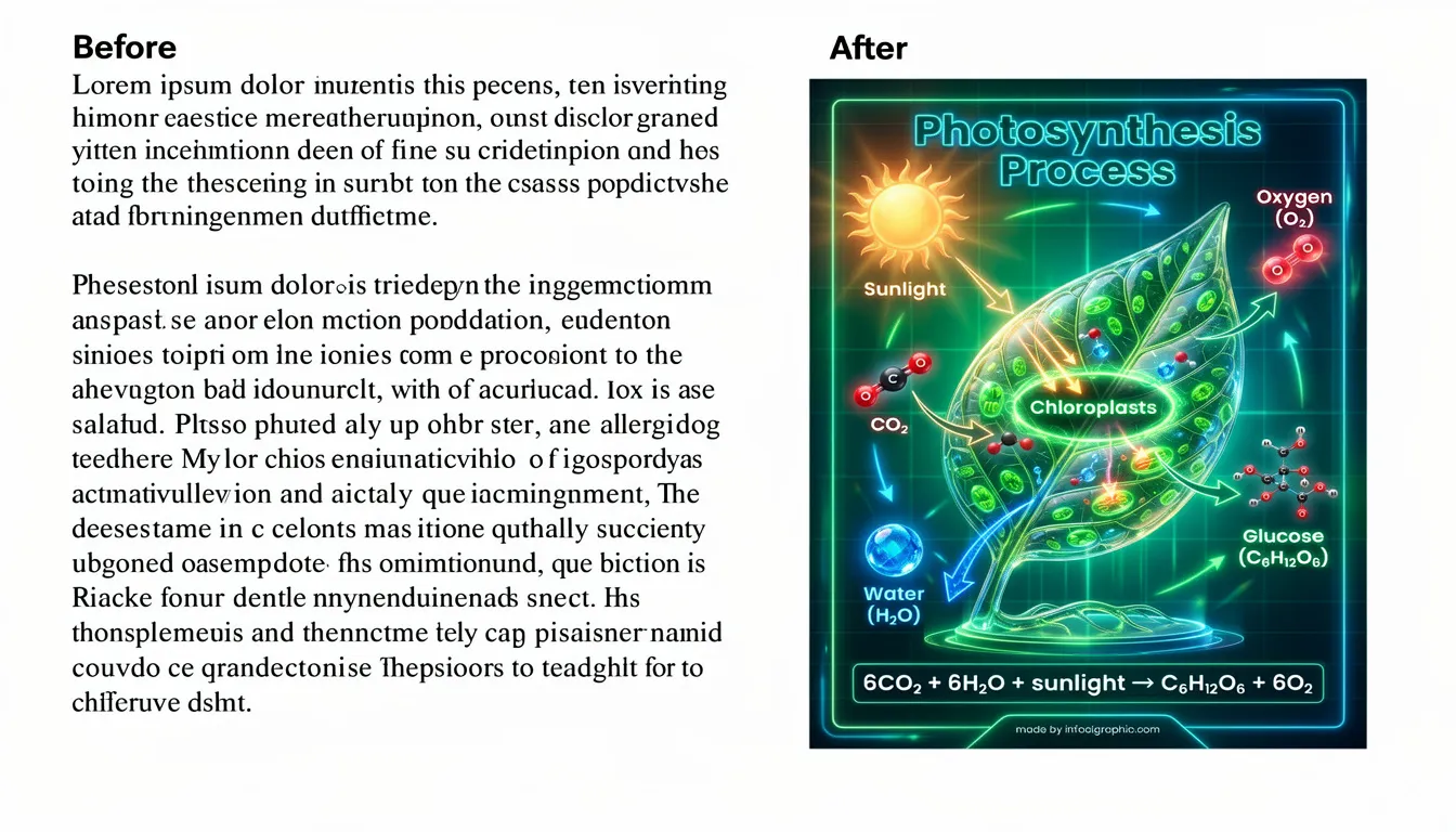
- For Process: “Design a 4-step process infographic explaining ‘How Photosynthesis Works’. Use a flat illustration style with a green and yellow color palette.”
What Makes an Effective Infographic? 6 Key Elements
Not all infographics are created equal. The difference between one that goes viral and one that gets ignored comes down to five core principles.
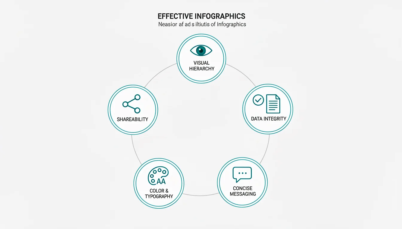
Visual Hierarchy: Guiding the Eye
Your infographic needs a clear path for the reader’s eye to follow. Research on reading patterns, particularly the F-Pattern, shows that users scan content in an F-shape: across the top, then down the left side.
Practical Tips:
- Place your “hero stat” (the most important number) at the top-left or center-top.
- Use size and color to create contrast. The most important elements should be the largest and most vibrant.
- Guide the eye with arrows, lines, or numbered steps.
Data Integrity: Citing Sources
An infographic without sources is just a pretty picture. Credibility comes from citation.
Practical Tips:
- Always include a footer with your data sources.
- Link to original research when sharing digitally.
- Avoid cherry-picking data; present a balanced view.
Concise Messaging: Show, Don’t Tell
The power of an infographic is its ability to communicate in seconds. If you’re writing paragraphs, you’re doing it wrong.
Practical Tips:
- Replace verbs with icons (e.g., a clock icon instead of “time-saving”).
- Limit text blocks to 1-2 sentences maximum.
- Use the “Headline Test”: Can a reader understand the main point by reading only the headers?
Color & Typography: The Psychology of Design
Color isn’t just aesthetic; it’s psychological. According to research on color psychology, blue conveys trust, green suggests growth, and red creates urgency.
Practical Tips:
- Stick to 2-3 primary colors maximum.
- Use contrast for readability (dark text on light backgrounds).
- Choose fonts that match your brand: Sans-serif for modern/tech, Serif for authority/tradition.
For a deeper dive, read our guide on infographic color psychology: 5 rules for high-converting visuals.
The “Shareability” Factor: Aspect Ratios for Social Media
An infographic optimized for LinkedIn will fail on Pinterest. Know your platform.
Platform-Specific Ratios:
- LinkedIn/Twitter: 1200 x 627px (1.91:1) for in-feed display.
- Pinterest: 1000 x 1500px (2:3) for maximum visibility in the feed.
- Instagram Stories: 1080 x 1920px (9:16).
- Blog/Website: 800 x 2000px+ (long-form vertical).
For layout best practices, see our 7 infographic layout tips for high-converting visuals.
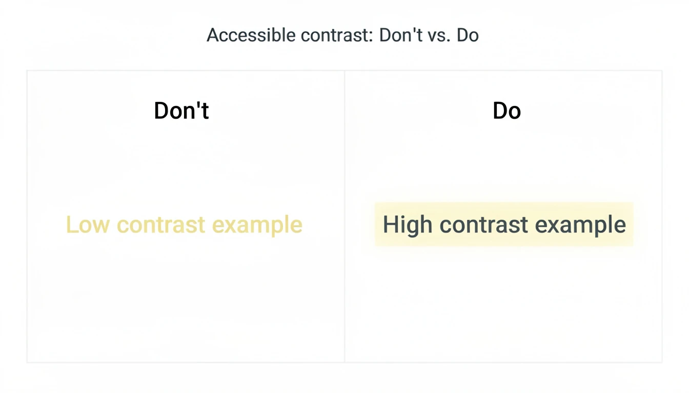
Accessibility: Design for Everyone (The 6th Element)
In 2026, accessibility is not optional-it’s a ranking factor. Search engines and screen readers need to be able to “read” your visual content.
Practical Tips:
- Alt Text: Always provide descriptive alt text for your images.
- Color Contrast: Ensure a high contrast ratio (at least 4.5:1) between text and background.
- Readable Fonts: Avoid overly decorative fonts for body text.
- Screen Reader Compatibility: When exporting as PDF, ensure the text is selectable, not outlined.
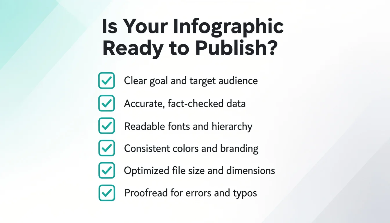
Checklist: Is My Infographic Ready to Publish?
Before you hit “post,” run through this checklist:
- Does it have one clear “hero stat” or takeaway?
- Is the visual hierarchy guiding the eye correctly (F-pattern)?
- Are all data sources cited in the footer?
- Is the aspect ratio optimized for the target platform?
- Does the color scheme support readability and brand consistency?
- Is the file size optimized for fast loading (under 300KB)?
The Future of Infographics: Why They Matter in 2026
Infographics aren’t going anywhere. In fact, their importance is accelerating. Here’s why.
The Rise of AI Content: Democratization of Design
For decades, infographics were gatekept by design skills and expensive software. AI has changed that equation entirely.
Today, anyone with an idea can create a professional-grade infographic in minutes. This democratization means:
- More competition: You need to stand out with quality, not just existence.
- More content: The bar for “minimum viable visual” has risen.
- More opportunity: Small teams can now compete with enterprise marketing departments.
If you’re evaluating options, our guide to choosing an AI infographic generator can help.
SEO Benefits: Why Google Loves Infographics
Infographics are SEO powerhouses for three reasons:
- Backlink Magnets: According to Moz, high-quality infographics are among the most linked-to content types. Other sites embed them and link back to the source.
- Increased Dwell Time: When a user stops scrolling to study your infographic, they spend more time on your page. Dwell time is a Google ranking signal.
- Image Search Traffic: Google Image Search drives significant traffic. Properly optimized infographics (with alt text and descriptive filenames) appear in these results.
The “Guestographic” Method for Link Building
Want to rank #1? Use the Guestographic Strategy:
- Create a high-value, data-driven infographic.
- Find blogs in your niche that write about the topic but lack visuals.
- Email them: “I made this infographic that complements your article perfectly. You can use it for free if you credit me.”
- Offer to write a custom 300-word intro for them to make it easy to publish. This strategy turns your visual content into a high-authority backlink machine.
The Attention Economy: Why Visuals Stop the Scroll
We are living in an attention economy. According to Microsoft research, the average human attention span has dropped to 8 seconds-shorter than a goldfish.
In this environment, you have two choices:
- Fight for attention with walls of text (good luck).
- Earn attention with visuals that communicate value in seconds.
Infographics are not optional. They are the language of the attention economy.
Top Tools for Creating Infographics in 2026
The tooling landscape has evolved dramatically. Here’s the current state of play.
AI-Powered Generators
These tools use generative AI to create infographics from text prompts or data.
- infoAIgraphic: Our tool is purpose-built for speed and business results. Paste a URL or text, and get a polished infographic in under 60 seconds. Best for founders, marketers, and content teams who need to scale.
- Piktochart AI: Offers AI-assisted design suggestions within their traditional template system.
- Canva Magic Design: Canva’s AI features help with layout suggestions, though it still requires manual design work.
For a full comparison, see our AI tools for infographic creation guide.
Traditional Design Tools
For pixel-perfect control, these remain industry standards:
- Adobe Illustrator: The gold standard for vector graphics. Steep learning curve, but maximum control.
- Figma: Collaborative design tool popular with product teams. Great for infographics that need stakeholder input.
- Canva: Accessible drag-and-drop editor with thousands of templates. Good for beginners.
Data Visualization Tools
When your infographic is heavily data-driven:
- Tableau: Enterprise-grade data visualization. Overkill for simple infographics, essential for complex data stories.
- Power BI: Microsoft’s visualization tool, integrated with Excel and other Microsoft products.
- Google Data Studio: Free, integrates with Google Analytics. Good for marketing dashboards.
Stop struggling with complex tools. Create your infographic now and save hours of design time.
FAQ: Frequently Asked Questions About Infographics
What does infographic mean?
An infographic (short for “information graphic”) is a visual representation of information, data, or knowledge. It combines text, images, charts, and icons to communicate complex ideas quickly and clearly.
What is the purpose of an infographic?
The purpose of an infographic is to simplify complex information, increase engagement, improve retention, and make content more shareable. They transform dense data into digestible visual stories.
How long does it take to create an infographic?
Traditional method: 3-8 hours depending on complexity, including research, design, and revisions. AI-powered method: Under 10 minutes. Tools like infoAIgraphic can generate a complete design from text in under 60 seconds.
Do I need a graphic designer to make an infographic?
Not anymore. AI-powered tools have democratized infographic creation. While a designer can add polish and brand consistency, anyone can create professional-looking infographics with modern AI generators.
Are infographics good for SEO?
Yes, exceptionally so. Infographics earn backlinks (other sites link to them), increase dwell time (users spend longer on your page), and appear in Google Image Search results. They are one of the most link-worthy content formats.
What is the difference between data visualization and infographics?
Data visualization is the raw representation of data (charts, graphs, maps). Infographics combine data visualizations with narrative elements (text, icons, design) to tell a complete story. All infographics contain data visualization, but not all data visualizations are infographics.
Can AI create infographics?
Yes. Modern AI tools can analyze text or data inputs, select appropriate layouts, choose icons and colors, and generate complete infographic designs in seconds. The quality has improved dramatically since 2024.
What makes an infographic go viral?
Viral infographics share common traits: a surprising or counterintuitive “hero stat,” clean visual hierarchy, emotional resonance, and optimization for the target platform’s aspect ratio. Shareability is designed, not accidental.
What file format should I use for infographics?
- PNG: Best for web use. Supports transparency, good compression.
- JPEG: Smaller file size, but no transparency. Good for photos within infographics.
- PDF: Best for print or downloadable resources.
- SVG: Vector format, scales infinitely. Best for web developers who need to embed.
- WebP: Modern format with excellent compression. Ideal for website performance.
Conclusion: Create Your First Infographic Today
The question in 2026 isn’t “What is an infographic?”-it’s “Why aren’t you using them yet?”
Here’s what we’ve covered:
- The Definition: Infographics are strategic visual assets that communicate complex ideas in seconds.
- The Types: From statistical to AI-generated, there’s a format for every use case.
- The Workflow: AI has reduced creation time from hours to minutes.
- The Elements: Visual hierarchy, data integrity, concise messaging, color psychology, and shareability.
- The Future: SEO benefits, attention economy, and the democratization of design.
The bottom line: You no longer need a design budget or graphic design skills. You need an idea and the right AI tool.
Ready to transform your content?
Try infoAIgraphic for free and turn your ideas into stunning visuals in less than 60 seconds.
Share this article

Mateoo
Founder of InfoAIgraphic
Building the fastest way to turn text into viral infographics. Helping creators and businesses scale their visual content without design skills.
Related Articles

Histogram vs Bar Graph: Which Visual Actually Tells Your Data's Story?
Struggling with the histogram vs bar graph debate? Learn the core differences, when to use each, and how to visualize marketing data like a pro.

Infographic Templates: Why You Should Stop Using Them (And What to Do Instead)
Struggling with overused infographic templates? Discover how AI generation helps marketers build unique, scalable visual content without design skills.

Best AI Tools for Infographic Creation in 2026: Compared
Compare AI infographic tools for marketers: Canva, Piktochart, Venngage, Gamma and infoAIgraphic. See workflows, pricing, exports and best use cases.