Histogram vs Bar Graph: Which Visual Actually Tells Your Data's Story?
Struggling with the histogram vs bar graph debate? Learn the core differences, when to use each, and how to visualize marketing data like a pro.

Histogram vs Bar Graph: Which Visual Actually Tells Your Data’s Story?
I’ve seen it a thousand times. A marketing team pulls brilliant insights from their CRM, drops the numbers into a random charting tool, and completely loses their audience.
Why? Because they used the wrong visual.
Choosing how to display your numbers isn’t just an aesthetic preference. It dictates whether your stakeholders understand the narrative or walk away confused. And nothing causes more head-scratching in marketing reports than the classic histogram vs bar graph debate.
If you want to scale your content marketing and build authority, you have to get the basics right. Let’s break down exactly how to choose the right chart, avoid common data traps, and build visuals that actually convert.
Key Takeaways
- Data type dictates the chart: Use bar graphs for distinct, categorical data (like product types or geographic regions) and histograms for continuous data (like age ranges or session durations).
- Mind the gap: Bar charts feature spaces between the columns to emphasize separate categories. Histograms have no gaps, highlighting the continuous flow of a distribution.
- Complexity requires layering: When standard charts fail to tell the whole story, upgrading to a segmented bar chart allows you to compare sub-categories without overwhelming your viewer.
The Core Problem: Good Data, Bad Visualization
You put in the hours pulling marketing analytics, but raw data is incredibly hard to comprehend. According to IBM’s breakdown of data visualization principles, visual displays are critical for idea illustration and discovery—but only if the structural foundation is accurate. If you use a histogram when you need a bar chart, you aren’t just making a design error; you are fundamentally misrepresenting the relationship between your numbers.
This happens frequently in performance tracking. When you rely on unified customer data, as noted by Salesforce in their marketing analytics overview, you need to visualize digital interactions clearly to understand the customer journey. If your audience looks at a chart and has to guess what the X-axis means, you have already lost them.
Deep Explanation: Bar Chart vs Histogram
To stop boring your audience with confusing spreadsheets, you need to understand the structural differences between these two heavyweights. For context on presenting this type of data cleanly, check out our B2B playbook on how to explain data with infographics.
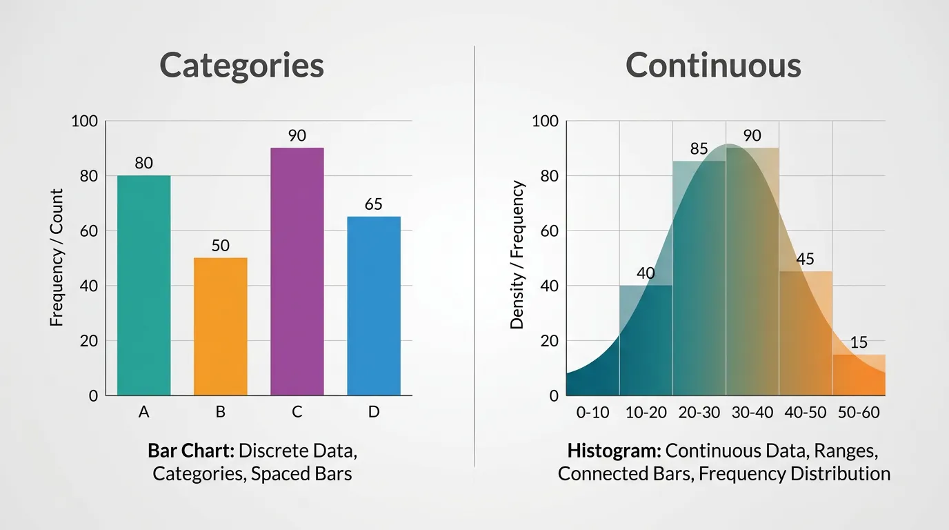
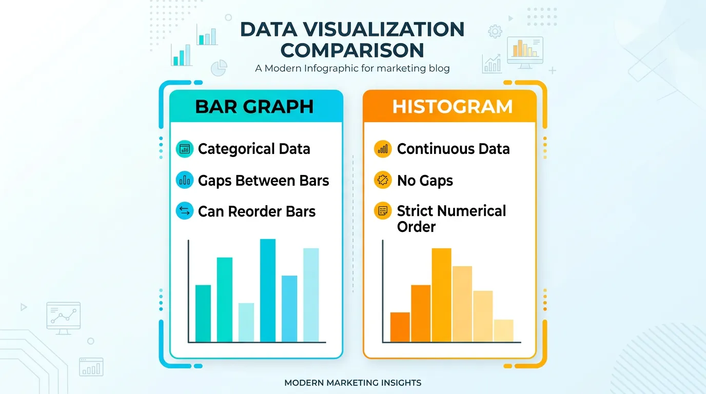
The Bar Graph: Comparing Distinct Categories
A bar graph (or bar chart) is your go-to tool for comparing discrete, unrelated categories.
When to use it: If you are comparing revenue by quarter, total leads by social media platform, or email open rates across different industries, you need a bar graph.
Key visual traits:
- There are equal gaps between each bar.
- The X-axis represents distinct categories (e.g., Facebook, LinkedIn, Twitter).
- The bars can be reordered (e.g., from highest to lowest) without changing the meaning of the data.
The Histogram: Showing Continuous Distribution
A histogram looks deceptively similar to a bar chart, but its job is entirely different. You use it exclusively for continuous, numerical data.
When to use it: If you want to show the distribution of customer ages, the spread of website page load times, or the distribution of days it takes to close a sales ticket.
Key visual traits:
- There are zero gaps between the bars. The end of one range is the exact beginning of the next.
- The X-axis represents a continuous scale divided into “bins” or intervals (e.g., 0-10, 11-20, 21-30).
- You cannot reorder the bars. Doing so would destroy the chronological or numerical sequence.
What About the Segmented Bar Chart?
Sometimes the bar graph vs histogram debate isn’t enough to solve your problem because your categorical data has layers. That is where a segmented bar chart (or stacked bar chart) shines.
If you want to show total revenue by quarter, but also break down that revenue by product tier within each quarter, you stack the segments. It keeps the distinct categories of a traditional bar chart while adding a secondary layer of insight.
Quick Comparison
Here is a straightforward breakdown to keep handy during your next reporting cycle:
| Feature | Bar Graph | Histogram | Segmented Bar Chart |
|---|---|---|---|
| Primary Use | Comparing distinct categories | Showing distribution over a continuous range | Comparing categories with sub-components |
| Data Type | Categorical (Qualitative) | Continuous (Quantitative) | Categorical (Qualitative) with sub-variables |
| Gaps Between Bars? | Yes | No | Yes |
| Can Bars Be Reordered? | Yes (e.g., ascending/descending) | No (ruins the continuous scale) | Yes |
| Marketing Example | Traffic by social channel | Distribution of user session lengths | Quarterly revenue stacked by product line |
Step-by-Step Guide: Choosing and Building the Right Visual
As Tableau emphasizes in their data visualization guides, effective visual storytelling is a delicate balancing act between form and function. You cannot just slap numbers onto a canvas and expect it to look good.
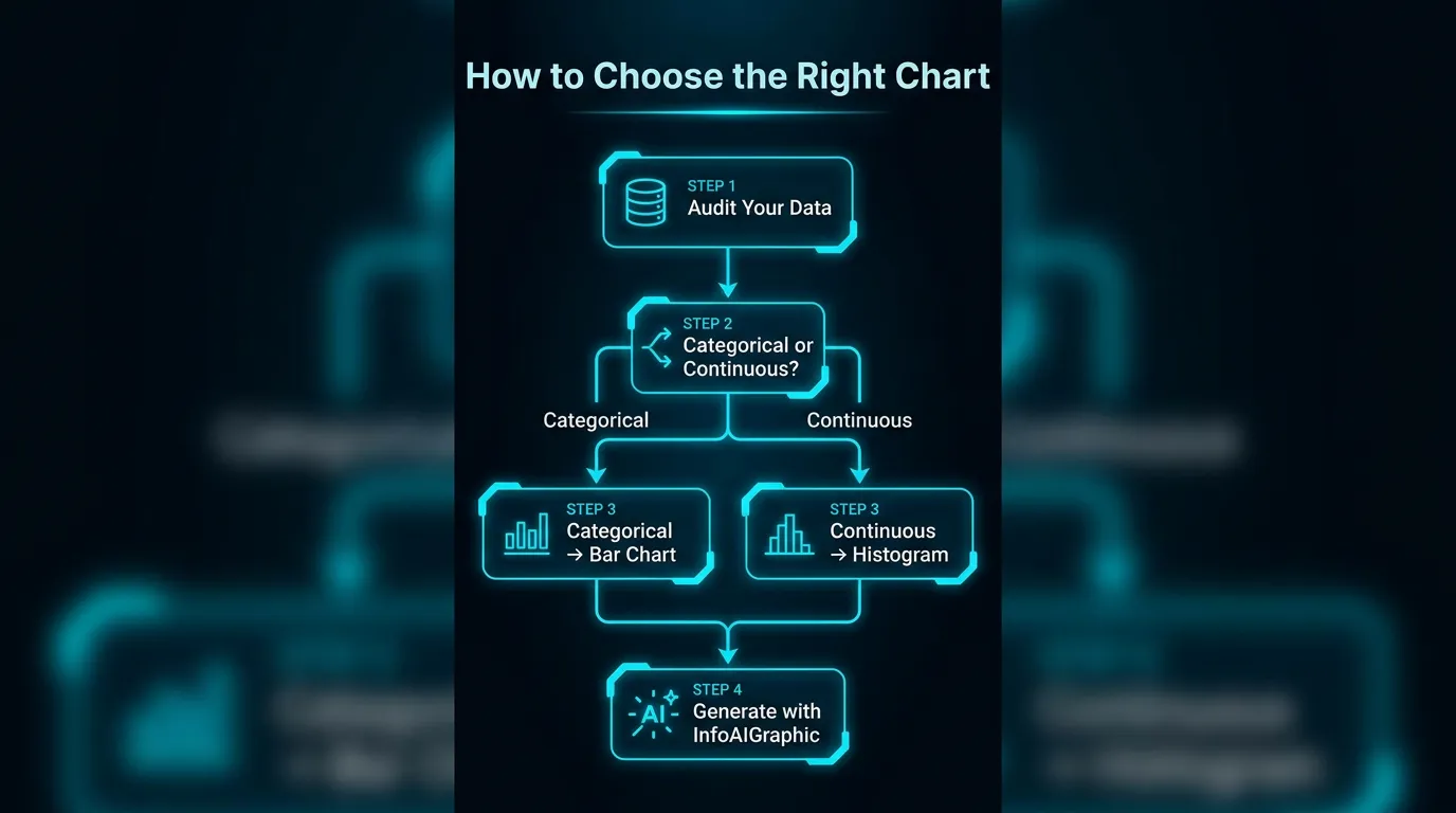
Here is my exact workflow for turning raw metrics into a high-converting graphic using InfoAIGraphic.
- Audit your data source: Before generating anything, clean your data. Pull your metrics from your CRM or analytics platform and ensure there are no outliers or missing fields. Iterating on accurate data is crucial; as Fivetran points out in their analytics strategy, you must base your campaigns on high-quality, aggregated data.
- Identify your data type: Ask yourself: “Am I looking at distinct categories (like product names) or a continuous flow of numbers (like time or age)?” If it’s categories, pick a bar chart. If it’s a flow, pick a histogram.
- Draft the prompt: In InfoAIGraphic, write a clear prompt. Specify the chart type. For example: “Generate a segmented bar chart showing our Q1 to Q4 lead generation, broken down by organic search, paid ads, and social media.”
- Iterate and troubleshoot: If the AI outputs something that looks cluttered, simplify your data bins. If you run into generation errors, read my guide on infographic workflow troubleshooting to quickly fix common failures.
- Publish and distribute: Embed the final visual into your blog posts, reports, and social feeds. According to Backlinko’s research on visual marketing, infographics and data visualizations are incredibly effective for generating backlinks and driving traffic.
If you are dealing with strict compliance or complex numbers, knowing your chart types is even more critical. In highly regulated industries, accuracy is non-negotiable—something I cover extensively in our AI in healthcare infographic guide.
FAQ
Q: Can I use a bar graph to show time-based data? A: Yes, you can use a bar chart for time if you treat the time periods as distinct, discrete categories (like Q1, Q2, Q3). However, if you are analyzing a continuous flow of time down to the minute or second to see distribution, a histogram is more appropriate.
Q: Why does a histogram have no gaps? A: The lack of gaps visually communicates that the data is continuous. The end of one “bin” (like ages 20-29) directly touches the start of the next (ages 30-39), showing that every possible number in the range is accounted for.
Q: What is the biggest mistake people make with segmented bar charts? A: Adding too many segments. If you stack more than four or five colors in a single bar, it becomes impossible for the human eye to easily compare the sizes of the segments across the chart. Keep it simple.
Conclusion
Understanding the difference between a histogram vs bar graph is the first step toward building marketing reports that people actually want to read. By matching your data type to the correct visual structure, you eliminate confusion and instantly elevate the professionalism of your brand.
Visual content doesn’t have to be a massive drain on your resources. With the right strategy and tools, you can automate the heavy lifting. If you are ready to speed up your content creation, read our AI infographic design guide for beginners and start generating high-quality charts in seconds using InfoAIGraphic.
Share this article

Mateoo
Founder of InfoAIgraphic
Building the fastest way to turn text into viral infographics. Helping creators and businesses scale their visual content without design skills.
Related Articles

How to explain data with infographics: B2B Playbook
Learn how to explain data with infographics using a practical structure that simplifies complex metrics and helps teams share insights clearly. Discover how!

How to add image into text in canva: The 2026 Guide to AI Alternatives
Discover how to add image into text in canva, the hidden costs of manual design, and the fastest AI alternatives to scale infographics for your brand.

Infographic workflow troubleshooting: Fix 6 Failures
Use infographic workflow troubleshooting tactics to spot bottlenecks, reduce rework, and keep production moving from draft to published asset. Read more!