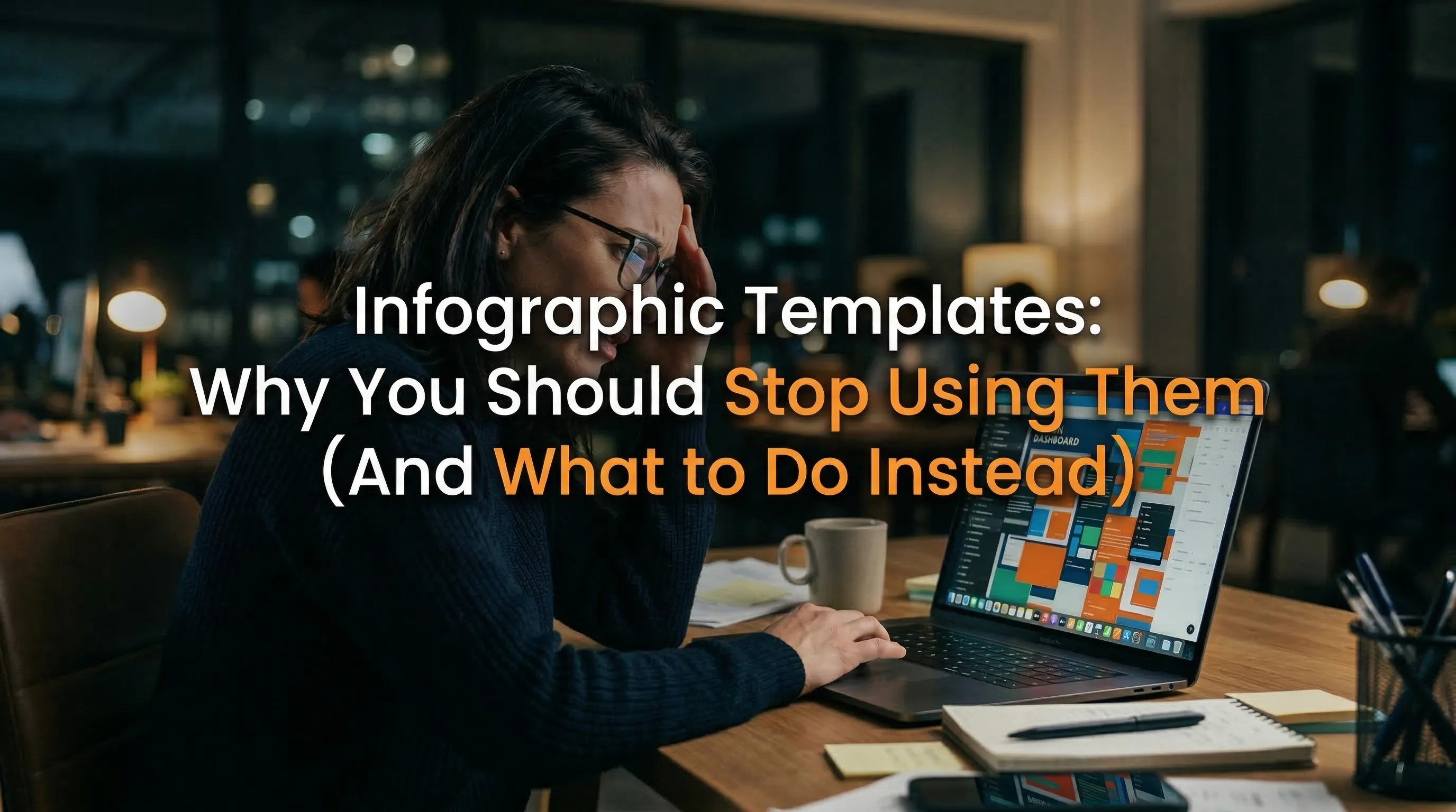
Infographic Templates: Why You Should Stop Using Them (And What to Do Instead)
I remember the first time I realized traditional visual marketing was broken. I had spent four hours tweaking nodes on an overly complex, rigid layout, trying to force my SaaS product data into a box it wasn’t meant to fit. It was frustrating, tedious, and the final result looked exactly like every other graphic on LinkedIn.
If you’re a marketer or founder, you know the drill. You hunt down a pre-made design, attempt to swap the colors, and ultimately compromise on the story you wanted to tell because the layout won’t allow for an extra bullet point. We’ve all been there.
That pain point is exactly why I built InfoAIGraphic. We are moving past the era where you have to rely on static files and rigid builders. Today, we’re talking about how AI is completely replacing traditional visual constraints and giving you the freedom to generate custom data visuals on demand.
Key Takeaways
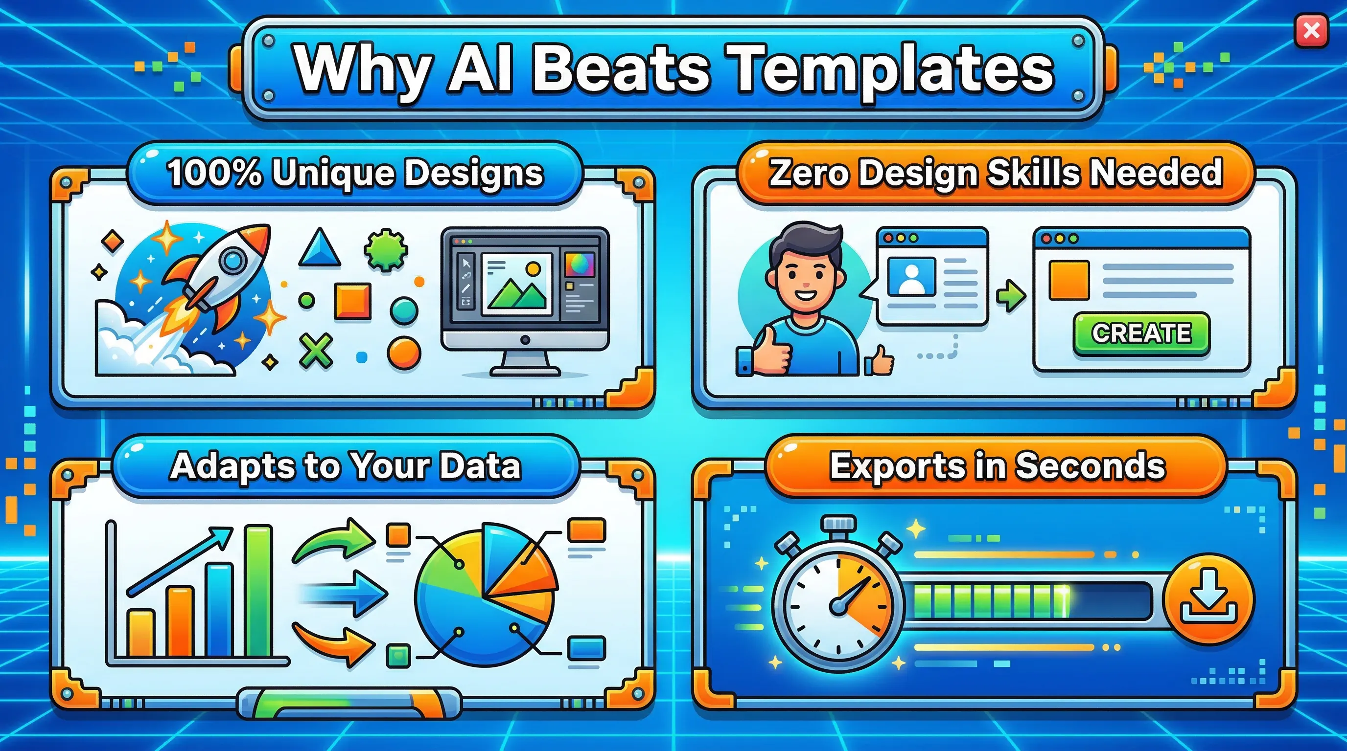
- Stop forcing data into rigid layouts: Pre-made visual structures dictate your content length and flow, often ruining your narrative.
- AI generation is the new standard: Instead of searching for the perfect layout, you can now describe your data and let AI build the exact structure you need.
- Stand out with unique styles: From a retro 2000’s infographic template to modern data-driven layouts, AI allows you to pivot visual styles instantly without starting from scratch.
To understand why we need a better way, we have to look at the core issue with traditional visual communication. As noted by TechSmith, communicating ideas visually reduces friction and helps teams absorb information faster. But when you use the exact same layouts as your competitors, your audience glazes over.
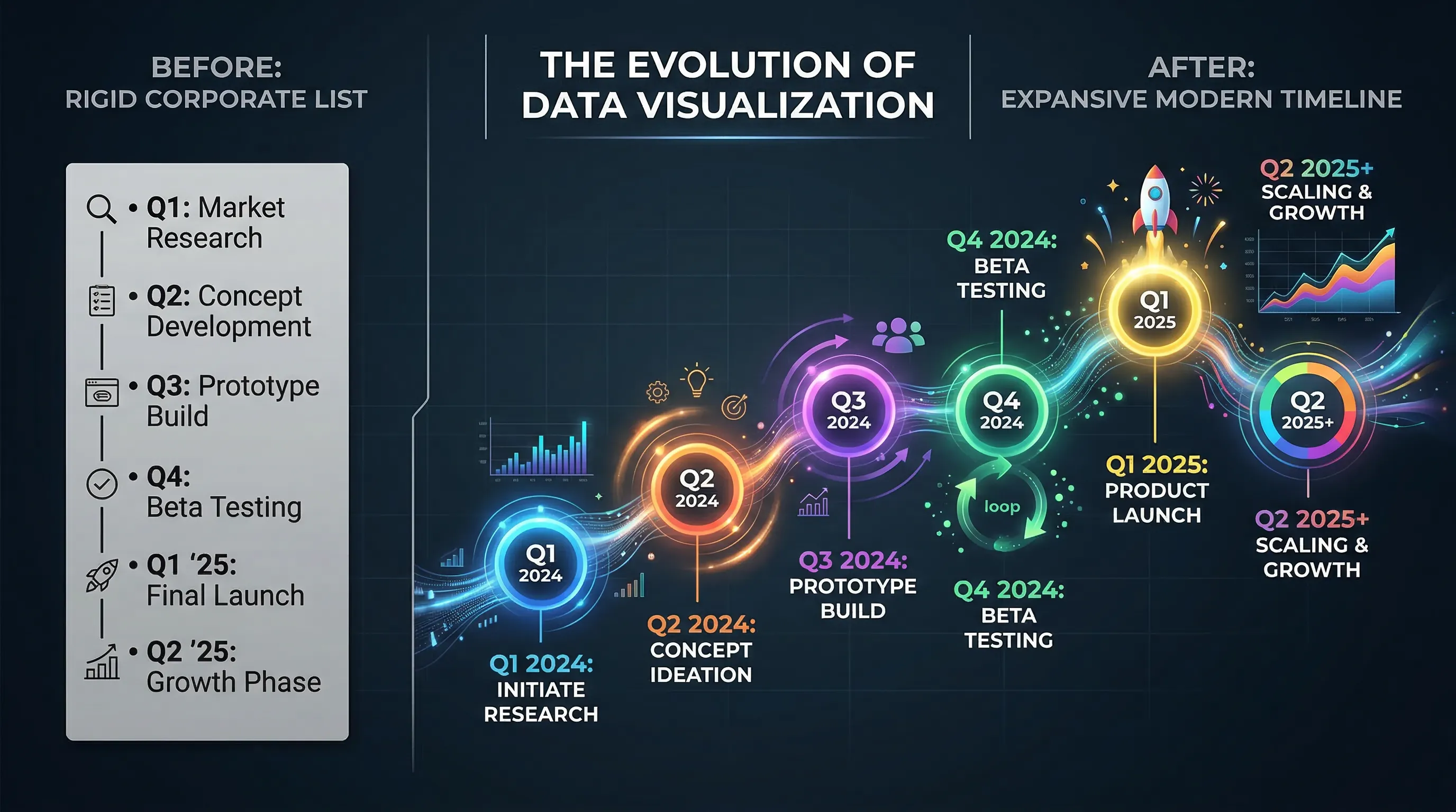
When you start with a blank canvas, you have two choices: hire an expensive designer or wrestle with a drag-and-drop tool. Most marketers choose the latter, leaning heavily on pre-built layouts. The problem? Those designs were made for someone else’s data.
When you try to map a complex dataset onto a template built for a simple five-point list, the design breaks. You end up shrinking text, deleting crucial context, or entirely misrepresenting the information.
The solution isn’t to buy more premium layout packs. The solution is to change the workflow entirely. As highlighted in a recent Bain & Company report, early adopters of generative AI in marketing are cutting their content creation time by 30% to 50%.
When you use an AI-powered generator, you flip the process. You start with your content, and the AI generates a bespoke layout that perfectly frames it. This allows you to experiment with wildly different visual aesthetics without losing an afternoon to pixel-pushing.
Want to trigger some nostalgia? You can prompt the AI to generate a 2000’s infographic template style with glossy buttons, drop shadows, and bright neon accents. Need to show a massive company history? You can easily instruct the tool to build an infographic mega timeline visual that elegantly snakes down the page, automatically calculating the spacing for your dates.
Let’s look at a clear breakdown of why this shift is happening.
Traditional vs. AI-Generated Visuals
| Feature | Traditional Drag-and-Drop Templates | AI Infographic Generation |
|---|
| Starting Point | Searching through a library of pre-made layouts. | Typing your raw data or uploading a document. |
| Data Fitting | You must edit your text to fit the rigid design boxes. | The design dynamically expands and adjusts to fit your text. |
| Style Changes | Requires manual editing of every font, color, and icon. | A single text prompt changes the entire aesthetic. |
| Time to Publish | 2-4 hours of manual tweaking and formatting. | 2-5 minutes of prompting and refinement. |
| Uniqueness | High risk of looking identical to competitors’ content. | 100% custom generated output every time. |
This shift toward intelligent generation is becoming a massive competitive advantage. According to IBM’s insights on AI in marketing, using AI to automate and hyper-personalize content is critical for businesses that want to scale efficiently. We are seeing this firsthand at InfoAIGraphic.
And if you want to add a human touch to your brand, you don’t need a drawing tablet. Generating hand written infographics—complete with organic-looking doodles, imperfect arrows, and script fonts—is just a matter of selecting the right AI style parameters.
Step-by-step guide
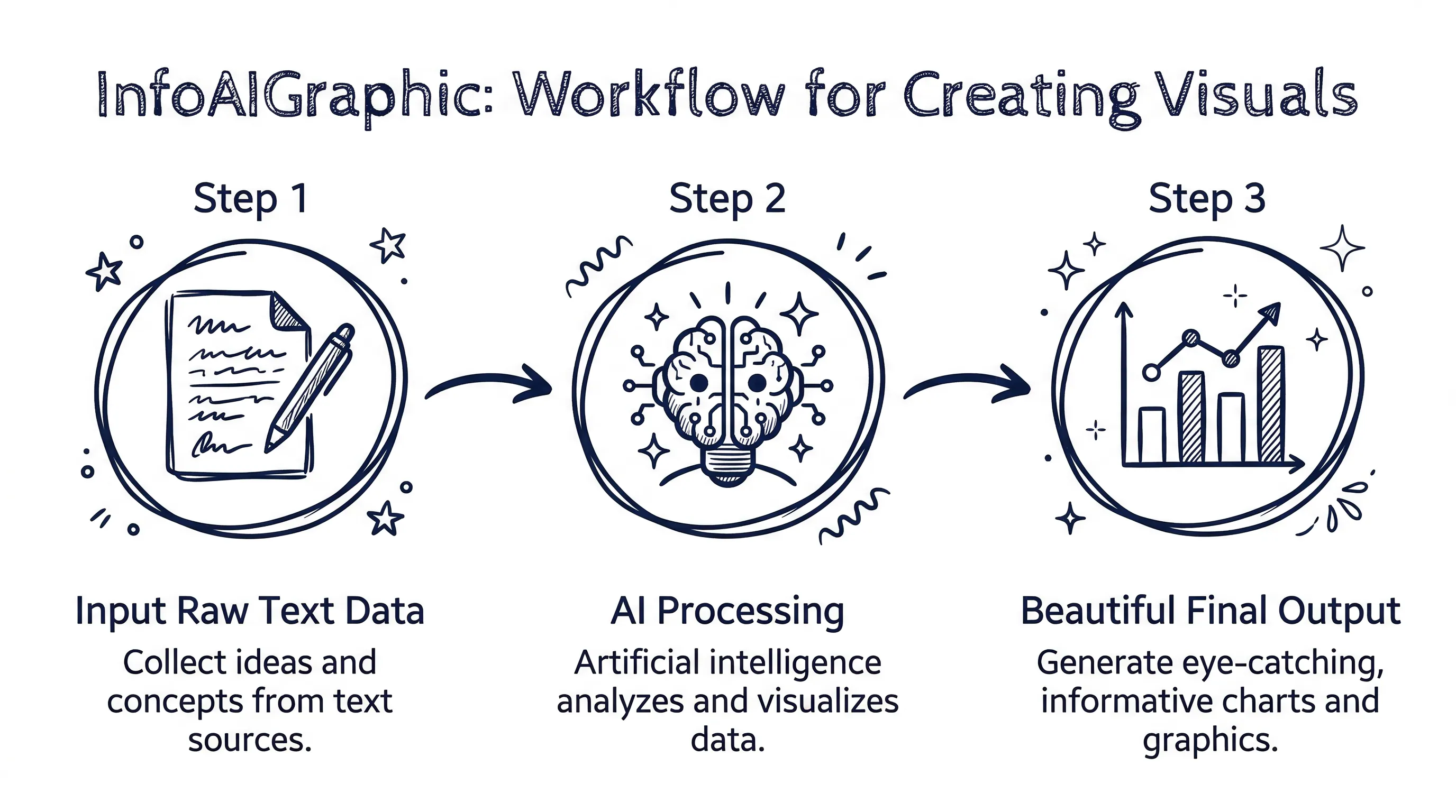
If you are ready to ditch the old way of doing things, here is exactly how you can build stunning, custom visuals using AI. I’ll walk you through the workflow we use every day.
- Compile your raw data first: Stop looking at designs. Gather your statistics, bullet points, or the core narrative you want to share. As Acquia points out in their visual content marketing guide, your visuals need to be strategic and backed by a clear message.
- Choose your AI generation tool: Log into InfoAIGraphic (or your preferred platform). If you are new to the ecosystem, I highly recommend checking out our Ai tools for infographic creation: 2026 B2B Guidebook to understand the landscape.
- Input your content and prompt: Paste your raw text into the engine. Tell the AI exactly what you want. For example: “Turn these 10 historical milestones into a vertical timeline using a dark mode, cyberpunk aesthetic.”
- Iterate on the aesthetic: Not happy with the first output? Don’t drag elements around. Adjust your prompt. Ask the AI to make it look like a 2000’s infographic template, or switch to a minimalist corporate style.
- Refine and export: Once the AI nails the structure, you can make minor text edits, ensure your branding is applied, and export the high-resolution file for your blog or social channels.
If you are just beginning this transition, you might want to review our AI infographic design for beginners: B2B Guide 2026 to get comfortable with prompting for visual output.
FAQ
Q: Are AI-generated infographics actually unique, or do they just recycle old designs?
A: They are entirely unique. Unlike traditional drag-and-drop tools that force you into a pre-existing box, AI tools generate the layout, icons, and structure from scratch based on your specific data and prompts.
Q: Do I need to be good at writing prompts to get a good result?
A: Not at all. While being descriptive helps, modern AI engines are built to understand natural language. You can simply paste your text and select a style preset, and the AI will handle the heavy lifting. For more on this, check out our Getting started with ai infographics: Founder Guide.
Q: Can I use these generated images for SEO and link building?
A: Absolutely. According to Backlinko, visual content like infographics is incredibly effective for acquiring backlinks and social shares. Original, AI-generated data visuals perform exceptionally well because they offer new information rather than recycled stock graphics.
Q: What if I have a very specific brand guideline I need to follow?
A: Most advanced AI visual tools allow you to upload your brand kit. The AI will prioritize your exact hex codes, typography, and logo placements while still generating a custom layout for your data.
Conclusion
We are living in an incredible time for content creators. You no longer have to compromise your data to fit someone else’s idea of a good layout. By stepping away from rigid infographic templates and embracing AI generation, you can produce higher-quality, deeply customized visuals in a fraction of the time.
Whether you need to browse AI infographic examples for inspiration: 2026 Ideas or you’re ready to start building your own, the tools are finally here to support your creativity, not hinder it.
If you are tired of fighting with design tools and want to turn your raw data into beautiful, conversion-focused visuals in minutes, give InfoAIGraphic a try today. Let’s make your data look as good as it deserves to.