Why Your Current SEO Report Template Is Failing (And How Visual Reporting Fixes It)
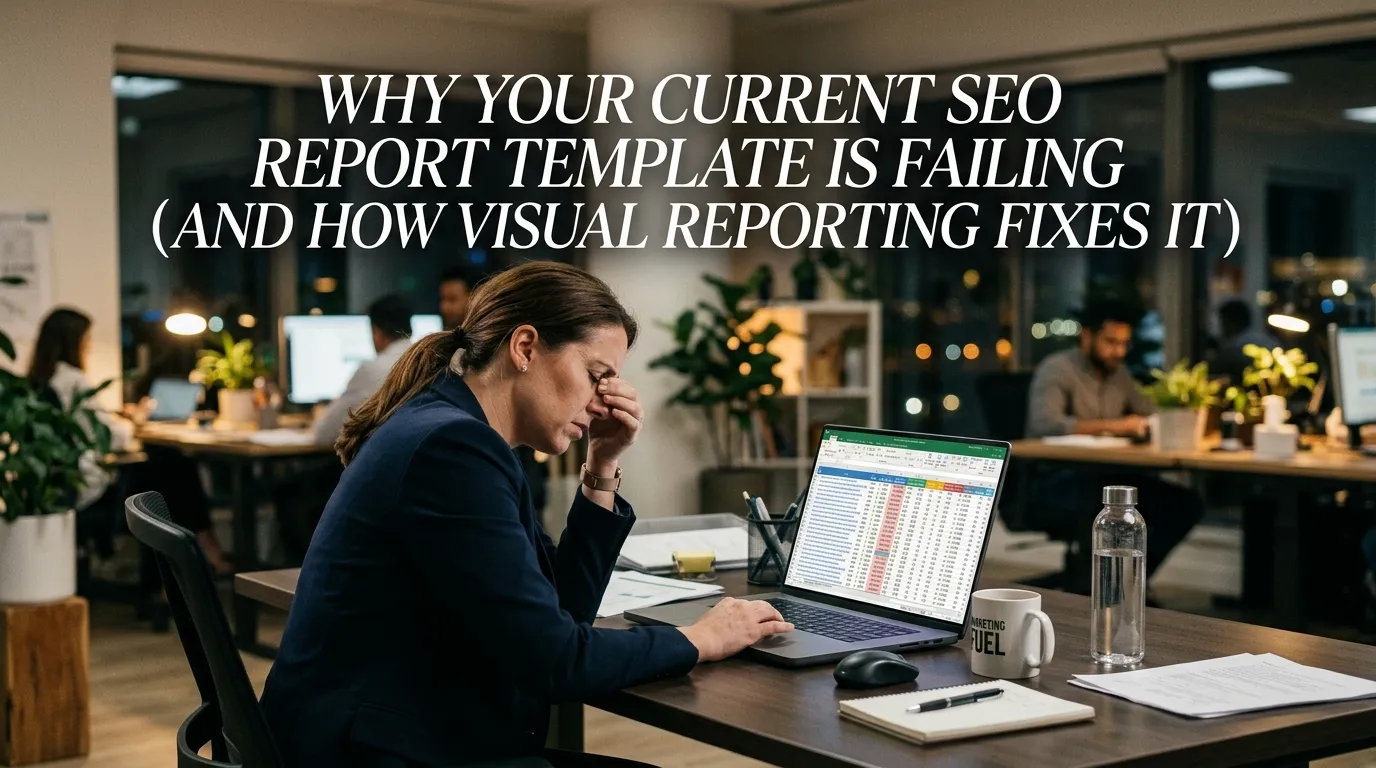
I have a confession to make: early in my career, I used to send clients and stakeholders 40-page PDF documents packed with raw data, assuming the sheer volume of numbers would prove my value. I exported every metric I could find. Organic traffic, bounce rates, keyword position changes, backlink profiles—it all went into a massive, unreadable document.
Nobody read it.
Worse, when it came time to negotiate budgets or prove return on investment (ROI), my stakeholders looked at me blankly. They didn’t understand the data, which meant they didn’t understand the value of my work. I realized then that data without a clear, visual narrative is essentially useless. If you cannot communicate your wins effectively, those wins might as well not exist.
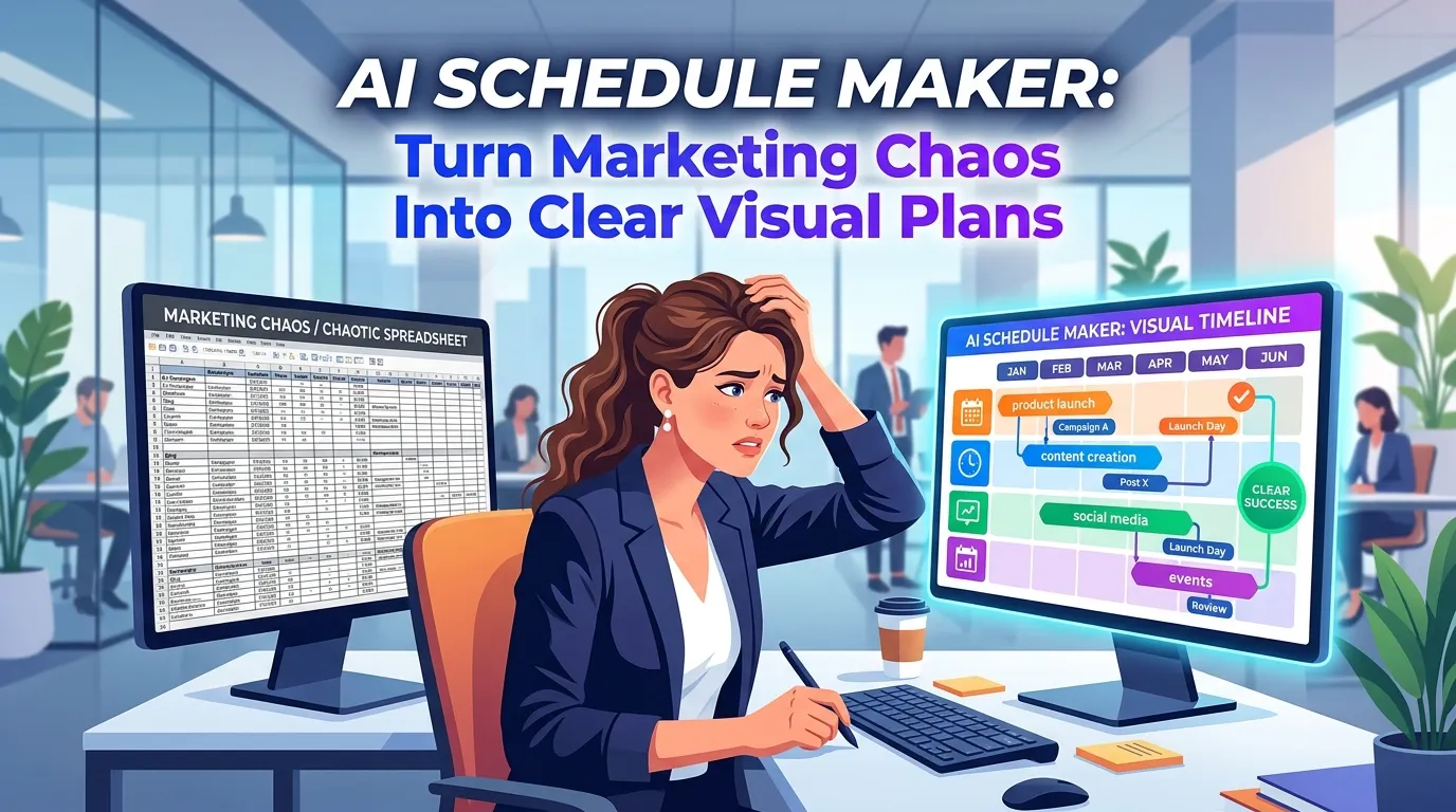
Today, as the founder of InfoAIGraphic, I see marketing teams and product owners making this exact same mistake. You are doing incredible work, ranking for competitive terms, and driving real revenue. But when it comes to reporting, you rely on a generic, text-heavy SEO report template that puts your executive team to sleep. You need to shift your mindset from data dumping to data storytelling.
Key Takeaways
- Stop relying on raw data dumps: A spreadsheet is not a report. The best SEO report template translates complex metrics into a visual narrative that non-technical stakeholders can instantly understand.
- Embrace visual SEO reporting: Replacing dense tables with an SEO infographic or automated visual dashboard drastically improves stakeholder engagement and secures marketing budgets.
- Automate the heavy lifting: By leveraging AI-powered infographic generators and data visualization tools, you can scale your reporting workflows without needing a dedicated design team.
The Problem With the Traditional SEO Report Template
Let’s talk about the elephant in the room. Most standard reporting formats are fundamentally broken. They are built for the practitioner, not the audience. When you export a standard dashboard, you are giving your CEO or client a tool meant for an SEO specialist.
When a stakeholder opens a dense report, they experience cognitive overload. They see thousands of rows of keyword rankings and complex attribution models. Because they don’t have the context to interpret this data, they skim the document, look for a single number (usually total traffic or revenue), and close the file.
You lose the opportunity to explain why traffic dipped during a seasonal lull, or how a specific technical fix led to a massive spike in conversions. According to Semrush, an effective SEO report needs to clearly highlight trends and issues, making it easy for stakeholders to digest the benefits of your work. If your report requires a translation dictionary, it is failing at its primary job.
The Missing Narrative Arc
Data needs a story. A traditional SEO report template usually lists metrics in a vacuum. It shows that organic traffic increased by 15%, but it fails to show the specific content updates, backlink acquisitions, or technical audits that caused the increase.
Marketing is inherently about storytelling, yet we often forget to apply this to our own internal reporting. We expect the numbers to speak for themselves. I can tell you from years of experience: numbers are completely silent until you give them a voice. You have to connect the dots between your daily actions and the macro-level business goals.
The “Vanity Metric” Trap
Many templates focus heavily on vanity metrics—numbers that look good on paper but do not correlate to business success. Tracking millions of impressions means nothing if your click-through rate (CTR) is zero and your conversions are non-existent. HubSpot Academy emphasizes that tracking and reporting on the right metrics is essential for uncovering valuable insights and making data-driven decisions.
If your current template highlights impressions and keyword volumes over revenue and lead generation, you are training your stakeholders to care about the wrong things. When those vanity metrics inevitably fluctuate, you will be forced to defend numbers that don’t actually impact the bottom line.
The Psychology of Visual Communication in Marketing
To fix your reporting, you must understand how human beings process information. We are visually wired creatures. Visual communication involves conveying ideas, instructions, and data through graphics rather than text or audio.
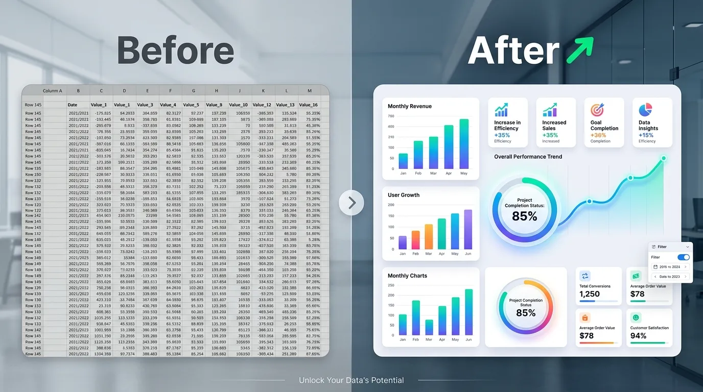
When you replace a wall of text with a well-designed chart or an SEO infographic, you are not just making the report “prettier.” You are fundamentally changing how the brain interacts with the information.
Processing Speed and Pattern Recognition
The human brain processes visual information significantly faster than text. When you look at a line graph showing organic traffic growth over 12 months, you instantly grasp the trend. If you were to read the exact same data presented in a 12-row table, it would take your brain much longer to compute the differences between each month and identify the upward trajectory.
Data visualization is crucial because it translates complex, high-volume data into a visual representation that is vastly easier to process. You want your stakeholders to spend their mental energy making strategic decisions based on your data, not struggling to understand the data itself.
Emotional Resonance and Persuasion
Numbers alone rarely inspire action. Visuals, however, can evoke an emotional response. Seeing a massive, brightly colored bar chart towering over competitors creates a feeling of victory and momentum. Seeing a steep red line indicating a sudden drop in site health creates a sense of urgency.
If you are trying to secure more budget for content creation or technical SEO tools, a visual SEO reporting format is your best weapon. It bridges the gap between the abstract work you do daily and the tangible business results your executives care about. It turns you from a “technical cost center” into a strategic growth driver.
Accessibility for Non-Technical Stakeholders
Your CEO likely doesn’t know what a canonical tag is. Your client probably doesn’t understand the difference between Domain Authority and Page Authority. And honestly? They shouldn’t have to.
A well-crafted visual report acts as a universal language. It democratizes the data. IBM notes that data visualization is not only reserved for data teams; management leverages it to discover patterns and understand complex relationships easily. When everyone in the room can understand the report, you foster better collaboration, faster approvals, and a deeper appreciation for your marketing efforts.
Deep Explanation of Solutions and Trade-Offs
So, you know you need to move away from the traditional, text-heavy spreadsheet. But what is the best way to implement visual SEO reporting? There are several approaches, each with its own set of advantages and drawbacks. Let’s break down the most common solutions so you can choose the right workflow for your team.
Solution 1: The Native Dashboard (Google Looker Studio / Tableau)
The most common step up from a spreadsheet is a live dashboard. Tools like Google Looker Studio or Tableau allow you to connect your data sources directly and create interactive charts. Tableau defines data visualization as the graphical representation of information, using elements like charts to help non-technical audiences understand trends without confusion.
The Pros:
- Real-time data: Your stakeholders can check the dashboard at any time and see up-to-the-minute metrics.
- Deep interactivity: Users can filter by date range, specific landing pages, or geographic locations.
- Automation: Once built, the data updates automatically without manual exporting.
The Cons:
- Steep learning curve: Building a truly effective, custom dashboard requires technical skills and an understanding of data blending.
- The “Blank Stare” effect: Even with visuals, an interactive dashboard can be overwhelming. If a stakeholder doesn’t know what to filter or where to look, they will still feel lost.
- Lack of narrative: A live dashboard shows what is happening, but it cannot explain why it is happening. It lacks the human context and storytelling element required for a complete report.
Solution 2: The Presentation Deck (Slide Decks)
Many agencies and enterprise teams use presentation software to build a monthly SEO report template. They take screenshots from their SEO tools, paste them into slides, and add bullet points to provide context.
The Pros:
- Strong narrative control: You control exactly what the stakeholder sees and in what order. You can walk them through the story step-by-step.
- Easy to add context: You can easily add text boxes explaining the “why” behind every chart.
- Familiar format: Everyone knows how to read a slide deck.
The Cons:
- Incredibly time-consuming: Manually taking screenshots, formatting slides, and updating text every single month is a massive drain on resources. It is not scalable if you manage multiple clients or products.
- Static and dated: The moment you export the PDF, the data is out of date.
- Prone to human error: Copy-pasting data manually dramatically increases the risk of typos and reporting errors.
Solution 3: The AI-Powered SEO Infographic Workflow
This is where the industry is heading, and it is exactly why I built InfoAIGraphic. By combining the narrative power of a static presentation with the visual impact of high-end design, you can create a highly engaging SEO infographic. Using AI to transform your key data points into a beautiful, cohesive visual story gives you the best of both worlds.
The Pros:
- Unmatched engagement: An infographic is designed specifically to be readable, shareable, and visually striking. It commands attention.
- Highly scalable: With text-to-infographic AI tools, you can input your key metrics and generate a polished visual report in minutes, not hours. If you want to see exactly how to implement this, check out our guide on how to Scale B2B Content Faster Now.
- Perfect for executives: A one-page visual summary is exactly what a busy executive wants. They can grasp the entire monthly performance in 60 seconds.
The Cons:
- Less granular detail: An infographic is a summary. It cannot hold 10,000 rows of keyword data. (Though, as we’ve established, you shouldn’t be sending that anyway).
- Requires a mindset shift: You have to let go of the desire to report on everything and focus only on the most critical narrative points.
To make this crystal clear, here is a breakdown of how these three methods compare across the factors that actually matter to marketing teams.
| Feature / Method | Raw Spreadsheets | Live Dashboards (Looker Studio) | AI SEO Infographic (InfoAIGraphic) |
|---|
| Setup Time | Very Low | High (requires technical setup) | Low (prompt-based generation) |
| Monthly Maintenance Time | High (manual data entry) | Low (automated updates) | Low (quick generation via AI) |
| Stakeholder Engagement | Very Poor | Moderate | Extremely High |
| Narrative & Storytelling | None | Low | High (contextual visual flow) |
| Visual Appeal | Poor | Good | Excellent |
| Best Used For… | Solo practitioners doing deep technical analysis. | Daily internal monitoring by marketing teams. | Executive summaries, client reporting, and proving ROI. |
Building the Perfect Visual SEO Report Template: What to Include
If you are ready to transition to visual SEO reporting, you need to structure your template correctly. Remember, the goal is to tell a story. Every good story has a beginning, a middle, and an end.
Here is the exact framework I use for a high-impact SEO infographic report.
Section 1: The Executive Summary (The Hook)
This is the most critical part of your report. You have roughly 10 seconds to capture your reader’s attention. Do not start with technical metrics like crawl budget or indexation errors. Start with the business impact.
- Primary Metric: Revenue generated from organic search (or lead value).
- Secondary Metric: Total organic conversions/goal completions.
- The “One-Sentence Story”: A bold, clear sentence explaining the month’s performance. Example: “Organic revenue grew by 22% in March, driven by a surge in non-branded search traffic to our new product category pages.”
Section 2: Traffic and Visibility Trends (The Journey)
Once you have established the business value, you need to show the momentum. This is where you visualize your traffic data.
- Year-over-Year (YoY) Growth: Always compare YoY rather than Month-over-Month (MoM) to account for seasonality. Use a clean bar chart or area graph to show this comparison visually.
- Top Performing Content: Highlight the top 3-5 pages that drove the most traffic. Instead of a boring list, use visual cards or icons to represent the content types (e.g., a blog icon, a product page icon).
- Keyword Milestones: Don’t list 500 keywords. Highlight 3-5 high-value, high-intent keywords that recently moved onto Page 1 of Google. Visualizing keyword movement is a fantastic way to prove that your specific on-page optimizations are working.
Section 3: The “Why” and The “What’s Next” (The Climax & Resolution)
This is the section that dashboards cannot replicate. This is where you justify your paycheck.
- Completed Initiatives: Use a visual timeline or a checklist to show what you actually did this month. Did you publish 10 new articles? Did you acquire 15 high-quality backlinks? Did you fix a critical site architecture issue? Visualize these actions. If you manage larger projects, consider using an Best B2B Workflow for Teams to show a multi-month roadmap.
- Roadblocks & Needs: Be honest about what is holding you back. If you need developer resources to fix core web vitals, state it clearly here.
- Next Month’s Focus: End with a forward-looking statement. What are the top three priorities for the upcoming month? This shows that you are proactive, not just reactive.
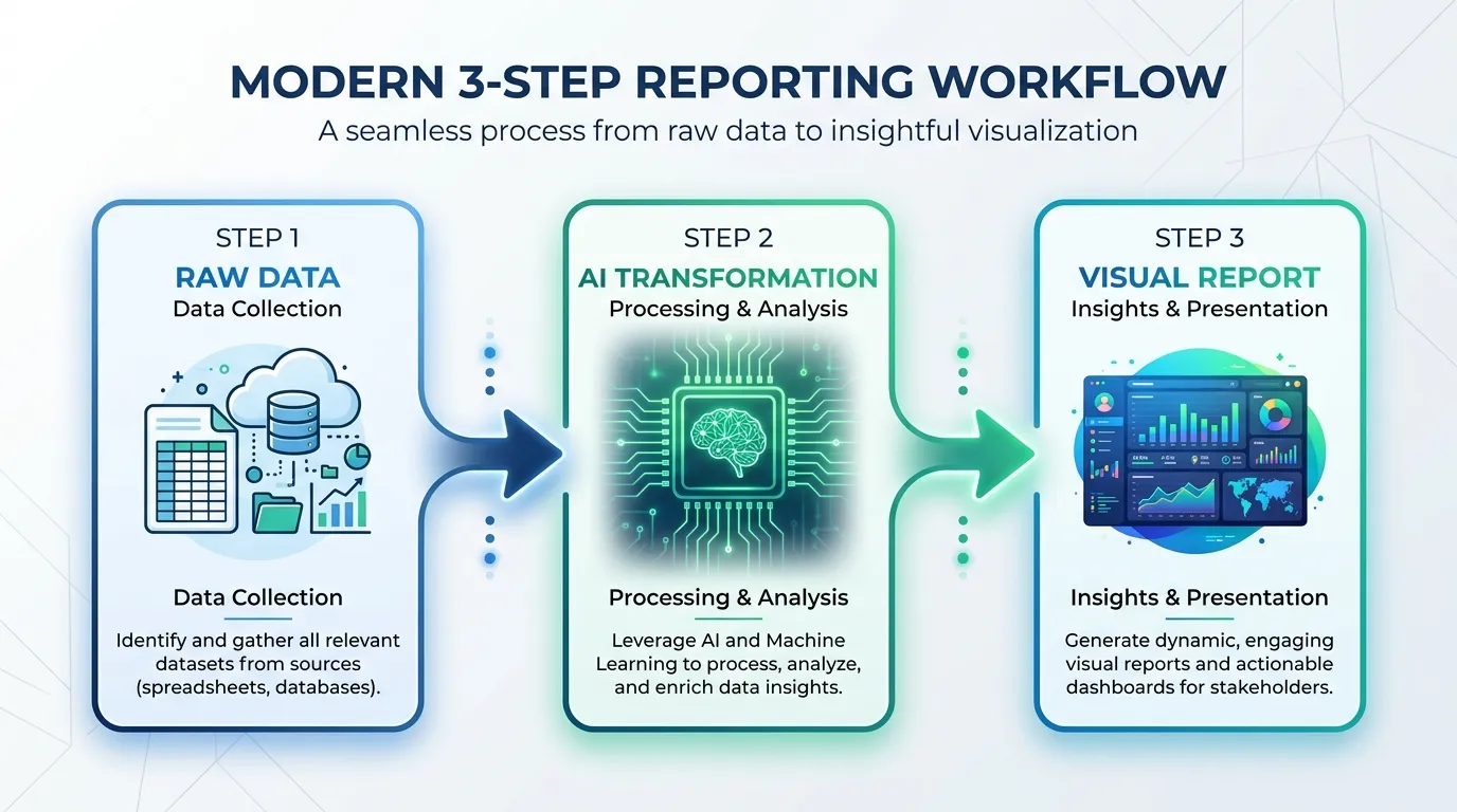
Step-by-Step Guide: Automating Your Visual Reporting Workflow
Transitioning from a manual spreadsheet to a highly polished SEO infographic might sound intimidating, but it is actually much faster once you establish the workflow. Here is a step-by-step guide to building a scalable visual reporting system.
1. Define Your Core Audience and Metrics
Before you build anything, identify exactly who will be reading this report. Are you reporting to a Chief Marketing Officer, a local business owner, or a product manager? Ask them directly what three metrics matter most to their success. Strip away everything else.
2. Standardize Your Data Extraction
You need a repeatable process for pulling data. I recommend setting up a basic Looker Studio dashboard or a Semrush custom report strictly for your own internal use. Set it up to automatically email you a PDF summary on the 1st of every month. This will serve as the raw data source that you will eventually visualize.
3. Draft the Narrative Bullet Points
When you receive your raw data, spend 15 minutes reviewing it. Do not just copy the numbers. Write down the story.
- What was the biggest win?
- What caused the biggest dip?
- What are the next steps?
Draft these as concise, impactful bullet points.
4. Leverage AI for Visual Generation
This is where the magic happens. Instead of opening a complex design tool and spending three hours aligning text boxes and charting graphs, take your drafted narrative and plug it into a specialized AI tool. By using the Compare Top Picks 2026 for infographic generation, you can transform your text directly into a structured visual asset. Paste your bullet points, select a professional corporate template style, and let the AI generate the layout, icons, and data visualizations.
5. Review and Refine
AI is incredibly powerful, but you are the expert. Review the generated SEO infographic. Ensure the color coding makes sense (e.g., green for positive growth, red for declines). Verify that the primary revenue metric is the largest and most prominent visual element on the page. Make minor text adjustments to ensure the tone matches your brand.
6. Distribute with Context
Never just attach an image to a blank email. When you send your visual report, include a brief, friendly summary in the email body.
“Hi Team, attached is the visual SEO summary for March. We hit a major milestone with a 22% increase in organic revenue, largely due to the new backlink campaign. Let me know if you’d like to jump on a 10-minute call to discuss next month’s targets.”
The Hidden Benefit: Visual Reporting as a Link Building Asset
Here is a strategy that very few marketers utilize: the data you compile for your internal reporting can often be repurposed for external marketing.
If you manage SEO for a SaaS company, you are likely sitting on a mountain of fascinating industry data. How has search volume for your niche changed over the last year? What are the most common technical errors you see in your industry?
When you get comfortable creating visual reports, you can start turning this proprietary data into public-facing infographics. These assets are incredibly powerful for acquiring high-quality backlinks. Journalists and bloggers love citing original data, but they rarely want to read a spreadsheet. If you provide them with a beautiful, embedded visual, they are far more likely to link back to your site as the source.
If you want to dive deeper into this specific tactic, I highly recommend reading our guide on Build Backlinks Faster Today. It will change how you view your monthly data gathering process.
Frequently Asked Questions (FAQ)
Q: How long should an ideal SEO report be?
A: Your report should be as short as possible while still conveying the necessary business impact. For an executive audience, a one-page visual summary or an SEO infographic is perfect. If you must provide deeper technical details, keep the primary narrative to one page and attach a secondary appendix for those who want to dig into the raw data.
Q: Do I need a graphic designer to create visual SEO reports?
A: Not anymore. While having a dedicated designer is great, it is entirely unscalable for monthly reporting. Modern AI-powered tools allow you to convert your text and data directly into professional visual formats without any prior design experience.
Q: What is the most common mistake marketers make when reporting on SEO?
A: The biggest mistake is reporting on technical outputs instead of business outcomes. Stakeholders do not care that you “fixed 45 broken canonical tags.” They care that your technical fixes resulted in a 10% increase in indexed pages, which drove 500 new visitors and generated $2,000 in new sales. Always tie your actions to revenue.
Q: How often should I send these visual reports?
A: Monthly reporting is the industry standard and generally provides the best balance. Weekly SEO reporting is often too noisy, as search rankings fluctuate naturally. Quarterly reporting is too infrequent and can lead to stakeholders feeling disconnected from your day-to-day progress.
Q: Can I use automated dashboards instead of infographics?
A: You can, but they serve different purposes. Dashboards are excellent for internal tracking and giving specialists a place to investigate data. However, when presenting to leadership or clients, an infographic provides a curated narrative that ensures your audience focuses exactly on the insights you want them to see, rather than getting lost in interactive filters.
Conclusion
The era of the dense, unreadable SEO report template is over. If you want to be viewed as a strategic partner rather than an expendable vendor or a technical cost center, you must change how you communicate your value.
Data is only as powerful as the story it tells. By adopting visual SEO reporting, you simplify complex metrics, accelerate decision-making, and prove your ROI in a format that anyone can understand. Transitioning to this model requires a shift in mindset—you have to stop hiding behind rows of data and start standing behind clear, visual narratives.
If you are tired of spending hours every month wrestling with spreadsheets and building slide decks that no one reads, it is time to upgrade your workflow. Start leveraging AI to transform your monthly metrics into stunning, high-impact visuals. Head over to InfoAIGraphic today, input your key monthly wins, and let our tool generate an SEO infographic that will finally get your stakeholders paying attention to your hard work.