AI in healthcare infographic: Simplify Medical Data
Use ai in healthcare infographic workflows to translate complex clinical data into clear visuals your audience understands quickly and trusts. Read more!

AI in Healthcare Infographic Guide: How to Simplify Complex Medical Data
You’re staring at a 30-page clinical study PDF. It’s dense, packed with p-values, Kaplan-Meier curves, and paragraphs of regulatory-approved jargon.
Your job? Turn it into a LinkedIn post or a patient education one-pager that people will actually read.
If you’re a healthcare marketer or content lead, you know this pain intimately. You can’t just “dumb it down”-that risks non-compliance or inaccuracy. But if you post the wall of text, your audience scrolls right past.
For years, the solution was hiring a specialized medical design agency. You’d pay $5,000, wait three weeks, and go through four rounds of redlines just to fix a typo in the disclaimer.
This is where the “ai in healthcare infographic” workflow changes the game.
I’ve spent the last few years building tools for this exact problem. I’ve seen teams go from “we can’t visualize this, it’s too complex” to publishing high-fidelity, compliant infographics in minutes.
In this guide, I’ll walk you through how to use AI to turn dense medical data into clear visual stories-without sacrificing accuracy or blowing your budget.
The “Accuracy vs. Engagement” Gap
Healthcare marketing has a unique friction point that B2B SaaS or e-commerce doesn’t face.
On one side, you have Compliance. Your medical directors and legal teams need every claim to be precise. They love text because text is safe. It’s precise.
On the other side, you have Human Biology. Our brains process visuals 60,000 times faster than text. According to research cited by PhotoShelter, articles with images get 94% more views than those without.
When you rely solely on text to explain a Mechanism of Action (MOA) or a new treatment protocol, you are asking your audience to do heavy cognitive lifting. Most won’t do it.
The old way to bridge this gap was expensive manual design. The new way is AI-assisted visualization. But you have to do it right.
What Is AI in Healthcare Infographic Generation?
When we talk about using AI for healthcare infographics, we aren’t talking about asking ChatGPT to “draw a doctor.” That results in weird hands and hallucinations.
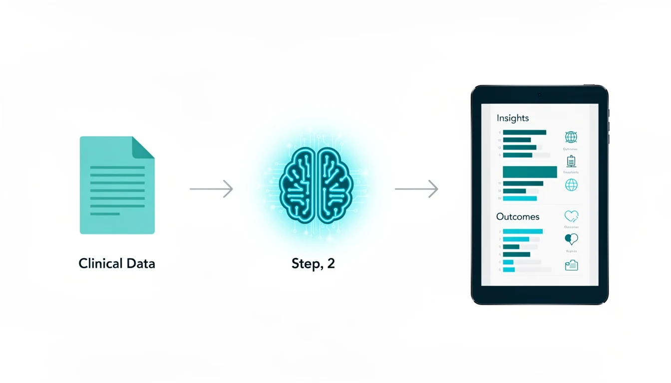
We are talking about structured data visualization workflows.
This involves using AI to:
- Parse complex medical text (like a whitepaper or study abstract).
- Extract the key data points (statistics, comparisons, process steps).
- Map those points into a visual framework (a timeline, a comparison chart, or a flow diagram).
It’s less about “generating art” and more about “structuring information.”
Why this matters for B2B Healthcare
If you are selling to hospital admins or procurement teams, they are overwhelmed. Demand Gen Report’s 2024 findings show that B2B buyers specifically want less sales messaging and more research-backed data. They want the facts, fast.
An AI-generated infographic allows you to give them that “snackable” insight immediately, respecting their time while establishing your authority.
3 Strategic Benefits for Medical Content Teams
1. Speed to Market (Newsjacking Clinical Data)
When a competitor releases data at a conference (like ASCO or HIMSS), speed is everything. Waiting two weeks for a designer means you miss the conversation. With AI tools, you can take a press release, generate a comparison infographic, and have it ready for medical review in under an hour.
2. Improving Health Literacy
This is personal for me. I’ve seen how confused patients get with standard brochures. A study published by Butler University found that using infographics significantly improved patient recall of health information compared to text alone. AI allows you to create these aids for every condition, not just the flagship ones with big budgets.
3. Repurposing High-Value Content
You likely have webinars, whitepapers, and case studies gathering dust. You can feed the transcripts of these assets into an AI tool to generate:
- Timelines of patient recovery.
- Statistical highlights for social media.
- Process maps for insurance reimbursement.
Ready to try this workflow? Try InfoAIGraphic free and turn your top article into an infographic in under 2 minutes.
The Elephant in the Room: Compliance & Accuracy
I talk to healthcare founders every week, and their #1 fear is: “What if the AI hallucinates a medical claim?”
They are right to be worried. A survey by Klick Health revealed that 65% of pharma marketers distrust AI for compliance submissions.
Here is the golden rule for using AI in healthcare: AI is the Drafter; You are the Auditor.
Never use an “end-to-end” generator that publishes directly to the web without human eyes. Instead, use a “Human-in-the-Loop” workflow:
- Source Control: Only provide the AI with your approved claims (the source text).
- Visual Verification: Use tools that keep the text editable. If the AI shortens “Type 2 Diabetes Mellitus” to “Diabetes,” you need the ability to change it back instantly if your legal team requires the full phrasing.
- Citation Layer: Ensure your infographic template has a dedicated footer for references. AI often forgets this; you must not.
Step-by-Step: Creating Your First AI Healthcare Infographic
Here is the exact workflow I use when turning a medical paper into a visual.
Step 1: Isolate the “Visualizable” Data
Don’t paste the whole PDF. Copy the specific section you want to visualize.
- Good: The “Results” section showing a 20% reduction in symptoms vs. placebo.
- Bad: The entire 5-page introduction about the history of the disease.
Step 2: Choose the Right Structure
Medical data usually falls into three buckets. Pick the template that matches your data:
- Comparison: (e.g., Drug A vs. Standard of Care).
- Process: (e.g., The 5 Steps of Mechanism of Action).
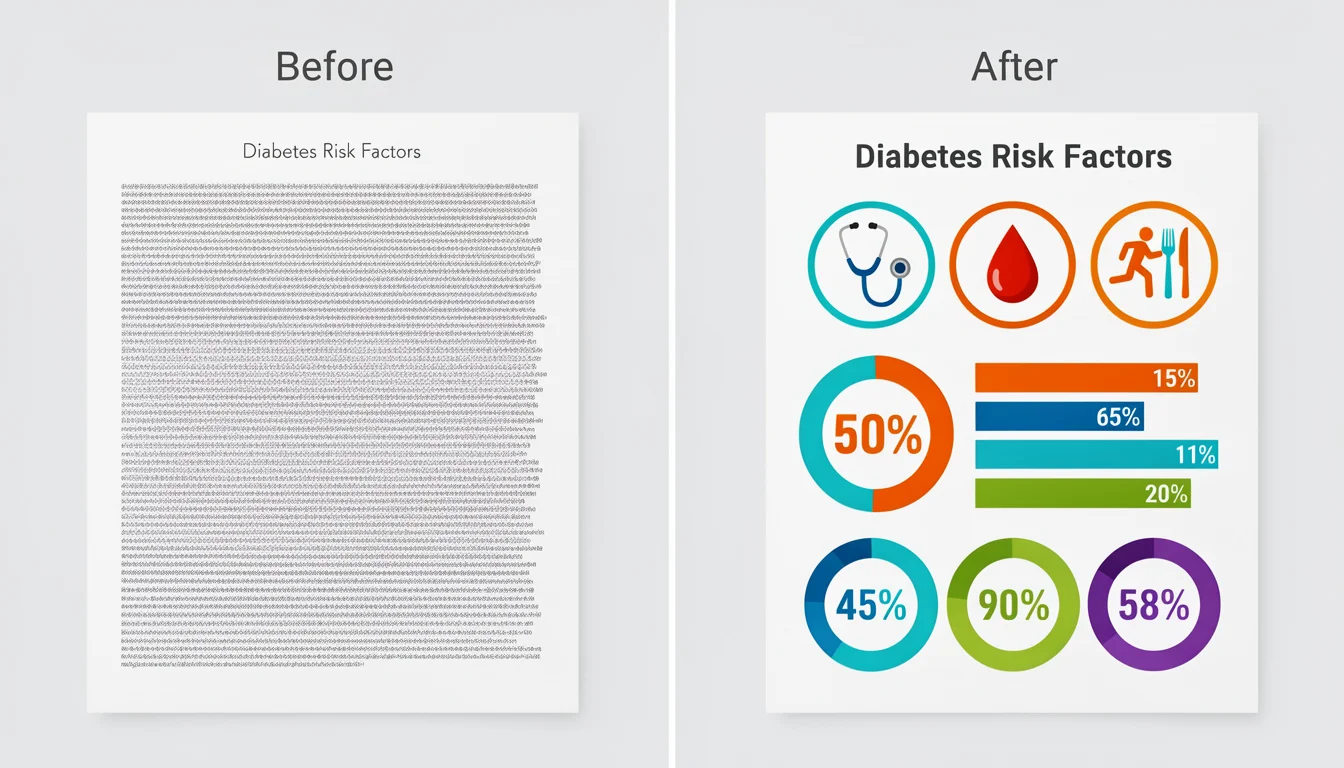
- List: (e.g., 4 Risk Factors for Hypertension).
For more on selecting the right tools for this, check out our AI Tools for Infographic Creation guide.
Step 3: Generate and Refine
Paste your text into the tool. Let the AI propose a layout.
- Founder Tip: Look at the icons first. AI sometimes picks generic “medical” icons. If you are discussing “Cardiology,” ensure it didn’t use a “Brain” icon. Swap them out immediately.
Step 4: The “Medical Review” Audit

Before you export, do the “Red Pen” test:
- Are the units correct? (mg vs. mcg matters!).
- Is the p-value accurately stated?
- Are the disclaimer and safety information (ISI) visible?
Step 5: Export and Alt-Text
Export as a high-res PNG. When you upload it to your site or LinkedIn, write detailed Alt Text.
- Why? HubSpot’s research consistently shows that accessibility improves SEO. Plus, in healthcare, you must ensure visually impaired patients can access the data via screen readers.
Generate your first AI infographic from a blog post with InfoAIGraphic - no design skills required.
Design Principles for Medical Data
When using AI, you often get a choice of color palettes. In healthcare, aesthetics are secondary to clarity.
1. Color Psychology: Avoid “alarmist” red unless you are specifically highlighting a danger or risk. Blue and Green are industry standards because they convey trust and health. See our deep dive on Best Infographic Colors Psychology for more on this.
2. White Space is Safety: In consumer marketing, you might pack an infographic with fun illustrations. In healthcare, clutter looks suspicious. It looks like you’re hiding the fine print. Use generous white space to signal transparency.
3. Data visualization > Decoration: If you have a chart, make sure the Y-axis starts at zero. AI might auto-crop charts to look “dramatic.” Always manually correct this to avoid misleading data visualization-a huge compliance no-no.
Common Mistakes to Avoid
In my testing of hundreds of AI-generated healthcare visuals, here is where people fail:
1. Ignoring the “ISI” (Important Safety Information)
In pharma marketing, the “fair balance” rule applies. You cannot show the benefit without the risk. Fix: Always ensure your infographic has a dedicated “scrolling” section or a static footer that contains the required safety text.
2. Over-simplifying Medical Terminology
AI loves to simplify. It might change “Myocardial Infarction” to “Heart Attack.” Fix: While “Heart Attack” is better for patients, “Myocardial Infarction” might be required for a physician audience. Know your audience and edit the text accordingly.
3. Using “Scary” Visuals
I once saw an AI generate a “virus” icon that looked like a jagged, terrifying monster for a pediatric flu shot campaign. Fix: Swap scary icons for neutral, clinical, or friendly illustrations.
FAQ
Q: Can AI really replace a medical illustrator? A: For complex anatomical drawings (like a detailed surgery guide), no. You still need a specialized human illustrator. For data visualization, charts, patient checklists, and summaries? Yes, AI is faster and often just as effective.
Q: How do I ensure my AI infographic is HIPAA compliant? A: Never put Protected Health Information (PHI) into a public AI tool. Only visualize de-identified or aggregate data. If you are visualizing a specific patient case study, ensure all names and identifiers are removed before you input the text.
Q: Is ai in healthcare infographic generation expensive? A: Compared to agencies, it is incredibly cheap. Most tools cost a monthly subscription (often under $50/month) versus $2,000+ per project for an agency.
Q: Can AI-generated infographics rank in Google? A: Yes, if they are helpful. Google ranks content that satisfies user intent. An infographic that quickly explains a complex medical topic is high-value. Just ensure you wrap it in a blog post with good text context (like the one you are reading!).
Q: How long does it take to create an infographic with ai in healthcare infographic tools? A: Once you have your source text ready, the generation takes about 2 minutes. The editing and review process might take another 10–15 minutes. It’s a drastic reduction from the traditional multi-week workflow.
Conclusion
The goal of using “ai in healthcare infographic” tools isn’t to cut corners on quality. It’s to free up your brain space.
If you spend 10 hours formatting a PowerPoint slide, that’s 10 hours you aren’t spending on strategy, talking to patients, or researching the market.
By using AI to handle the structure of your visual content, you can focus on the substance-the medical accuracy and the patient impact.
Start small. Take one existing blog post or patient brochure. Run it through a tool like InfoAIGraphic, audit the output for accuracy, and see how much faster you can get critical information into the hands of the people who need it.
Share this article

Mateoo
Founder of InfoAIgraphic
Building the fastest way to turn text into viral infographics. Helping creators and businesses scale their visual content without design skills.
Related Articles

Mental health infographic: Design for Clarity and Impact
Create a mental health infographic that communicates sensitive topics clearly, builds trust, and increases shares without overwhelming your audience. Read more!

YouTube Video Summarizer API Key: The Founders Guide to AI Infographics
Discover how a YouTube video summarizer API key transforms long content into stunning AI infographics. Learn workflows, prompt engineering, and visual data
How to Edit Text in Image Files: The Founder’s Guide of Infographic Design 2026
Learn how to edit text in image files using AI. Discover how marketers extract data from static visuals and turn them into dynamic, stunning infographics.