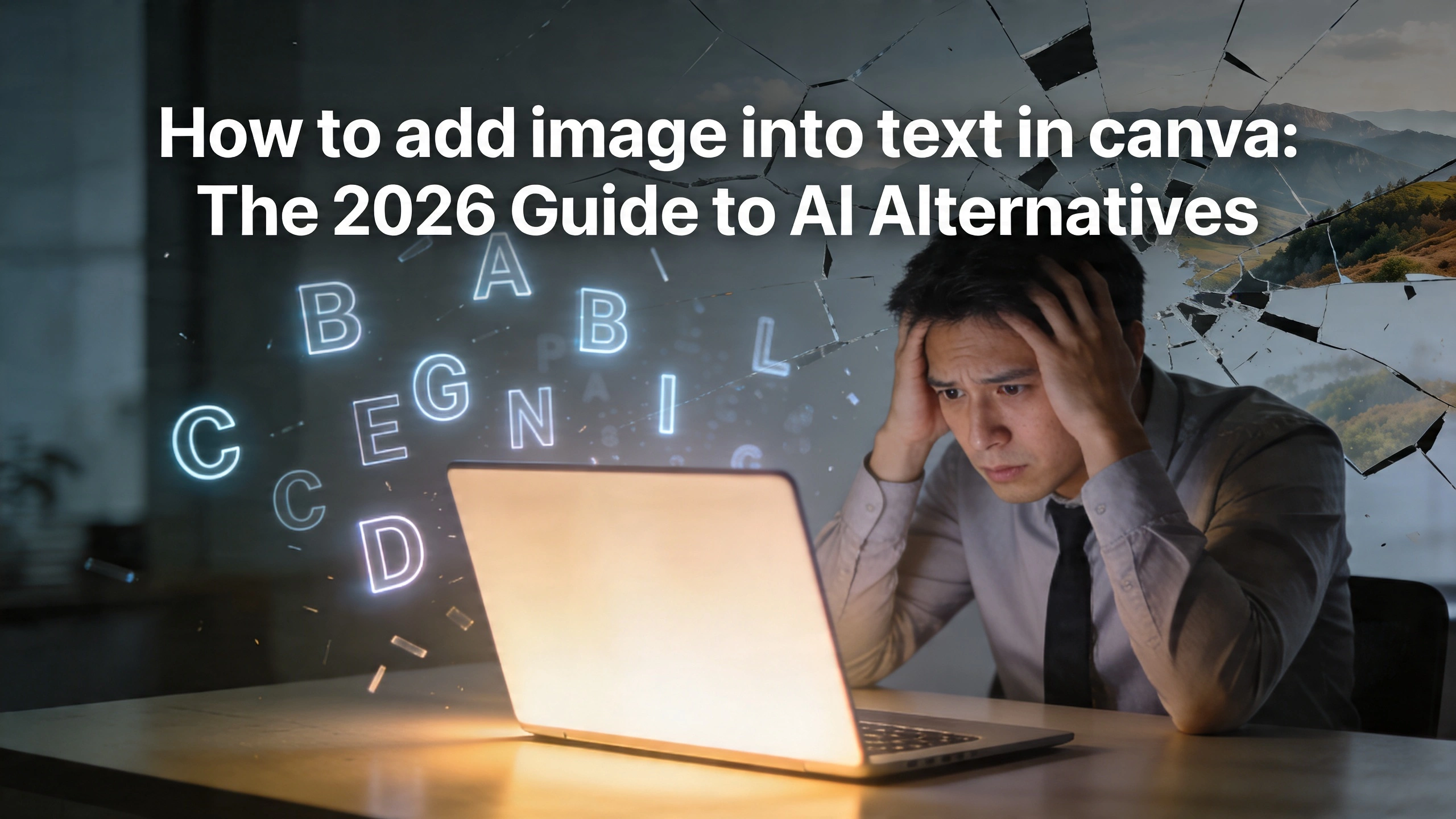
How to add image into text in canva: The 2026 Guide to AI Alternatives
When I first started building InfoAIGraphic, I spent hours shadowing marketing teams to see exactly where their creative bottlenecks were hiding. I watched brilliant product owners and seasoned content marketers lose entire afternoons to incredibly repetitive tasks. One of the most common, frustrating requests I saw designers struggling with was a seemingly simple visual effect: masking a photograph inside typography.
Marketers consistently search for how to add image into text in canva because they want that striking, premium look for their blog headers, pitch decks, and social media graphics. They see big brands using bold, image-filled typography to grab attention, and they want to replicate that aesthetic. But what they don’t realize until they are knee-deep in the interface is how intensely manual that process actually is on traditional drag-and-drop platforms.
You aren’t just clicking a button. You are dragging individual letter frames, painstakingly aligning them, dropping the same image into every single letter, and manually scaling the background so it looks like one continuous photograph. If you need to change the word from “GROWTH” to “SCALING” an hour later? You have to delete everything and start completely from scratch.
As a founder focused on scaling visual content through artificial intelligence, I knew there had to be a better way. Modern marketing demands speed, flexibility, and absolute precision. You cannot afford to spend twenty minutes on a single word when you have an entire campaign to launch.
In this comprehensive guide, I am going to walk you through the legacy method of masking text so you understand the mechanics of the problem. Then, I will show you why marketing teams are aggressively abandoning these manual workflows in favor of smarter solutions. Finally, we will explore the best canva alternatives available today, and how you can use AI to bypass the busywork entirely.
Key Takeaways
- The manual method is fundamentally broken for scaling: Executing the steps for how to add image into text in canva requires dragging individual letter frames and manually aligning background images, making edits and template reuse virtually impossible.
- Marketing efficiency demands better tooling: Producing high-volume visual content requires transitioning away from traditional drag-and-drop editors to AI-powered generators that handle complex design styling instantly via text prompts.
- Data visualization needs narrative focus, not technical tweaking: The fastest canva alternative for infographics allows your team to focus on the story and the data, letting the AI construct the typography, masking, and layout in seconds.
The Hidden Cost of Manual Visual Production
To understand why simple design requests cause so much friction, we have to look at the sheer volume of assets marketing teams are expected to produce in 2026. You are no longer just making one hero image for a blog post. You are adapting that image for LinkedIn, formatting it as a square for Instagram, turning it into a tall graphic for Pinterest, and embedding it into an email newsletter.
When we talk about what exactly constitutes visual content, we are referring to everything from complex infographics and data charts to memes, GIFs, and beautifully typography-driven hero images. The demand for these assets has skyrocketed. Audiences have become heavily visually oriented, and if your content looks like a wall of text, your bounce rate will immediately reflect that lack of engagement.
But creating these visuals manually comes with a hidden cost: your team’s time.
When your marketing team is bogged down trying to figure out how to perfectly align a sunset photo inside a ten-letter word on a legacy design platform, they are not strategizing. They are not writing better copy. They are not analyzing campaign data. They are functioning as pixel-pushers.
This dynamic directly impacts your bottom line. Industry leaders are constantly emphasizing a sharp focus on marketing efficiency, which measures how well a team uses its budget, time, and resources to achieve maximum results at minimal cost. If your most expensive talent is spending hours nudging digital letters a few pixels to the left or right, your efficiency is plummeting. You are paying for strategy and getting manual labor.
The Legacy Approach: How to add image into text in canva
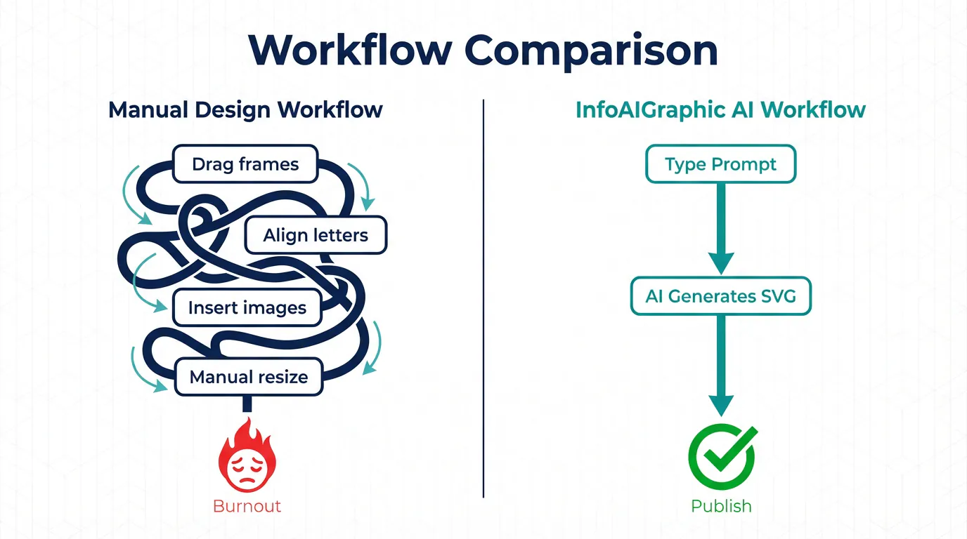
Because it remains one of the most highly requested tutorials, I want to break down exactly what it takes to execute this technique using traditional, manual design platforms. Understanding the specific mechanics of this workaround highlights exactly why it fails at scale.
If you are using that famous Australian legacy design tool, there is no native “text mask” feature where you can simply type a word and drop an image onto it. Instead, you have to use a workaround involving shape frames. Here is the exact, manual process:
- Open a Blank Canvas: Start by creating a new design file in your preferred dimensions.
- Navigate to the Elements Tab: Go to the side panel and search for “Frames.”
- Find the Alphabet Frames: You will need to scroll down past the basic circles, squares, and phone mockups until you find the individual letter frames.
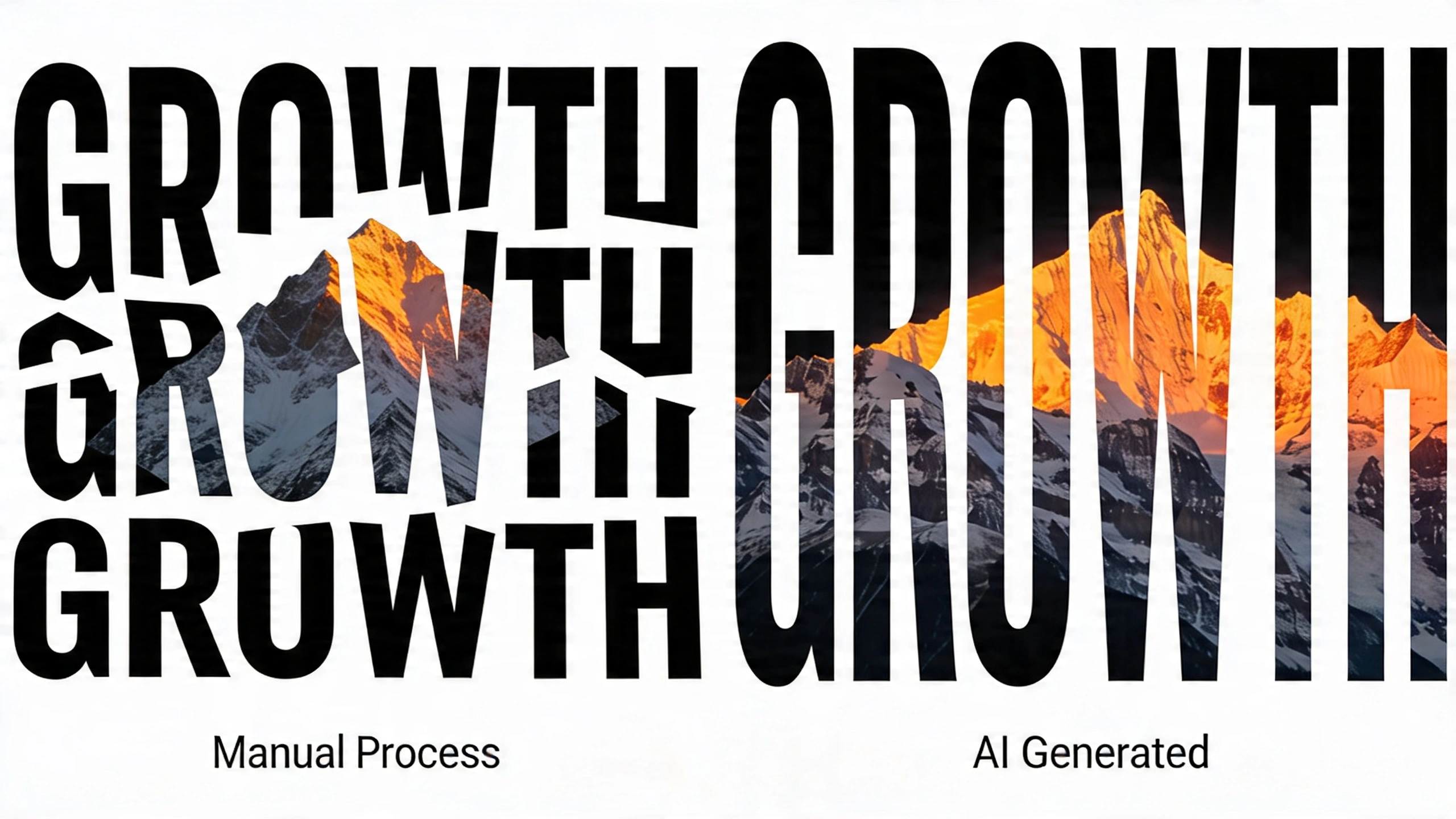
- Drag Each Letter Individually: If the word you want to create is “INNOVATION,” you must find the I, drag it to the canvas. Find the N, drag it to the canvas. Find the N again, drag it. You do this for all ten letters.
- Manually Adjust Kerning: Because these are individual shapes and not actual typography, they do not automatically space themselves. You must manually drag each letter to ensure the gap between the ‘I’ and the ‘N’ matches the gap between the ‘T’ and the ‘I’. If you resize one letter, you have to carefully resize all the others to match.
- Upload Your Target Image: Bring your desired background photograph (for example, a vibrant city skyline) into your media library.
- Populate the Frames: Drag the city skyline image into the first ‘I’. Then drag it again into the ‘N’. Repeat this ten times.
- The Nightmare of Alignment: At this point, the skyline is repeating ten separate times, once inside each letter. It looks disjointed and chaotic. To fix this, you must double-click the first ‘I’, scale the skyline image up so it covers the physical width of the entire word “INNOVATION,” and position it to the far left. Then, double-click the ‘N’, scale the image up to the exact same size, and position it slightly to the left. You must repeat this exact sizing and positioning ten times, hoping you don’t misalign a single pixel, so that the city skyline looks like one continuous photograph spanning across the word.
If reading that process felt exhausting, imagine executing it on a tight deadline.
Now, imagine your creative director reviews the graphic and says, “Actually, let’s change the word from INNOVATION to DISRUPTION.”
Because you used individual shape frames rather than editable text, you cannot simply highlight the word and type a new one. You have to delete the entire word, hunt down the new letters from the Elements tab, realign the kerning, drop the image into the new letters, and manually resize the background all over again.
This rigid, non-destructive workflow is exactly why manual design tools break down in high-velocity marketing environments. They were built for hobbyists making one-off graphics, not for marketing teams managing agile, data-driven campaigns.
Why Marketing Teams Are Seeking Faster Methods
When you multiply the friction of that single text-masking task across an entire content calendar, you begin to see why burnout is so prevalent in creative teams.
Modern marketing campaigns are incredibly iterative. You might want to A/B test five different hero images with five different keywords. If producing a single masked header takes twenty minutes, producing five takes over an hour and a half. That is simply not sustainable.
Furthermore, B2B companies are dealing with highly complex narratives. Building a robust B2B content marketing pipeline requires creating educational, authoritative assets that explain difficult concepts clearly. You need diagrams, workflow charts, and heavy data visualization. You do not have the luxury of wasting time on decorative text formatting.
The shift we are seeing in 2026 is a move from manual creation to programmatic generation. Marketing teams want to define the logic of the design, and let an engine handle the rendering.
If you want a deeper dive into the broader landscape of how AI is replacing manual software, you can review our Best ai infographic generator: Compare Top Picks 2026 to see how modern tools stack up. The consensus is clear: if a tool makes you drag individual letters onto a canvas to create a text mask, it is obsolete.
Evaluating the Fastest Canva Alternative for Infographics
When marketing teams realize the limitations of their current software, the immediate next step is searching for canva alternatives. However, simply switching to another traditional drag-and-drop editor doesn’t solve the core issue. Moving to a different manual platform just gives you a different interface for doing the exact same tedious work.
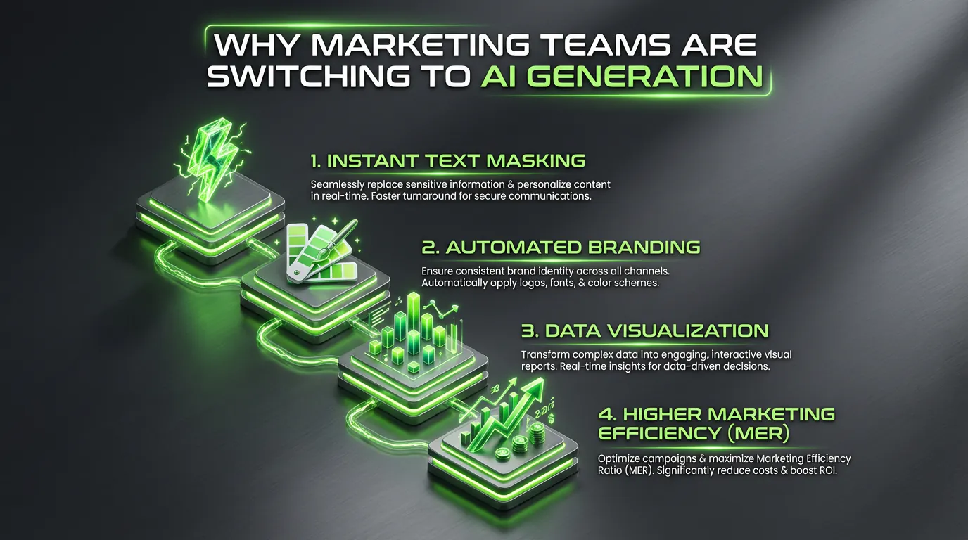
To truly fix the bottleneck, you need an AI-native solution. You need a platform where you type a prompt, supply your data, and receive a finished, fully-formatted visual asset.
At InfoAIGraphic, we built our engine specifically to be the fastest canva alternative for infographics and data-heavy visual content. We looked at the exact pain points marketers face—like text masking, data alignment, and brand consistency—and automated them completely.
Here is a breakdown of how a legacy, manual platform compares to an AI-driven generator like InfoAIGraphic when executing common marketing tasks:
| Feature/Task | Legacy Manual Platforms | InfoAIGraphic (AI Generator) |
|---|
| Masking Image into Text | Requires searching for letter frames, manual kerning, and repetitive image alignment. (10-20 mins) | Automated via prompt. Type the word and specify the image. AI generates the SVG clip path instantly. (5 seconds) |
| Editing Text After Masking | Impossible. Requires deleting frames and starting the process over from scratch. | Instant. Change the text string in the prompt, and the AI regenerates the masked graphic immediately. |
| Creating a 5-Point Infographic | Requires dragging 5 text boxes, finding 5 icons, aligning them to a grid, and formatting colors. | Paste your 5 bullet points into the engine. AI selects icons, structures the layout, and applies your brand palette. |
| Data Visualization (Charts) | Requires manually typing numbers into a clunky mini-spreadsheet to generate a basic chart. | Paste raw CSV data. AI interprets the data, selects the best chart type, and styles it to fit the overall graphic. |
| Brand Consistency | Relies on the human user remembering to apply the correct hex codes and brand fonts every time. | Hardcoded into your workspace. The AI strictly adheres to your predefined typography and color rules automatically. |
When you review this table, the choice becomes obvious. Choosing an AI alternative isn’t just about getting a cool new tool; it is about protecting your team’s bandwidth. For those migrating away from slower tools, check out our dedicated guide on Finding the Best Alternatives to Infography.in for Scalable Visual Content to ensure you pick a platform that actually solves your scalability issues.
Step-by-Step Guide: Generating Masked Text and Infographics with AI
Let’s look at how this modern workflow actually functions in practice. If you want to achieve that premium, image-masked typography look without doing any of the manual labor, here is how you do it using an AI engine like InfoAIGraphic.
Step 1: Define Your Content and Brand Assets
Before you generate anything, ensure your brand workspace is set up. This means your core brand fonts, hex codes, and logo files are saved in the system. Unlike legacy tools where you apply these manually to every element, the AI will use this workspace as its baseline truth for every generation.
Step 2: Input Your Raw Text or Data
Navigate to the generation prompt box. Instead of looking at a blank canvas, you start with your content. Let’s say you are creating a header graphic for a new blog post about renewable energy. You simply type your headline: “The Future of Solar.”
Step 3: Write the Design Prompt
Next, you instruct the AI on how to treat that text. Your prompt might look like this:
“Create a wide header graphic. The primary text is ‘The Future of Solar’. Mask a high-quality, seamless photograph of a bright sun setting over solar panels inside this text. Keep the background a solid, dark brand blue so the masked text pops.”
Step 4: Generate and Review
Hit generate. In a matter of seconds, the engine processes your request. It dynamically creates true typography, generates an SVG clipping path around the font, fetches or generates the relevant solar panel image, and masks it perfectly across the entire phrase. The kerning is mathematically perfect. The image spans across the letters seamlessly.
Step 5: Iterate Instantly
If you look at the result and decide the word “Solar” should actually be “Wind Power”, you do not have to delete anything. You simply change the word in your prompt and click generate again. The AI recalculates the clipping paths and outputs a new version instantly.
Step 6: Export and Embed
Once you are satisfied, export the asset in your required format—whether that is a transparent PNG, a high-resolution JPEG, or a scalable vector graphic (SVG).
This workflow reduces a frustrating twenty-minute task into a five-second command. Budget-conscious teams should read our breakdown of the Free ai infographic generator: Top Tools for Marketers to see how accessible this technology has become for businesses of all sizes.
Advanced Data Visualization Tricks for 2026
While mastering typography tricks like masking is great for top-of-funnel engagement, true B2B marketing relies heavily on explaining complex information. This is where mastering the core principles of visual communication becomes critical.
Visual communication is not just about making things look pretty; it is about reducing cognitive load. When a potential buyer lands on your whitepaper, they do not want to read a wall of statistics about supply chain logistics. They want to see a flowchart, a timeline, or a data-rich infographic that makes the value proposition instantly clear.
If your team is stuck in manual design platforms, they will avoid creating these complex graphics because they take too long. A designer might spend three hours just aligning the nodes on a flowchart. Consequently, your marketing materials become text-heavy, boring, and ineffective.
By switching to AI generation, you remove the barrier to entry for complex data visualization. You can paste a block of dense text explaining a five-step customer onboarding process into InfoAIGraphic, and prompt the AI to turn it into a sequential timeline. The AI extracts the key steps, assigns relevant iconography, structures the layout logically, and formats it to your brand guidelines.
This enables you to experiment with formats you previously avoided. You can turn survey results into beautiful pie charts, transform dull product feature lists into engaging comparison tables, and summarize massive blog posts into highly shareable, bite-sized infographics for LinkedIn.
When you’re ready to tackle complex statistics, our How to explain data with infographics: B2B Playbook provides a complete strategic framework for turning raw data into compelling visual stories.
Measuring the Impact on Your Marketing Efficiency Ratio (MER)
As a founder or product owner, you might appreciate the time savings on a surface level, but you need to justify the transition technically. This is where understanding your Marketing Efficiency Ratio (MER) becomes highly relevant.
MER is a holistic metric that evaluates the overall effectiveness of your marketing spend compared to the revenue generated. While return on ad spend (ROAS) looks at specific campaign performance, MER looks at the big picture.
How does graphic design software impact your MER? It comes down to resource allocation and content velocity.
If you are paying a senior marketer $80,000 a year, their time is incredibly valuable. If they spend 15% of their week manually formatting blog graphics, fighting with letter frames to mask text, and nudging icons on infographics, you are bleeding resources. You are paying a premium salary for low-leverage, manual labor. This drives up your operational costs without proportionally increasing your output, thereby lowering your overall marketing efficiency.
By adopting AI-driven canva alternatives, you reclaim that 15%. That marketer can now use those hours to spin up entirely new campaigns, optimize email conversion sequences, or conduct deeper customer research. Your content velocity increases—you are able to publish four high-quality, visually engaging blog posts a week instead of two, driving more organic traffic and generating more leads, all without increasing your headcount.
When your output increases and your operational friction decreases, your MER improves. You are getting more results from the exact same team.
At InfoAIGraphic, I hear this exact feedback from our power users constantly. They didn’t just buy a tool to make infographics; they bought an engine that allowed their marketing team to finally operate at full capacity. They stopped worrying about the technical minutiae of graphic design and started focusing purely on communication and strategy.
FAQ
Q: What is the exact workaround for how to add image into text in canva?
A: To mask an image inside text on traditional manual platforms, you must go to the elements tab, search for letter frames, and drag each letter of your word onto the canvas individually. You then upload your background image, drag it into every single letter frame separately, and manually resize and align the image inside each letter so it appears as one continuous graphic. It is a highly manual, tedious process that cannot be easily edited later.
Q: Are there better canva alternatives for large teams?
A: Yes. For teams that need to scale production, AI-powered platforms like InfoAIGraphic are significantly better alternatives. Instead of relying on manual drag-and-drop mechanics, these platforms use AI prompts to generate designs, mask text instantly via true SVG clipping paths, and automatically enforce brand guidelines across all outputs.
Q: Why shouldn’t I just use a professional tool like Photoshop to mask text?
A: While professional software like Photoshop handles text masking effortlessly through clipping masks, it introduces a massive learning curve. Most marketing teams, copywriters, and product owners do not have the time or expertise to learn complex Adobe software just to create a blog header. AI generators bridge this gap by offering professional-level output through simple, natural language prompts.
Q: How does the fastest canva alternative for infographics handle brand assets?
A: The best AI platforms use a centralized brand workspace. You upload your fonts, specific hex codes, and logos once. When the AI generates an infographic or a piece of typography, it strictly pulls from this predefined logic, ensuring that every asset your team produces is 100% compliant with your visual identity without requiring manual oversight.
Q: Can AI generators handle complex data sets or just text formatting?
A: Advanced tools like InfoAIGraphic excel at data visualization. You can input raw CSV data or dense paragraphs of text, and the AI will analyze the information to construct appropriate charts, timelines, or step-by-step infographics, handling all the layout, alignment, and icon selection automatically.
Conclusion
The way we produce visual content has fundamentally changed. The days of accepting clunky, manual workarounds to achieve simple design effects are over. Searching for how to add image into text in canva will show you exactly how much time you are wasting on tasks that should be instantaneous.
As a marketer, your primary job is to communicate value, tell compelling stories, and drive action. Every minute you spend dragging letter frames across a screen is a minute stolen from your actual goals. By embracing the fastest canva alternative for infographics, you empower your team to scale their output, maintain pristine brand consistency, and focus entirely on strategy.
Stop pushing pixels manually. It’s time to let AI handle the rendering so you can focus on the results. Try InfoAIGraphic today and experience the future of visual content generation.


