Finding the Best Alternatives to Infography.in for Scalable Visual Content
As the founder of InfoAIGraphic, I spend a lot of time talking with marketing directors, product owners, and content strategists. A common theme always comes up: creating compelling visual assets takes entirely too long.
You have incredible data. You have a great story. But turning that raw text into an engaging, professional infographic often grinds your content pipeline to an absolute halt. If you have been searching for the best alternatives to infography.in, you are likely feeling this exact friction right now.
A lot of marketers start with basic online design platforms because they promise a quick win. They offer a web-based interface for throwing some graphics together. But as your team scales and your content demands increase, you start hitting walls. You find yourself spending an hour nudging text boxes, aligning icons by hand, and struggling to make complex data look clean.
This guide is designed to help you rethink your workflow. I will walk you through why modern marketing teams are moving away from manual template editors, how to evaluate the right AI tools for your team, and exactly how to build a scalable, high-quality visual content machine.
Key Takeaways
- Workflow speed is everything: Relying on basic template manipulation limits how much content your team can ship. Automating the layout process saves hours per campaign.
- True AI understands data: The most effective alternative tools do not just give you a blank canvas; they interpret your raw information and generate logical, structured layouts automatically.
- Consolidation saves budget: Moving away from fragmented systems and embracing a single, intelligent data-to-visual pipeline reduces both agency costs and internal friction.
The Visual Bottleneck in Modern Marketing
Before we look at specific infography.in alternatives, we need to address why this conversation is even happening. Marketing teams are under immense pressure to produce more content across more channels than ever before.
According to HubSpot’s State of Marketing, the demand for visual content shows absolutely no sign of slowing down. Audiences simply do not have the attention span to read three-thousand-word whitepapers without visual breaks. They want summaries. They want data points. They want clean, easy-to-digest infographics.
But how do most teams currently build these assets?
They usually rely on a highly fragmented process. A copywriter drafts the text. A marketer reviews it and tries to condense it into bullet points. Then, the text gets handed off to a designer—or a marketer acting as a designer—who opens up a traditional web-based graphic tool.
This person then spends hours dragging and dropping elements, fighting with snap-to-grid features, and searching for the right vector icons.
Why Standard Visual Processes Fail
The main issue with this workflow is cognitive overload. When you force a marketer to focus on graphic design micro-adjustments, they stop focusing on the narrative.
They worry about whether the blue circle aligns perfectly with the text box, rather than whether the data point actually makes sense to the reader. As highlighted by Gartner’s marketing research, marketing leaders are consistently being asked to do more with less budget, making these inefficient workflows a massive liability.
When you use rigid template platforms, you are forced to fit your unique data into someone else’s pre-designed box. If your data has five points, but the template only has four sections, you have to manually redesign the layout. This is not just annoying; it is fundamentally unscalable.
Why Marketers Seek Infography.in Alternatives
When evaluating the market for design software, it becomes clear why search volume for an ai infographic tools comparison is rising. Teams are hitting the ceiling of what basic tools can provide.
Here are the primary reasons I hear from product owners and marketing managers who are actively looking to switch their tech stack.
Template Fatigue and Brand Dilution
Your audience is smart. When you use the same exact template library that thousands of other companies are using, your content starts to look generic. It loses its stopping power in a crowded social media feed.
You want to stand out, but building custom layouts from scratch in a basic editor takes too much time. You need a system that generates unique, brand-aligned structures on the fly, without relying on static templates.
The Speed Limit of Manual Adjustments
Time is the most expensive resource in your marketing department. If an infographic takes three hours to build, that represents hundreds of dollars in labor costs.
You can see this sentiment echoed in Forbes Innovation discussions regarding marketing efficiency. If you want to run agile campaigns, you cannot afford a three-day turnaround time for a single social media graphic. You need a tool that turns text into a finished graphic in minutes, not hours.
The Demand for True Data-to-Visual Logic
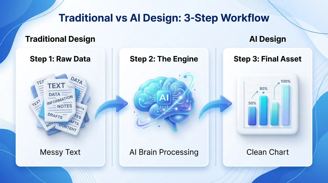
Many legacy tools call themselves “smart,” but they still require you to do all the heavy lifting. They do not read your text. They do not understand that a chronological list should probably be a timeline. They do not recognize that comparing two products should automatically generate a comparison matrix.
This is where true AI design tools step in. They bridge the gap between raw data and visual layout logic.
When you decide to move on from your current setup, you essentially have three paths you can take. Each has its own set of trade-offs regarding cost, speed, and quality.
Path 1: Manual Vector Design (Figma, Adobe Illustrator)
The traditional route is to bring everything in-house using professional, industry-standard vector software.
The Pros:
You have absolute, pixel-perfect control over every single element. If you can dream it, you can design it.
The Cons:
The learning curve is incredibly steep. These tools are built for professional graphic designers, not marketing managers. Creating an infographic in Illustrator can easily take an entire day. Plus, the software licenses can be expensive, and it completely bottlenecks your workflow if only one or two people on your team know how to use the software.
Path 2: Heavy Agency Outsourcing
If you do not want to design it yourself, you can pay someone else to do it.
The Pros:
Zero internal design time required. You hand over the brief, and eventually, you get a polished asset back.
The Cons:
Agencies are expensive and slow. You might wait a week for the first draft, only to spend another week going back and forth on revisions. For high-level brand identity work, agencies are fantastic. For churning out weekly data visualizations and blog graphics, they are entirely too slow and cost-prohibitive.
Path 3: Dedicated AI Generation (InfoAIGraphic)
This is the sweet spot for modern marketing teams. AI-driven platforms are designed specifically to eliminate the friction between having data and having a visual asset.
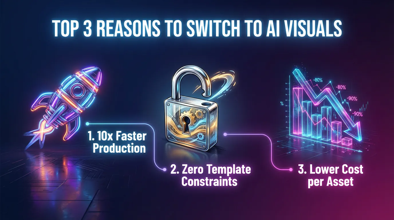
The Pros:
Incredible speed. You input your raw text, data, or links, and the AI generates a structured, well-designed infographic almost instantly. It handles the layout, the iconography, and the color palettes. Finding the best ai infographic generator is about matching your tool to your team’s specific output needs, and a dedicated AI workflow offers the highest ROI for daily content creation.
The Cons:
You have to learn how to write effective prompts. AI requires clear instructions. If you feed it garbage data, it will generate a confusing graphic.
To make this crystal clear, I have put together a breakdown of how these different methodologies compare for a standard marketing team.
| Feature / Methodology | Traditional Vector Tools (Illustrator) | Basic Drag & Drop Editors | AI Generation (InfoAIGraphic) |
|---|
| Primary User | Graphic Designers | Marketers / Admins | Marketers / Content Teams |
| Time to Final Asset | 4 to 8 hours | 1 to 3 hours | 2 to 5 minutes |
| Data Interpretation | None (100% manual) | None (100% manual) | High (AI structures the data) |
| Layout Flexibility | Infinite | Low (Rigid templates) | High (Dynamic generation) |
| Learning Curve | Extremely Steep | Moderate | Low (Prompt-based) |
| Cost per Asset | High (Labor/Hourly rate) | Medium (Labor time) | Low (Subscription scale) |
As you can see, when looking for the best alternatives to infography.in, the goal is not just to find another drag-and-drop tool. The goal is to fundamentally change how the work gets done.
The Psychology of Visual Learning in B2B
Why are we obsessing over infographics in the first place? Because the human brain demands them.
The Content Marketing Institute repeatedly emphasizes that B2B audiences crave educational, easy-to-skim formats. Your buyers are busy executives, project managers, and founders. They do not have time to read a wall of text.
When you present data visually, you reduce the cognitive load on your reader. Cognitive load refers to the amount of working memory resources used. Heavy text requires high cognitive load. A clean, structured infographic requires very little.
If you want your audience to remember your core value proposition, you have to show it to them, not just tell them. This is why having a rapid visual production pipeline is a revenue-generating asset, not just a marketing vanity metric.
Step-by-Step Guide: Scaling Visuals with an AI Workflow
If you are ready to transition away from manual tools and build a faster, smarter content engine, you need a process. You cannot just buy a new software subscription and hope for the best. You have to train your team on a new way of thinking.
Here is the exact step-by-step workflow I recommend for teams moving to InfoAIGraphic or similar AI platforms.
1. Consolidate Your Raw Source Material
Stop writing infographic copy from scratch. Instead, look at the assets you already have. Do you have a high-performing blog post? A recent webinar transcript? A massive annual industry report? Gather these raw materials. The beauty of AI is that it can process large amounts of unstructured text. You do not need to perfectly format the data before you begin.
2. Define the Narrative Goal
Before you open the software, decide what the graphic is supposed to achieve. Is it a step-by-step tutorial? A statistical summary? A pros and cons list? Knowing the structure helps you write a better prompt.
3. Craft the AI Prompt
This is the most critical step in the new workflow. Instead of dragging shapes onto a canvas, you are instructing the AI.
A good prompt looks like this:
“Take the following survey data about remote work. Summarize it into 5 key statistics. Create a modern, professional infographic using a blue and gray color palette. Use clear, corporate iconography and arrange the data in a vertical list format.”
4. Generate and Route
Hit generate. The AI will parse your data, select appropriate icons, balance the whitespace, and output a completed graphic. If you are just dipping your toes into automated design, you might start by looking for a free ai infographic generator to practice this prompting phase before committing to a full enterprise workflow.
5. Iterative Refinement
The AI will get you 90% of the way there in seconds. Now, you act as the editor. You review the output. Maybe you want to swap out one specific icon, or tweak a headline for better SEO. Because the foundation is already built, these edits take minutes instead of hours.
6. Multi-Channel Distribution
Once the asset is finalized, it is time to deploy. Slice the infographic into a carousel for LinkedIn. Embed the full version in your blog post. Add snippets to your email newsletter. Because it took you five minutes to create the asset, you now have the time and energy to actually distribute it properly.
Real-World Use Cases for AI Visuals
To truly understand the power of upgrading your visual stack, let’s look at how different marketing segments apply this AI-first approach.
B2B Reporting and Case Studies
Imagine you are a product marketing manager who just received the quarterly performance metrics. The sales team needs a one-pager to show prospects how much time your software saves.
In the old system, you would submit a ticket to the design team and wait. In the new system, you paste the raw metrics into InfoAIGraphic, prompt it to create a “Before and After” comparison matrix, and have a polished sales enablement asset ready for the afternoon meeting.
LinkedIn and Instagram algorithms heavily favor swipeable carousel posts. But creating ten perfectly aligned, visually cohesive slides is a nightmare in basic template editors. By utilizing an AI workflow, you can input a long-form article and instruct the system to break it down into a multi-slide visual story automatically.
Internal Team Alignments
Not all visual content is for external marketing. Sometimes, you just need to explain a complex new internal process to your own company.
For complex project reporting, an AI timeline generator simplifies how you communicate deadlines and milestones to your stakeholders. You just feed it the dates and descriptions, and it handles the visual spacing and layout.

Overcoming Common Data Visualization Roadblocks
Even with the best tools, marketers often stumble over common data visualization mistakes. Upgrading your software won’t fix a fundamentally flawed strategy. Here are a few pitfalls to avoid as you scale your output.
Trying to Show Everything at Once
The biggest mistake marketers make is cramming too much data into a single image. Just because you have fifty data points does not mean they all belong in one graphic.
Good design requires negative space. It requires breathing room. If you overwhelm the viewer, they will simply scroll past. Use AI to distill your information. Ask the tool to “extract only the top three most surprising statistics.” Less is almost always more.
Ignoring Brand Consistency
When moving fast, it is easy to accidentally generate graphics that look like they came from five different companies. You must establish strict brand guidelines within your AI tool. Set your hex codes, choose your approved typography, and ensure every output adheres to that visual identity. Consistency builds trust over time.
Forgetting the Call to Action (CTA)
Every piece of content you create should have a job to do. If someone reads your infographic and loves it, what are they supposed to do next?
Always ensure your visual assets include a clear next step. Whether it is a URL at the bottom, a prompt to download a full report, or a simple request to share the post, do not leave your audience hanging.
The Financial ROI of Upgrading Your Workflow
Let’s talk about the actual financial impact of switching your software stack. Marketing is ultimately a math equation. Customer Acquisition Cost (CAC) versus Lifetime Value (LTV).
McKinsey’s insights on AI reveal that generative technology has the potential to add trillions in value to the global economy, specifically through marketing and sales efficiency. But how does that apply to your budget?
Let’s run a hypothetical scenario.
Assume your marketing team produces 10 infographics a month.
Using a manual drag-and-drop editor, it takes roughly 2 hours per infographic. That is 20 hours of labor a month. If your marketing manager’s time is valued at $50 an hour, that is $1,000 a month spent just pushing pixels around a screen.
Now, imagine switching to an AI generation tool. The time per infographic drops to 10 minutes. That is roughly 1.5 hours of labor a month, or $75.
You just saved over $900 a month in operational friction. More importantly, you freed up 18 hours of your marketer’s time to focus on strategy, distribution, and relationship building—the things that actually drive revenue.
Building a Scalable Asset Library
Once you have your creation pipeline optimized, you need to manage your assets properly. Creating graphics quickly is great, but if nobody can find them three months later, you lose a massive amount of compound value.
To keep your campaigns organized, an AI Schedule Maker is invaluable. You need a centralized hub where all generated visuals are tagged, categorized, and easily searchable by the rest of the team.
When the sales team needs a specific graphic about cybersecurity compliance, they should not have to ping you on Slack. They should be able to search the library, grab the high-resolution asset, and drop it into their pitch deck instantly.
FAQ
As teams evaluate the best alternatives to infography.in, several common questions pop up. Here is a clear, honest breakdown of what you need to know.
Q: Do I need to be a prompt engineering expert to use AI infographic tools?
A: Not at all. While writing clear instructions helps, platforms like InfoAIGraphic are built specifically for marketers, meaning the underlying system already understands basic design principles. You just need to speak plainly about the data and the goal, and the tool does the heavy lifting.
Q: Will AI-generated graphics look like obvious, generic AI art?
A: This is a valid concern, but it applies mostly to raw image generators, not data visualization platforms. A dedicated infographic generator uses clean vector icons, structured typography, and precise alignment to create highly professional, corporate-ready assets that look hand-crafted by a designer.
Q: How does the AI handle highly complex or sensitive company data?
A: You are in total control of what data you feed into the prompt. The AI acts as a layout engine, structuring the text you provide. For sensitive internal reporting, you simply input the sanitized metrics, and the software organizes them logically without storing or distributing your proprietary information externally.
Q: Can I edit the infographic after the AI generates it?
A: Yes, absolutely. The generation phase gets you 90% of the way there, but you always have the ability to click into the design, rewrite a header, swap an icon, or adjust a color. It is a collaborative workflow, not a locked final file.
Q: Is it actually faster than just using a pre-made template?
A: Yes. Templates require you to manually format your text to fit the specific constraints of the design. AI adapts the design to fit your text. That fundamental flip in logic is what saves you hours of frustrating manual adjustments.
Conclusion
The marketing landscape is incredibly competitive, and your audience’s attention is harder to capture than ever. Relying on slow, rigid, manual design processes is no longer sustainable if you want to scale your output and maintain quality.
When searching for the best alternatives to infography.in, look beyond simple drag-and-drop interfaces. Look for intelligent systems that understand your raw data and instantly translate it into compelling visual narratives. By embracing an AI-driven workflow with InfoAIGraphic, you stop wasting time acting as an amateur graphic designer, and you start operating as a high-level strategic marketer. Stop wrestling with templates and let the AI do the heavy lifting for your next campaign.


