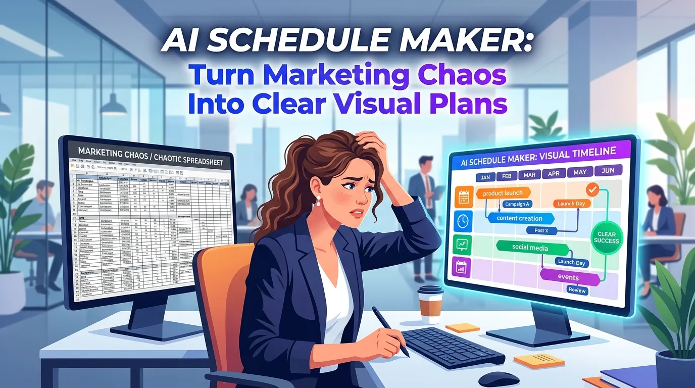
AI Schedule Maker: Turn Marketing Chaos Into Clear Visual Plans
I have sat through more painful Monday morning alignment meetings than I care to count. You probably know the exact type of meeting I am talking about. The project manager pulls up a massive spreadsheet with 400 rows of tasks, color-coded in a way that only makes sense to them. The marketing team squints at the screen, trying to figure out when the email copy is actually due, while the product owner quietly checks out and starts answering Slack messages.
We try to organize our brilliant, creative marketing campaigns using tools built for accountants. It is a fundamental mismatch. When you are launching a new product feature, coordinating a multi-channel holiday campaign, or running an intensive SEO sprint, your team does not need another grid of text. They need a map. They need to see the entire landscape of the project at a single glance.
This exact frustration is why I became obsessed with the intersection of artificial intelligence and data visualization. Building the InfoAIGraphic platform taught me that the bottleneck in modern marketing is rarely a lack of ideas—it is a lack of shared understanding. We generate massive amounts of data, but we fail to translate it into a format our teams can actually digest.
This is where adopting an AI schedule maker changes everything. By instantly transforming raw dates and tasks into a digestible, visually engaging timeline, you remove the friction of project planning. You stop managing spreadsheets and start managing outcomes.
In this comprehensive guide, I am going to walk you through exactly why visual planning is replacing text-heavy project management, how to choose the right tools, and the exact step-by-step workflow you can use to automate your schedule creation.
Key Takeaways
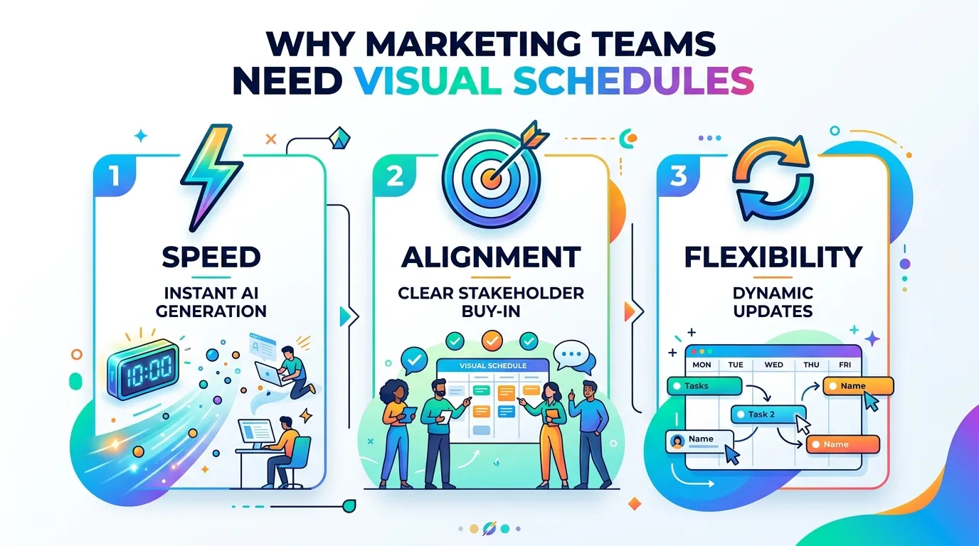
- Visuals drive alignment: Humans process visual timelines infinitely faster than text rows. Moving to a visual schedule eliminates the “I didn’t know that was due today” excuse.
- AI eliminates the design bottleneck: You no longer need to wait three days for a graphic designer to make your project roadmap look presentable. AI tools generate these instantly from raw text.
- Static templates are dead: Traditional visual schedule templates force your data into a rigid box. Generative AI adapts the design to fit the unique shape and flow of your specific project data.
The Psychological Burden of Text-Heavy Planning
Before we talk about the technology, we need to talk about human behavior. Why do standard project management grids fail marketing teams so consistently?
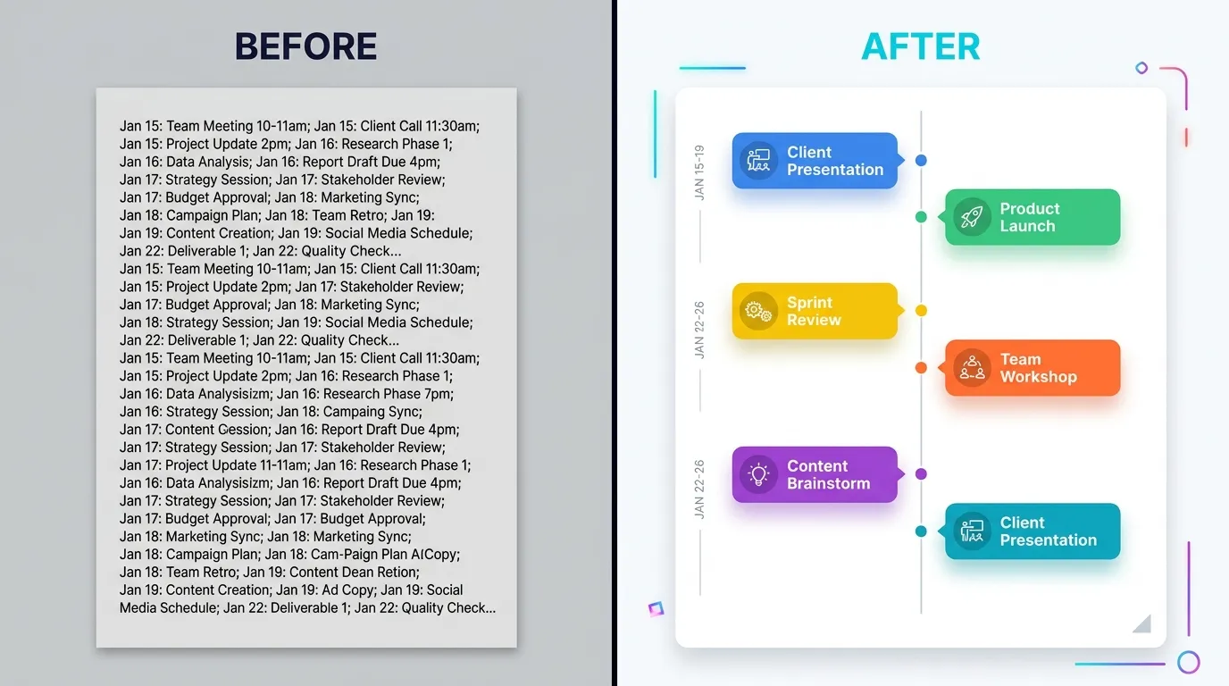
It comes down to cognitive load. When I look at a spreadsheet, my brain has to do a massive amount of computational work. I have to read a start date in column C, hold that date in my working memory, read an end date in column D, calculate the duration, and then mentally map that duration against the five other tasks assigned to me in rows 12 through 17.
This mental gymnastics exhausts your team before the actual work even begins. When stakeholders are overwhelmed by information, they simply stop reading it. They miss deadlines not out of malice, but out of cognitive fatigue.
Visual communication solves this immediately. When you look at a beautifully designed timeline, you do not have to calculate durations or overlap. Your visual cortex does it for you automatically. You instantly see that the “Content Drafting” block overlaps heavily with the “Graphic Design” block, signaling a need for tight collaboration.
This is not just my personal theory. According to Forbes, visual communication acts as a strategic advantage, helping leaders cut through the noise and directly counter workplace information overload. When you present a plan visually, you turn abstract concepts into tangible realities that your team can actually grasp and rally behind.

Enter the AI Schedule Maker
For years, we knew that visual schedules were better. The problem was the execution.
If you wanted a beautiful, highly readable project timeline for your quarterly kickoff presentation, you had two bad options. Option one: you wrestle with generic presentation software, manually dragging little colored rectangles around a slide for three hours until it looks decent. Option two: you submit a ticket to your internal design team, wait a week, and then realize the dates have already changed and the graphic is outdated.
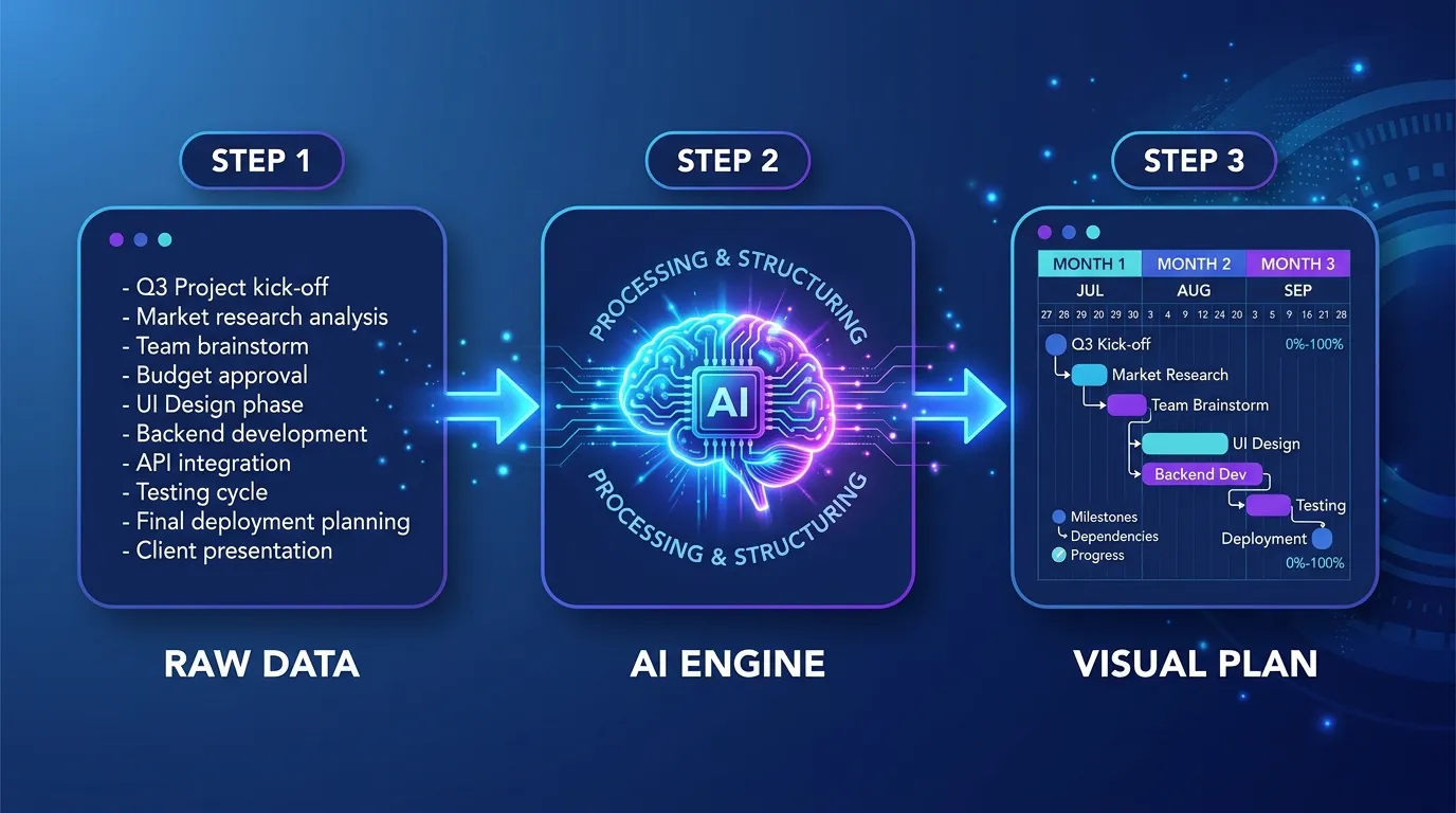
An AI schedule maker fundamentally breaks this compromise. It allows you to input your raw, messy project data—often just pasting a list of milestones or a rough text outline—and it automatically generates a structured, beautifully formatted visual timeline in seconds.
The business impact of this is massive. By removing the manual labor from content and planning creation, teams can move incredibly fast. McKinsey research on generative AI highlights that AI can increase the productivity of the marketing function by up to 15% of total marketing spending. A huge portion of that productivity comes from automating the tedious operational tasks—like formatting schedules and updating roadmap graphics—so your team can focus on execution and strategy.
How It Changes the Workflow
When I talk to marketing directors using InfoAIGraphic, the most common feedback I hear is how much their internal communication has improved.
Instead of walking into a stakeholder meeting and reading down a bulleted list of launch dates, they drop a stunning visual roadmap onto the screen. The conversation immediately shifts. Executives stop asking granular, confusing questions about dates and start asking strategic questions about sequencing and resource allocation.
As noted in Harvard Business Review’s breakdown of why visualizations work, the ability to create smart visual data is no longer a nice-to-have skill for managers—it is an absolute must-have for making sense of complex work. If you cannot visualize your schedule, you cannot effectively lead the project.
Comparing Your Schedule Creation Options
To truly understand the value of an AI-driven approach, we need to look at how it stacks up against the legacy methods you are probably using right now. It is easy to stick with the devil you know, but the hidden costs of manual planning are draining your team’s resources.
Below is a breakdown of how different approaches to schedule visualization compare across key business metrics.
| Method | Setup Time | Design Flexibility | Update Speed | Visual Impact | Best Use Case |
|---|
| Spreadsheets (Excel/Sheets) | 10 Minutes | Extremely Low (Grid only) | Fast | Very Poor | Budget tracking, deep data storage |
| Traditional PM SaaS | 1-2 Hours | Low (Rigid Gantt charts) | Fast | Average | Granular daily task tracking for developers |
| Manual Graphic Design | 3-5 Hours | Very High | Extremely Slow | Excellent | High-stakes annual shareholder decks |
| AI Schedule Maker | 2 Minutes | High (AI adaptive layouts) | Instant | Excellent | Marketing roadmaps, content plans, agile sprints |
The Problem with Traditional “Visual Schedule Templates”
Look at the table above. You might be wondering about standard design software. Why not just buy a pack of visual schedule templates and fill them in yourself?
I strongly advise against this approach for one simple reason: your project data never fits the template perfectly.
A static template might have space for five milestones in a linear progression. What happens when your project has seven milestones, and two of them happen simultaneously? You end up spending an hour trying to resize text boxes, nudging graphics around, and breaking the alignment of the original template.
An intelligent AI schedule maker does not use rigid templates. It uses dynamic frameworks. When you input your data, the AI analyzes the length of your text, the number of milestones, and the chronological relationships between them. It then generates a layout specifically optimized for that exact data set. If you add a new milestone later, the entire visual smoothly rebalances itself.
This dynamic adaptability is exactly why I recommend reading our guide on the AI timeline generator: Best B2B Workflow for Teams to see how this flexibility practically applies to long-term B2B planning.
Step-by-step guide: Creating Your First AI Visual Schedule
If you are ready to transition away from spreadsheets and start presenting your plans visually, here is the exact framework I use and teach to our users.
This workflow will take you from a messy brain dump to a boardroom-ready visual schedule in a matter of minutes.
1. Consolidate Your Raw Project Data
Do not worry about formatting yet. Your first goal is simply to get all the dates, milestones, and task owners out of your head and into a single text document.
I usually start with a basic bulleted list. Write down the core phases of your project. For a marketing campaign, it might look like this:
- Phase 1: Research and Ideation (Oct 1 - Oct 10)
- Phase 2: Asset Creation and Copywriting (Oct 11 - Oct 25)
- Phase 3: Review and Compliance (Oct 26 - Oct 31)
- Phase 4: Multi-channel Launch (Nov 1)
- Phase 5: Post-Launch Optimization (Nov 2 - Nov 15)
Keep the descriptions concise. A visual schedule should be a map, not a novel. If you have paragraphs of text explaining a single phase, you are defeating the purpose of visualization.
2. Identify the Core Narrative
Every schedule tells a story. Before you generate the visual, ask yourself what the most important takeaway is for your audience.
Are you trying to show executives that the launch date is aggressive but achievable? Are you trying to show the design team that their workload is heavy in week two but lightens up in week three?
Knowing this helps you guide the AI. If the focus is on deadlines, you want a timeline-centric layout. If the focus is on team hand-offs, you want a phase-based workflow layout.
3. Prompt the AI Schedule Maker
Now, bring your text into your AI generation tool. (If you want a detailed comparison of the current market leaders, check out our Best ai infographic generator: Compare Top Picks 2026 post).
The secret to getting a perfect result on the first try is writing a clean, direct prompt. Do not just paste the text and hit enter. Give the AI context.
Example Prompt:
“Act as an expert project manager. Take the following marketing campaign milestones and generate a professional, modern visual schedule. Use a horizontal timeline layout. Color code the phases to show progression from planning (cool colors) to execution (warm colors). Keep the text minimal and focus on readability for an executive audience. [Insert Data]“
4. Review and Refine the Output
The AI will generate your visual schedule in seconds. Review it critically.
Did it handle overlapping dates correctly? Is the text legible if this graphic is scaled down in an email or a Slack message?
The beauty of an AI tool is that making changes requires zero design skills. If the timeline feels too cluttered, you don’t have to manually delete elements. You simply prompt the tool again: “This is too crowded. Please group Phase 1 and Phase 2 together under a single ‘Pre-Launch’ milestone to simplify the view.”
If you want to understand how this iterative refinement scales across a whole content department, you should explore our playbook on Text to infographic ai: Scale B2B Content Faster Now.
5. Distribute for Alignment
A visual schedule is useless if it lives in a silo. Export your generated timeline as a high-resolution PNG or PDF.
Embed it directly into the top of your strategy documents. Pin it to your project Slack channel. Make it the first slide in your kickoff deck. The goal is to make this visual the single source of truth for the entire team. Because it is highly readable, stakeholders will actually reference it daily instead of asking you for updates.
Scaling Visual Communication Across Your Department
Once you realize how fast you can turn data into visuals using an AI schedule maker, you will start seeing opportunities to visualize everything. This is a good instinct.
Visual content dominates modern marketing not just for external audiences, but internally as well. HubSpot’s marketing statistics consistently show that visual content (like video and images) provides the highest ROI because it maximizes engagement. That exact same principle applies to internal team engagement. If you want your team to be engaged with a project, you have to present it visually.
Here are a few advanced ways marketing leaders are using AI schedule generation to scale their impact:
Rethinking Client and Executive Reporting
If you work at an agency, or if you report to a demanding C-suite, you know the dread of the monthly reporting meeting. You present a massive document full of metrics, and the stakeholders glaze over.
Instead of just showing what happened, show them what is happening next visually. Generate a clean schedule of next month’s initiatives and place it right next to this month’s results.
We actually wrote an entire breakdown on this specific use case. If you struggle with stakeholder pushback, read Why Your Current SEO Report Template Is Failing (And How Visual Reporting Fixes It). Visuals build trust because they project competence and clarity.
Managing Agile Marketing Sprints
Agile marketing requires incredible speed and adaptability. If your visual roadmap takes hours to update, you will never update it, and your team will quickly fall out of sync.
Because an AI schedule maker can regenerate a timeline instantly based on new text inputs, it perfectly complements the agile methodology. After your bi-weekly sprint planning meeting, you can take the sprint notes, feed them into the AI, and have a fresh, updated visual sprint schedule pinned in Slack before the team even gets back to their desks.
This rapid iteration cycle is exactly what technology analysts are pointing to for the future of work. As highlighted by Gartner regarding top AI innovations, the focus of enterprise AI is shifting heavily toward operational scalability and real-time intelligence. Using AI to instantly visualize operational shifts is a prime example of this trend in action.
The Future of Project Visualization
We are rapidly moving away from the era where “data visualization” meant a pie chart in Excel. As AI models become deeply integrated into our daily workflows, the expectation for how we communicate complex plans is shifting.
In the near future, bringing a text-only schedule to a strategic meeting will be viewed the same way we currently view bringing a handwritten ledger to a financial review. It will look outdated, inefficient, and unprofessional.
The teams that adopt AI schedule generation now are giving themselves a massive communication advantage. They spend less time managing the formatting of their plans and more time actually executing them. They suffer from fewer missed deadlines because everyone physically sees the deadlines. They experience less friction with leadership because the roadmap is transparent and easily digestible.
You do not need to be a graphic designer to be a great visual communicator anymore. You just need the right AI partner, clear project data, and the willingness to leave the spreadsheet grid behind.
FAQ
Q: What exactly is an AI schedule maker?
A: It is an intelligent software tool that takes raw project data—like text lists, dates, and milestones—and automatically designs a formatted, professional visual timeline or roadmap without requiring any manual graphic design work.
Q: How does it differ from a standard project management app?
A: Standard PM apps (like Jira or Asana) are built for granular, day-to-day task tracking and often produce very rigid, complex Gantt charts. An AI schedule generator is built for communication and high-level alignment, creating flexible, presentation-ready visuals designed for stakeholders to understand instantly.
Q: Can I customize the output if the AI gets the design wrong?
A: Absolutely. Most advanced tools allow you to iterate through conversational prompts (e.g., “make the colors match our corporate branding” or “group the last three items together”) or use a drag-and-drop editor to tweak the generated results.
Q: Will this replace my existing task management software?
A: No, it acts as a companion. You will still use your PM tool to assign daily tickets to your team, but you will use the AI generator to create the high-level visual roadmaps you share in pitch decks, executive summaries, and kickoff meetings.
Q: Is my proprietary project data secure when generating these visuals?
A: Security varies by platform, but reputable AI tools specifically built for enterprise use employ strict data privacy guardrails and do not use your proprietary project timelines to train their public models. Always check the platform’s specific data policy before inputting sensitive launch dates.
Conclusion
Clarity is the ultimate currency in modern business. If your team cannot understand your schedule in five seconds or less, your schedule is failing you. We have spent too many years trying to force creative, dynamic marketing plans into the rigid, text-heavy boxes of traditional spreadsheets.
By leveraging an AI schedule maker, you empower yourself to communicate visually, instantly, and effectively. You eliminate the friction of manual design, bypass the limitations of static templates, and finally give your stakeholders a roadmap they can actually read and follow.
If you are ready to stop managing pixels and start leading projects, it is time to upgrade your workflow. Try feeding your next project outline into InfoAIGraphic and watch how quickly your team aligns when they can finally see the big picture.