How to Create an Infographic for Social Media in 2026
Learn a practical workflow for creating readable social media infographics, adapting formats, checking sources, and publishing accessibly in 2026.

How to Create an Infographic for Social Media in 2026
Try the workflow on your own content
Turn an article into a visual starting point with the blog-to-infographic workflow, or use the text-to-infographic workflow for notes, campaign briefs, and original copy. Eligible users can review a watermarked preview before deciding whether to unlock a clean HD export.
A useful social media infographic communicates one clear idea at feed speed. It does not need to contain the entire report, blog post, or campaign plan. It needs a focused promise, a readable hierarchy, trustworthy source material, and an aspect ratio that survives the platform’s crop.
This guide gives you a practical source-to-social workflow. It avoids promises about virality or guaranteed engagement because distribution depends on the audience, topic, timing, account, creative quality, and platform behavior. The goal is a visual that can be understood, checked, and reused.
Key takeaways
- Start with one audience action. Decide what viewers should understand or do after seeing the infographic.
- Build for the smallest realistic screen. If the body text requires zooming, the design is too dense.
- Use a hierarchy, not a transcript. A headline, one key message, and a few supporting points are usually stronger than a compressed article.
- Adapt the composition instead of stretching it. Square, portrait, and story formats need deliberate reframing.
- Publish accessibly. Use readable contrast, descriptive alt text, a useful caption, and source information where appropriate.
- Measure the intended outcome. Saves, qualified clicks, replies, or profile visits may be more useful than raw impressions.
Step 1: define the goal and audience
Start with a single sentence:
After seeing this infographic, the audience should understand [idea] and take [next step].
That sentence controls every later decision. An executive summary for LinkedIn should not use the same language as a classroom explainer for Instagram. A product process may need ordered stages, while a research finding may need one dominant number and a short interpretation.
Answer four questions before opening a design tool:
- Who is the primary viewer?
- What do they already know?
- What is the one useful takeaway?
- What action, if any, should follow?
Do not start by choosing colors or browsing templates. Those choices are easier after the communication problem is clear.
Step 2: reduce the source to a visual story
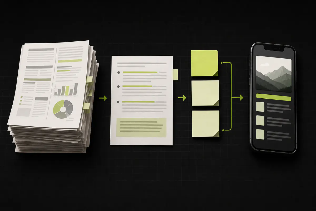
Most source material contains more detail than a social post can support. Extract the hierarchy instead of shrinking everything.
Use this content model:
- Hook: the audience-facing reason to stop.
- Key message: the conclusion the visual should establish.
- Support: three to five facts, steps, or examples that make the message credible.
- Context: a short qualifier, date, or source note when needed.
- Next step: one action that follows naturally from the content.
Keep related points together. If the source contains two separate arguments, make two graphics rather than forcing both into one crowded canvas. The infographic layout tips guide explains how grouping and reading order support scanning.
Choose the right story structure
| Content shape | Useful infographic structure | Example |
|---|---|---|
| Ordered actions | Process | Five stages of customer onboarding |
| Change over time | Timeline | Milestones in a product launch |
| Alternatives | Comparison | Manual workflow versus automated workflow |
| Several independent points | Informational list | Seven checks before publishing |
| A small set of meaningful numbers | Statistical summary | Quarterly support metrics |
| A system with levels | Hierarchical | Strategy, workstreams, and priorities |
The structure should explain the relationship between ideas. Decoration cannot repair an unclear relationship.
Step 3: design for mobile readability
Mobile readability is primarily a content decision. Large text cannot rescue a visual containing twelve long paragraphs.
- Use a short headline that remains clear without the caption.
- Give the key message the strongest visual weight.
- Keep body copy concise and use complete, plain-language phrases.
- Leave visible space between sections so the hierarchy survives a small screen.
- Use icons only when they clarify meaning; decorative icons add noise.
- Maintain strong contrast and avoid placing text over detailed imagery.
- Test the exported image on a physical phone before publishing.
The infographic best practices guide covers hierarchy and mobile review in more detail. For palette decisions, use the infographic color guide and verify contrast rather than relying on color preference alone.
Step 4: adapt the design to the platform
Social platforms accept a range of dimensions, and their presentation rules change. The safest approach is to check current official guidance and inspect the upload preview before publishing.
| Placement | Current official guidance | Practical design note |
|---|---|---|
| Instagram feed photo | Width between 320 and 1080 pixels; original resolution retained within supported ratios from 1.91:1 to 3:4 | Use 1080px width and keep essential content away from crop-sensitive edges |
| Instagram carousel | All selected items share one chosen orientation | Build every slide on the same canvas and make the first slide establish the promise |
| LinkedIn photo post | At least 552×276 pixels; LinkedIn recommends 1080px width; supported ratio ranges from 3:1 to 4:5 | A 4:5 portrait image gives professional content more vertical room in the feed |
| LinkedIn multi-image post | Up to 20 photos; the first image influences the rendered layout | Keep the first image legible by itself and preview the complete set before posting |
These specifications come from Instagram’s photo resolution guidance and LinkedIn’s photo-sharing guidance, reviewed in August 2026. Recheck them before production because platform requirements can change.
Reframe rather than resize
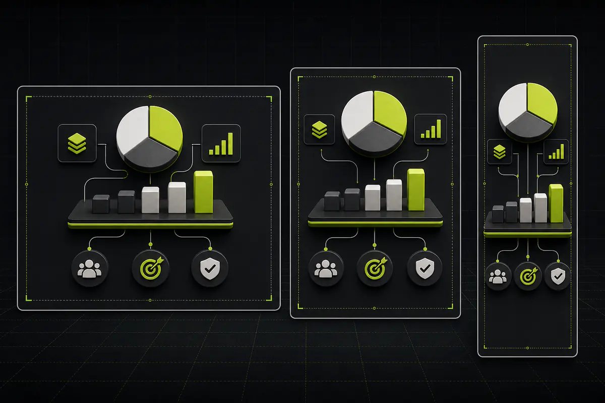
Simple resizing scales everything, including text, spacing, and details. Reframing preserves the idea while changing the composition.
For a square version, reduce the number of supporting sections. For a 4:5 portrait version, stack the hierarchy and use the extra vertical space. For a story-style canvas, keep interface safe areas clear and increase the distance between the opening hook and lower call to action.
Save a reusable content hierarchy, not one permanently fixed image. That makes adaptation faster without treating every platform as identical.
Step 5: verify facts, sources, and rights
An attractive error is still an error. Before publishing:
- Compare every number with the original source.
- Preserve dates, units, denominators, and qualifiers.
- Distinguish illustrative examples from measured results.
- Add a compact source line when a claim depends on external data.
- Confirm that you may use supplied logos, photos, icons, and quotations.
- Do not upload confidential information to a generation or design service.
- Keep the source URL or document in the campaign record so future updates are possible.
If AI helped summarize or structure the content, perform the same review. AI can accelerate a draft, but it does not replace source verification or editorial responsibility.
Synthetic worked example: turning a launch brief into a social infographic
Consider this fictional source:
Product Launch Readiness — Synthetic campaign brief. Product workstream: onboarding QA, import validation, and empty states. Go-to-market workstream: positioning, launch page, and sales enablement. Operations workstream: monitoring, support playbook, and escalation ownership. Decision gates: experience approved, launch assets ready, support coverage confirmed.
This is explicitly synthetic: it does not represent a customer, campaign, or measured outcome.
1. Define the goal
Help an internal launch team understand the three workstreams and the final decision gates.
2. Select the hierarchy
- Headline: Product launch readiness
- Three equal workstreams
- One compact decision-gate row
- No invented dates, percentages, or performance claims
3. Choose the social format
Use a 4:5 portrait layout for the primary post. If the copy becomes too dense, convert each workstream into one carousel slide and use the first slide as the overview.
4. Add the caption
The caption can explain why the framework matters and invite the team to review ownership. It should not repeat every label already visible in the graphic.
5. Review the result
Check the workstream names, reading order, mobile text size, source label, and whether the decision gates remain visible in the feed crop.
This example demonstrates a workflow, not engagement performance. Explore additional structures in the AI infographic examples guide.
Step 6: make the post accessible

Accessibility improves the experience for more people and forces useful design discipline.
Write descriptive alt text
Describe the purpose and essential information, not every decorative detail. For the synthetic example, useful alt text could be:
Product launch readiness infographic showing product, go-to-market, and operations workstreams followed by three decision gates.
If the graphic contains important details that do not fit naturally in alt text, include them in the post caption or linked page.
Do not rely on color alone
Use labels, icons, shapes, or position in addition to color. A green section and red section are not meaningful when color is the only distinction.
Check contrast and text size
Test the actual exported image on a phone, in bright and dim conditions. Make sure secondary labels remain readable and interactive platform overlays do not cover essential content.
Step 7: publish and measure the intended outcome
Write a caption that adds context instead of duplicating the infographic. A practical caption structure is:
- One sentence explaining the problem.
- One sentence describing what the visual contains.
- A short observation or lesson.
- One relevant next step.
After publishing, measure the result that matches the goal. For an educational post, saves and useful questions may matter. For a campaign asset, qualified clicks or sign-ups may matter. For an internal framework, replies and alignment may matter.
Do not treat one post as a universal test of the format. Record the topic, structure, aspect ratio, hook, distribution context, and outcome so future comparisons are meaningful.
Common mistakes to avoid
- Copying the complete article into the image. Extract a hierarchy instead.
- Designing only on a desktop monitor. Review at real phone size.
- Using the same crop everywhere. Reframe for each important placement.
- Making unsupported performance claims. Separate examples from measured outcomes.
- Leaving out sources. Keep evidence close to claims and preserve the original reference.
- Repeating the image in the caption. Use the caption for context and interpretation.
- Using several competing calls to action. Give the audience one clear next step.
- Skipping alt text. Describe the essential visual information for people who cannot inspect the image.
Frequently asked questions
What size should a social media infographic be?
There is no universal size. Use current platform guidance and the upload preview. Instagram supports feed photos from 1.91:1 through 3:4 at widths up to 1080 pixels, while LinkedIn supports photo ratios from 3:1 through 4:5 and recommends 1080px width. A 4:5 portrait canvas is a useful starting point for many feed-based professional visuals.
Should I publish one infographic or a carousel?
Use one image when the message has a single compact hierarchy. Use a carousel when each step or section needs more room than a phone screen can provide. The first slide should communicate the subject and value without depending on later slides, and every slide should use the same orientation and visual system.
How much text should a social media infographic contain?
Use only enough text to communicate the key message and supporting evidence clearly. There is no reliable universal word limit because layout, type size, and audience differ. Test the export on a phone. If a viewer must zoom, or if every section looks equally important, reduce or split the content.
Can I reuse the same infographic across multiple platforms?
Yes, but adapt the composition instead of stretching one file. Preserve the message, palette, and hierarchy while changing the crop, section count, and spacing for each placement. Check safe areas and upload previews because platform interfaces can cover or crop content differently.
How do I make a social media infographic accessible?
Use strong contrast, readable type, descriptive alt text, and labels that do not depend on color alone. Keep important details away from interface overlays. If the infographic contains substantial information, repeat the essential meaning in the caption or link to an accessible text version.
Should I cite sources inside the infographic?
Include a concise source line when facts, numbers, or quotations depend on external evidence. Keep the full reference in the caption or linked page when the URL is too long for the visual. Record the original source internally so the asset can be checked and updated later.
Do I need a designer to create a social media infographic with AI?
Not necessarily. A content-to-infographic tool can help structure a visual preview from an article, report, transcript, or notes. You still need human review for accuracy, hierarchy, readability, licensing, and platform fit. A designer remains valuable when precise brand control or complex data visualization is required.
Conclusion
A strong social media infographic begins with a focused message, not a canvas size. Define the audience action, reduce the source to a visual hierarchy, design for a phone, adapt the composition, verify the evidence, and publish with accessible context.
Start from content you already trust. Generate a free preview, inspect the watermarked result, and unlock the clean HD export only when the visual is useful.
Share this article

Mateoo
Founder of InfoAIgraphic
Building the fastest way to turn text into viral infographics. Helping creators and businesses scale their visual content without design skills.
Related Articles

YouTube Video Summarizer API Key: The Founders Guide to AI Infographics
Discover how a YouTube video summarizer API key transforms long content into stunning AI infographics. Learn workflows, prompt engineering, and visual data

How to Edit Text in Image Files: The Founder’s Guide of Infographic Design 2026
Learn how to edit text in image files using AI. Discover how marketers extract data from static visuals and turn them into dynamic, stunning infographics.

Vision Board Examples: How B2B Teams Visualize Success in 2026
Discover practical B2B vision board examples and learn how to create a digital vision board using AI. Explore templates, workflows, and expert tips.